Wolf Richter wolfstreet.com, www.amazon.com/author/wolfrichter
The inflection point was in June. This is how inflection points show up at the subcutaneous level in all housing markets.
The first obvious sign that something was up, that something wasn’t going the right way, came on June 6, 2017, when the housing market in Sonoma County was still booming, according to the data. Sonoma County is a little north of San Francisco, between the Pacific and Napa County. It’s wine and craft-brew country, sprinkled with beautiful cities and towns. And it’s pricy.
“I haven’t seen this one before,” Thomas Stone, a broker in Sonoma County, told me at the time. “Food and booze yes. But $1,000 cash seems qualitatively different.” He’d received the offer of a $1000 cash raffle by Sotheby’s for a broker’s tour of four homes in the city of Novato that Sotheby’s was trying to sell. The $1,000 would go to the winning broker. “Visit All Four Luxury Properties in Novato to Win!” the brochure said (I added the red marks):

These kinds of antics are an early sign that it’s getting tougher to sell homes at the prices sellers envision. But then came the horrific wildfires that spread across several counties in Northern California, including Sonoma and Napa, killing 43 people, and burning down thousands of homes, including entire neighborhoods in Sonoma County’s largest city, Santa Rosa. The destruction created a burst of demand in some zip codes, but it didn’t last long.
And a year after the $1,000 cash raffle flier had gone out, the inflection point of Sonoma County’s housing market became visible in the subcutaneous data from the Multiple Listing Services (MLS).
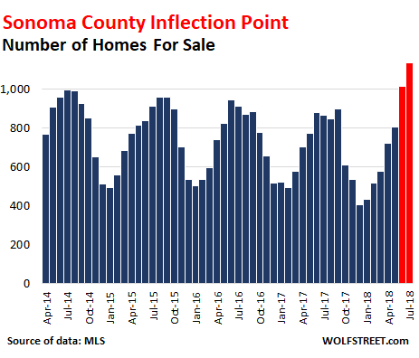
In June and July 2018, supply suddenly shot to the highest level in years. The chart below shows the number of homes listed for sale in the county. Both June (1,014 homes listed for sale) and July (1,135 homes listed for sale) hit the highest levels in the data going back to 2014:
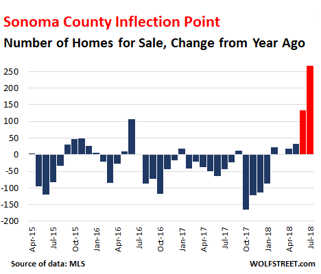
This inflection point becomes even more obvious in the year-over-year increase in the number of homes listed for sale:
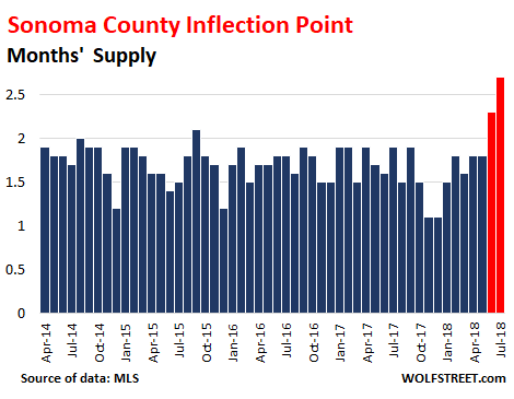
Months’ supply of homes for sale – the number of homes for sale divided by the number of homes sold – jumped from 1.6 months in June 2017 to 2.3 months in June 2018. In July, it jumped to 2.7 months:
Toward the end of July, Stone said: “The last three weekly office meetings have been focusing on the changing market, how to prepare sellers for lower prices when taking a listing and how to change your marketing to take advantage of the change.”
Brokers only make money when there is a sale. When sellers are asking for more money than buyers are willing to pay, sales stall, and the market grinds down, and volume falls off – until sellers start lowering their prices. It is the brokers’ job to convey a sense of reality to their clients — the sellers.
Stone added another data bit: Of the 114 “new” listings at the time, 30 had been listed before, and had been pulled because they didn’t sell, and now were back on the market as “new” listings.
And there were 94 price reductions. “Some days the price reductions alone exceed new listings,” he said.
However, this doesn’t include homes that had been listed at a higher asking price, pulled off the market, and later relisted at a lower asking price. If the home sells at the latest and lower asking price, it’s considered “at asking,” though at its prior listing, it had had a higher asking price but didn’t sell.
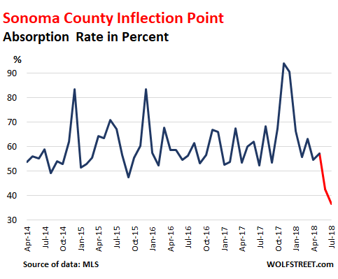
The chart below shows the “Absorption Rate” (the number of closed sales divided by the number of homes for sale). It shows the percentage of the supply that has been “absorbed” by the market. The spike late last year to 94% was in part due to the fires. But in June this year, the market only absorbed 43% of the supply, the lowest in years, and in July, the market only absorbed 37%:
So in this kind of market where the inflection point has become visible to industry insiders, what should sellers do so that their house will sell? Lower the asking price. The chart below shows the “average asking price” of homes listed for sale:
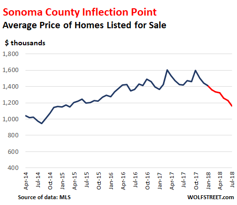
The average “asking price” in July dropped 18% year-over-year to $1.16 million, the lowest since the spring of 2015. Some caution is advised: “Average” asking prices (sum of all asking prices divided by the number of all homes for sale) can be skewed by a small number of very expensive homes that might not sell for a long time and remain in the asking price data for a long time. So the “average asking price” is a lot higher than the “median” price of homes that actually sold. More on those in a moment. Nevertheless, this is a big and consistent move.
So, what about the median prices at which homes actually sold? The “median sold price” – which means 50% of the homes sold for more, and 50% sold for less – in July dropped to $639,000 – the lowest for the year. But it was still up 6.5% from July last year, and many stories in the media cite this number to show that the housing market is still hot:
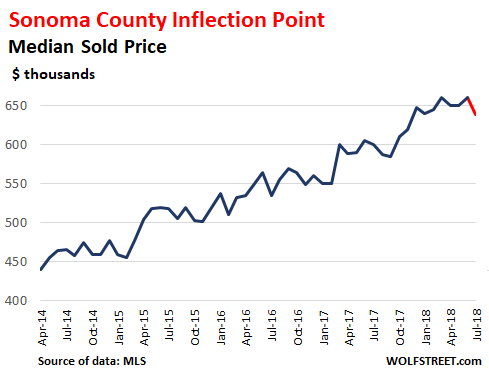
A home is considered sold when the sale has closed. There is some delay between the signing of the contract and the closing of the sale, and the median price in July reflects many deals that were made in a prior month.
But to see what has been happening this year, let’s put the median prices for 2018 under the microscope. July was the low point so far this year, and the lowest since November 2017:
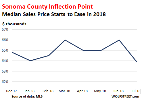
The median price is the last metric to move, and it has met its inflection point in July.
When I talked with Stone a few days ago, he mentioned that the weekly office meetings still focused on how to get sellers to be more realistic. This has now been the case for five weeks in a row. The “vast majority of brokers, except for a few eternal optimists,” expect prices to skid, he said. He expects a 25% correction over the next three years. And the above charts show how it starts at the subcutaneous level, for industry insiders to see, but before it turns into media-ready year-over-year declines in the median price that causes so much wailing and gnashing of teeth.
The Case-Shiller Home Price Index, the way it is designed, lags about three months behind the median price data. According to it, there is a historic spike in Seattle, sharp increases in other metros, but New York condos fall. Read… The Most Splendid Housing Bubbles in America