The media is claiming the stock market is about to “melt up”. I’m not convinced, in fact current financial conditions are reaching another extreme and there are new reasons to believe this might be the last peak in the biggest mania ever. No doubt QE has created the most persistent risk seeking behavior in history, however financial values cannot stay so divorced from real values forever.
Most people think that because the Fed is back to expanding its balance sheet again there is no risk, even skeptics think you should back up the truck and buy buy buy! This is similar to the psychology of 2007/early 2008 where people thought “The Fed won’t let it happen, they will just print.” It’s the psychology of a top and the persistent Repo dislocation is an early sign of the liquidity problems coming our way.
In January 2018 I made a post titled “The Evidence for the Greatest Top in History”. That was on the day of that stock market peak. Whilst the main US indices have rallied since then the market has been narrowing, breadth is weak. Typical of a peaking stock market.
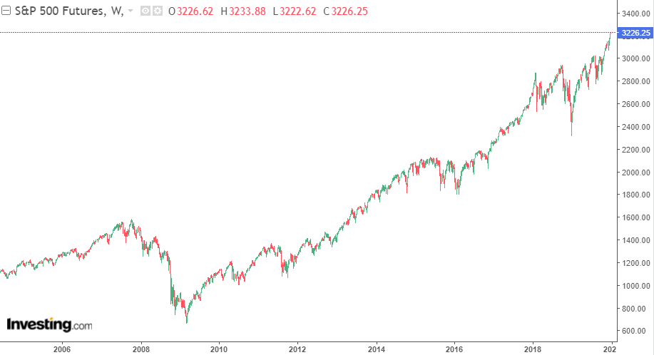
In fact you can see total US stock valuations are not any higher than the peak in January 2018.
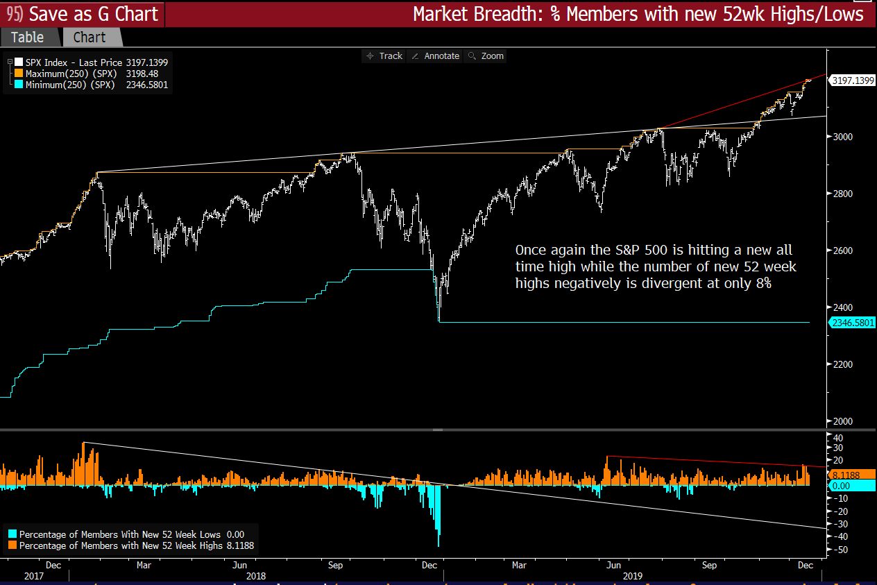
Despite the surge 52 week highs are much lower than in Jan ’18. Even though the market was making a major bottom 1 year ago. This is a further indication of the lack of breadth.
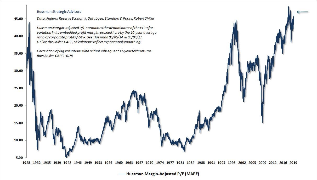
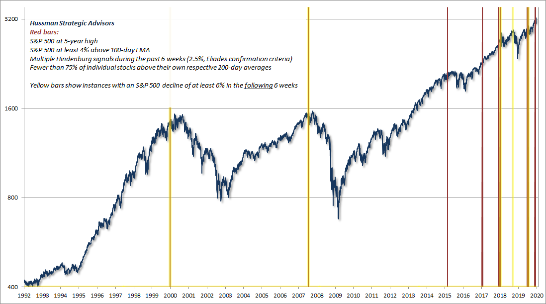
John Hussman recently put out a chart that narrows down certain instances of poor market breadth that tend to come at tops.
Markets top on optimism and bottom on pessimism. The psychology towards US stocks is extreme.
Here are some of the charts showing extreme optimism in the stock market
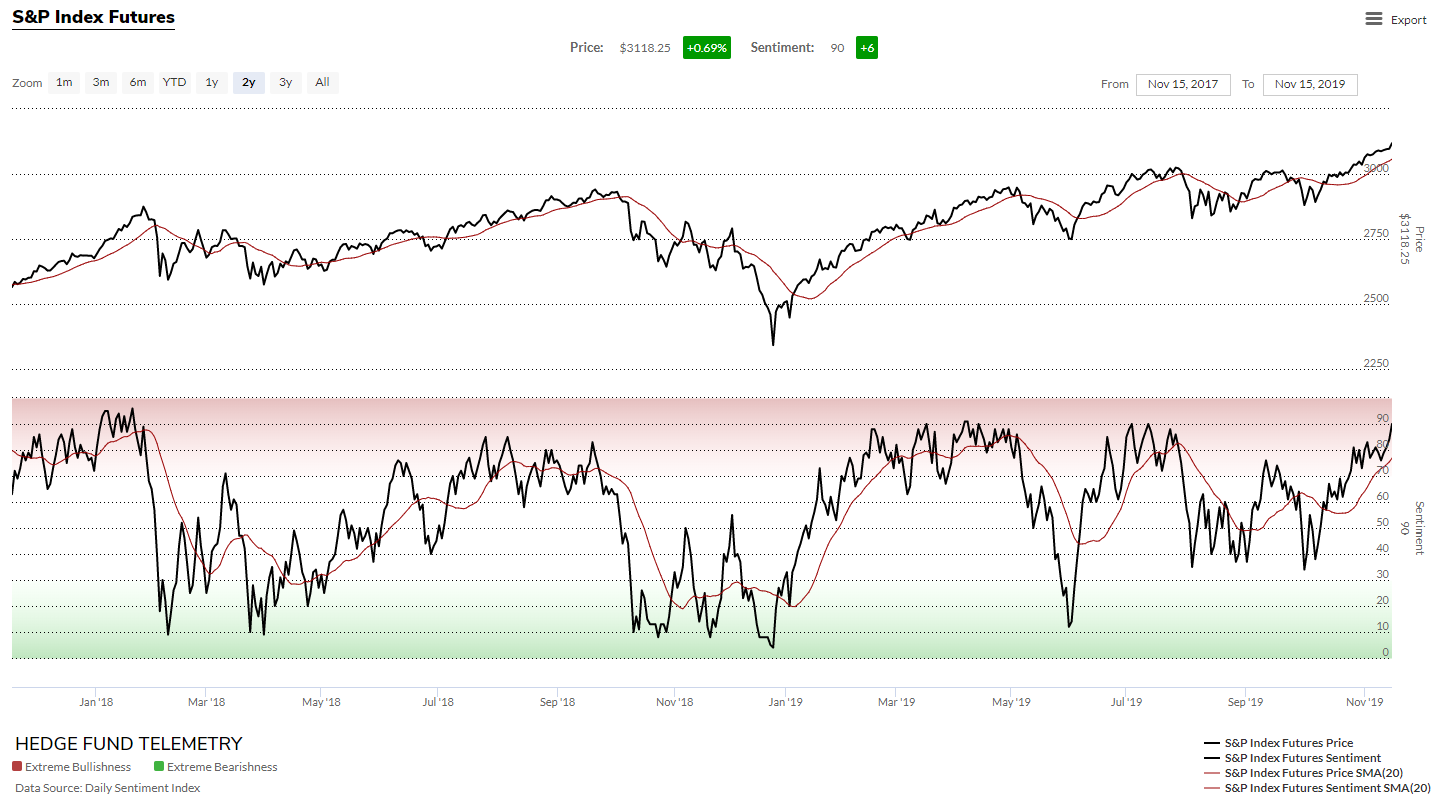
The daily sentiment index has often been in the extreme zone this year with bulls over 80%. I used this to time the peak in January 2018 as bulls hit the mid 90s. This chart only goes to mid November but the DSI has been elevated since then. I haven’t seen any readings so elevated that they would help pin point a top though.
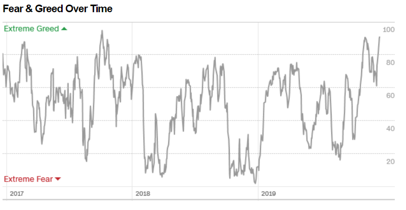
The Fear and Greed index is a composite indicator and is the highest since the run up to the January 2018 peak.
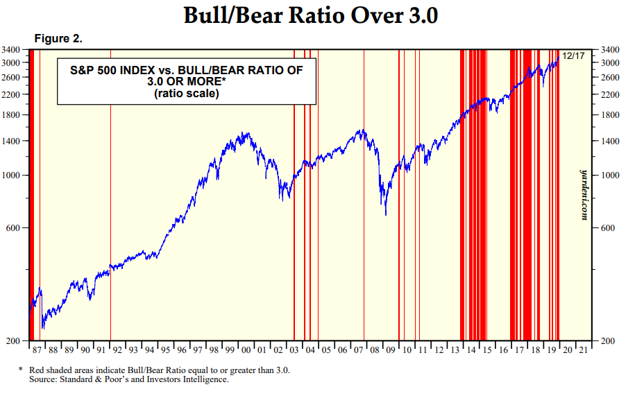
Investors intelligence is a good measure of optimism. The bars here show a ratio over 3 — extreme optimism. Optimism has been so persistent in recent years its usefulness for timing has become limited.
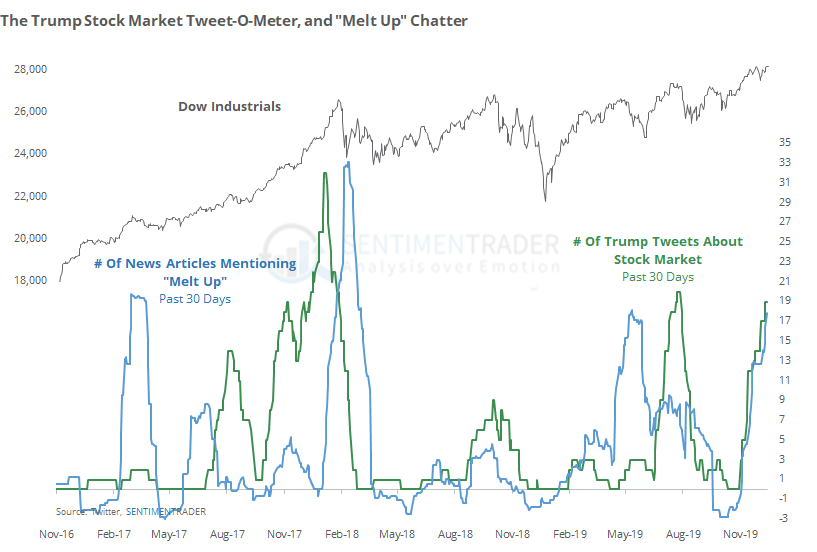
And here you can see the medias talk of a “melt-up” charted. Hint: the meltup has already happened. You can see that by the time the media is all over it they are talking about the past.
This is also reflected by articles such as these where one commentator says “All over the world, markets are falling love. Buy it. Buy it all,”
‘Back up the truck and buy, buy buy,’ because there is no risk, says MUFG economist — MarketWatch
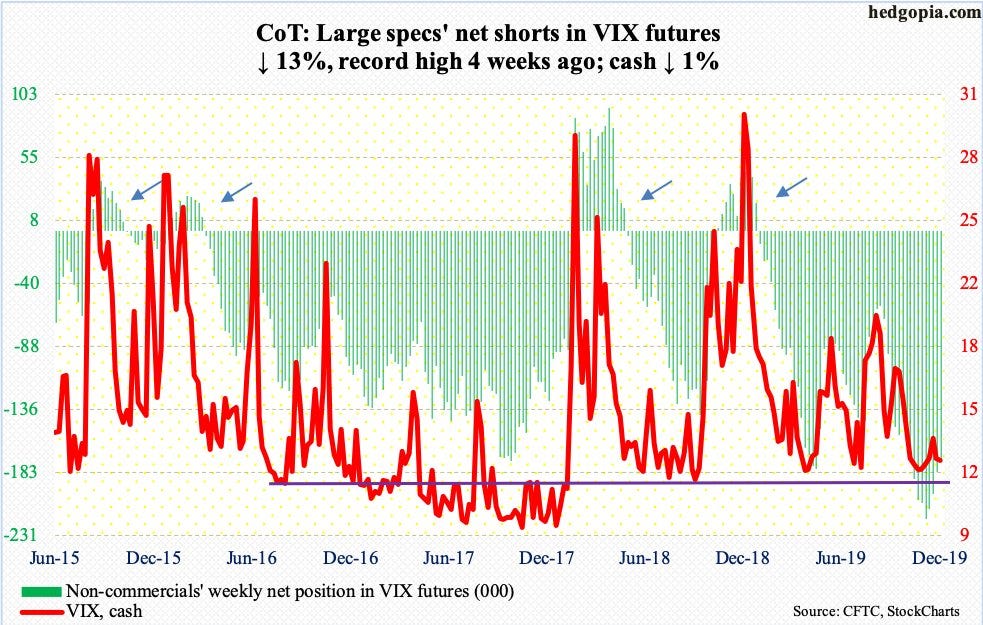
Hedge funds are record short volatility again. This could fuel explosive downside just like in January 2018. Recently vol has been very low in various financial markets. Perhaps 2020 will feature extreme volatility across financial assets.
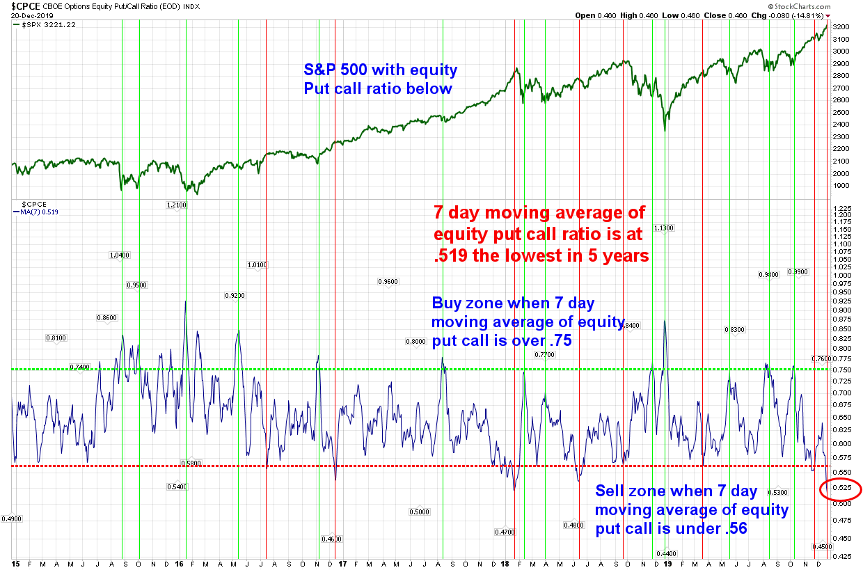
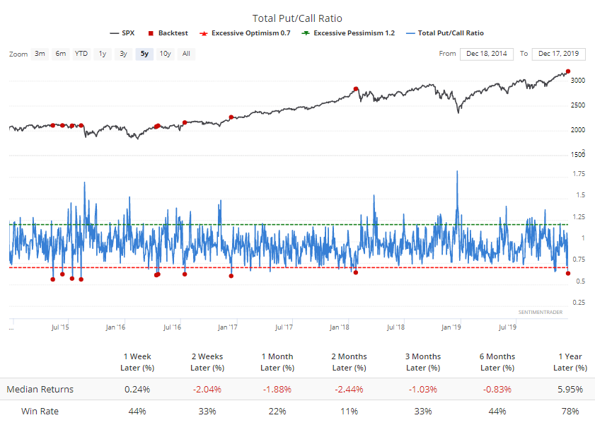
Another chart showing the put/call ratio.
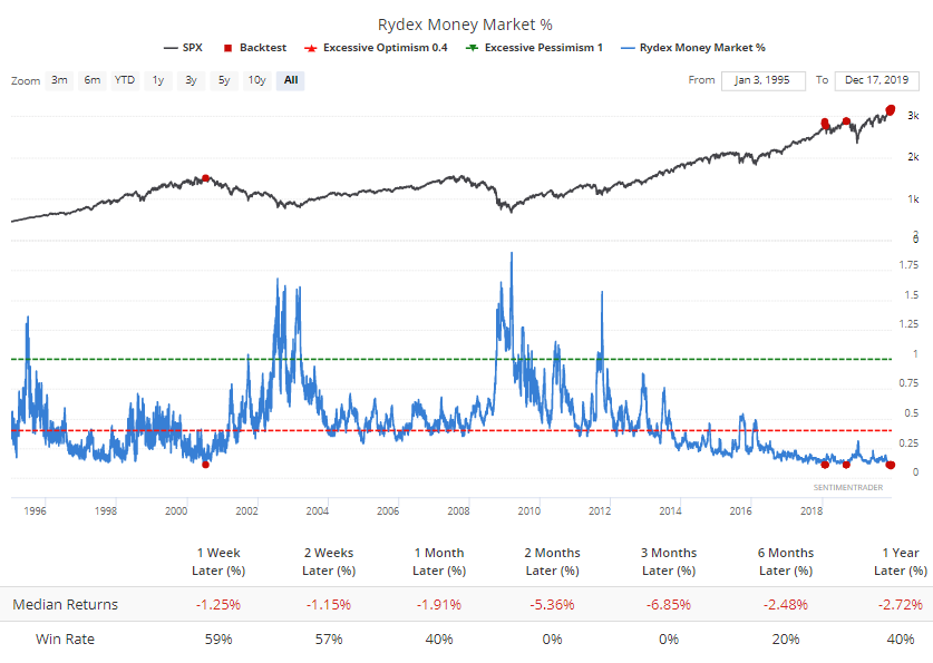
This chart shows how much of Rydex funds are being held in cash. Investors are “all in”
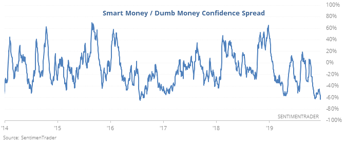
Sentimentrader has a composite measure called the smart money/dumb money confidence spread. Dumb money is much more confident than smart money here.
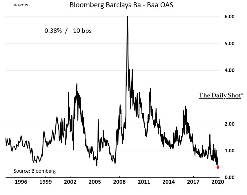
The BB-BBB spread is the tightest in history as investors have piled into corporate debt. Just another indicator of how easy financial conditions are. Similar conditions were seen in 2007 before the financial crisis.
In my opinion current conditions are again similar to January 2018. One difference between then and now is market breadth is much more narrow. As John Hussman says this opens a “trap door” underneath prices when the market turns.
Additionally the yield curve inverted earlier this year and has now uninverted. This typically precedes recession. If Stocks fall and short term rates resume their fall it would be a good leading indicator of recession.