via John P. Hussman:
I’ve often described what I call the Iron Law of Valuation: the higher the price investors pay for a given set of expected future cash flows, the lower the long-term investment returns they should expect. As a result, it’s precisely when past investment returns look most glorious that future investment returns are likely to be most dismal, and vice-versa.
Market returns and economic growth have underlying drivers. At their core, extended periods of extraordinary growth and disappointing collapse reflect large moves in those drivers from one extreme to another. Extrapolation becomes a very bad idea once those extremes are reached.
For example, from 1982 to 2000, the S&P 500 enjoyed an extraordinary period of total returns averaging just over 20% annually. The primary driver of those gains wasn’t growth in revenue or earnings (though the combination of 4.6% average annual S&P 500 revenue growth and a high starting dividend yield certainly helped). No, the primary driver was expansion in the S&P 500 price/revenue ratio, which rose from a profound low of 0.3 in 1982, to an offensively extreme 2.2 by the 2000 peak.
Conversely, in the 9-year period from 2000 to 2009, the S&P 500 lost half of its value despite positive overall growth in revenue and earnings. The reason was that the S&P 500 price/revenue ratio collapsed from 2.2 to less than 0.7 over that period – a retreat that even 9 years of 4.7% annual revenue growth was wholly unable to offset.
From 2009 to 2018, the S&P 500 price revenue ratio advanced from less than 0.7 to a breathtaking multiple of 2.4 early this year – the highest level in the history of the U.S. stock market. Extrapolating the market gains of these past several years, as if they are somehow a birthright of passive investing, is likely to have brutal consequences for investors.
Market returns and economic growth have underlying drivers. At their core, long periods of extraordinary growth and disappointing collapse reflect large moves in those drivers from one extreme to another. Extrapolation becomes a very bad idea once those extremes are reached.
The upshot is this. Measured from their highs of early-2018, we presently estimate that the completion of the current cycle will result in market losses on the order of -64% for the S&P 500 Index, -57% for the Nasdaq 100 Index, -68% for the Russell 2000 Index, and nearly -69% for the Dow Jones Industrial Average.
These estimates undoubtedly seem preposterous, as was my March 2000 projection of an -83% plunge in technology stocks (the tech-heavy Nasdaq 100 lost an implausibly precise -83% in the subsequent 2000-2002 collapse), as was my projection in 2000 that the S&P 500 would likely suffer negative total returns over the following decade (it did), as was my April 2007 estimate that the S&P 500 could lose -40%, not to become deeply undervalued, but simply to reach valuations that were “standard, normal, commonplace” (the S&P 500 went on to lose -55% in the subsequent 2007-2009 collapse, though I emphasized in late-2008 – after the S&P 500 had indeed collapsed by more than -40% – that “The best way to begin this comment is to reiterate that U.S. stocks are now undervalued”).
Severity versus immediacy
Despite the severity of these estimated market losses, don’t confuse severity for immediacy. Let’s briefly review the considerations that distinguish long-term, full-cycle outcomes from immediate ones.
A moment’s thought should make it clear that valuation extremes like 1929, 2000, 2007 and today could never have emerged unless the market was able to entirely shrug off less extreme valuations along the way. When investors have the speculative bit in their teeth, as they did through the majority of the period between 2009 and 2017, valuations may exert very little effect on market outcomes, even for fairly extended segments of the market cycle. We gauge the inclination of investors toward speculation or risk-aversion from the uniformity or divergence of market internals – the behavior of thousands of individual securities, industries, sectors, and security types (including debt securities of varying creditworthiness). When investors are inclined to speculate, they tend to be indiscriminate about it.
As I’ve detailed in recent quarters, our own difficulty during the recent speculative half-cycle had nothing to do with either valuations or market internals, but instead my belief – based on a century of market cycles – that certain combinations of evidence (specifically, extreme combinations of “overvalued, overbought, overbullish” market conditions) provided a measurable limit to speculation. Historically, regardless of other market conditions, one could adopt a negative market outlook once those syndromes emerged. Not this time. Not in the face of zero interest rates. Not in the face of post-election enthusiasm. This time, there was no such thing as “too much” or “too extreme.” One had to wait for market internals to deteriorate explicitly before adopting a negative market outlook. Late last year, we adopted that requirement, with no exceptions.
The present combination of record valuations and divergent market internals, coming off of the most wicked ‘overvalued, overbought, overbullish’ extremes in history, creates a danger zone that will not be resolved until some combination of those factors – valuations, internals, and overextended conditions – shifts to a less dangerous mix.
Understand what I’m actually saying here. If our measures of market internals were to improve (having shifted to an unfavorable condition the week of February 2, 2018), our immediate outlook would become neutral or possibly even constructive – with a safety net – regardless of valuations that I view as obscene. If extreme valuations alone were enough to cause a market collapse, the market would have collapsed quite a long time ago. But valuations are not enough. It’s extreme valuation, coupled with deteriorating or divergent market internals (signaling a subtle shift toward risk-aversion among investors) that opens up a potential trap door.
It’s very true, and a valid criticism, that “overvalued, overbought, overbullish” warning signs were completely ineffective in recent years, and that my own reliance on the historical effectiveness of those warning signs was detrimental. But even in the period since 2009, once those warning signs have been joined by divergent market internals, the S&P 500 has lost value, on average.
At present, our measures of market internals remain unfavorable, partly because of deterioration in interest/credit sensitive sectors, as well as tepid participation (the number of individual stocks participating in various market advances), divergent leadership (for example, a large number of stocks simultaneously hitting 52-week highs and lows), and the divergences we observe in an array of other sectors.
We don’t make forecasts about when or whether market internals will shift, because sufficiently uniform market action can produce those shifts very quickly. So our outlook will shift as the evidence does. Given last year’s adaptations, those shifts will likely be more frequent because we’re no longer inclined to adopt a negative outlook in the face of extremely overextended syndromes alone.
The problem, again, is that market internals are presently suggesting a subtle shift toward risk-aversion among investors. In the face of extreme valuations, investors face enormous downside risks, as they did in 2000 and 2007. The present combination of record valuations and divergent market internals, coming off of the most wicked “overvalued, overbought, overbullish” extremes in history, creates a danger zone that will not be resolved until some combination of those factors – valuations, internals, and overextended conditions – shifts to a less dangerous mix.
As I did in 2000 and 2007, I mean these figures seriously – not as hyperbole, but based on outcomes that would be historically standard, normal, and commonplace given current valuation extremes. At present, we project market losses over the completion of this cycle on the order of -64% for the S&P 500 Index, -57% for the Nasdaq 100 Index, -68% for the Russell 2000 Index, and nearly -69% for the Dow Jones Industrial Average.
Valuation update
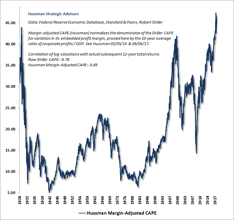
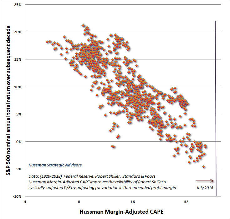
The charts below provide a quick update regarding current valuation extremes. The first is our Margin-Adjusted CAPE, which substantially improves the reliability of Robert Shiller’s cyclically-adjusted P/E ratio by adjusting the earnings figure for variations in the implied profit margin. As I’ve regularly noted, this measure is not vulnerable to the “dropoff” of earnings from the financial crisis, as is true for the raw Shiller P/E. Moreover, normalizing profit margins does not imply a requirement that profit margins will decline over the near term, or even during the coming economic cycle.
Remember, a valuation ratio is nothing more than shorthand for a proper discounted cash flow analysis. It’s important to recognize that stocks are a claim not to next year’s earnings, or the next few years of earnings, but to the very long-term stream of cash flows that will be delivered into the hands of investors for decades and decades to come. As I demonstrated back in January, our Margin-Adjusted CAPE is tightly correlated with the ratio of the S&P 500 to the actual discounted value of subsequent S&P 500 dividends, across more than a century of history.
As I did in 2000 and 2007, I mean these figures seriously – not as hyperbole, but based on outcomes that would be historically standard, normal, and commonplace given current valuation extremes. At present, we project market losses over the completion of this cycle on the order of -64% for the S&P 500 Index, -57% for the Nasdaq 100 Index, -68% for the Russell 2000 Index, and nearly -69% for the Dow Jones Industrial Average.
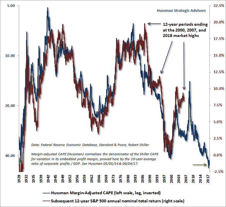
The next chart shows the relationship of our Margin-Adjusted CAPE (left scale, log, inverted) and actual subsequent S&P 500 total returns over the following 12-year period. Notice that market extremes like 2000, 2007 and today always induce an “error” between the two lines, because by definition, a move to extreme overvaluation means that recent returns have been better than one would have anticipated 10-12 years earlier based on valuations at the time. As it happens, those “errors” are strongly correlated with shorter-term cyclical variations in consumer confidence, which is another way of saying that investors often ignore valuations based on their psychological mood. That’s why it’s important to couple the analysis of valuations with measures of market internals that help to gauge investor attitudes toward speculation and risk-aversion.
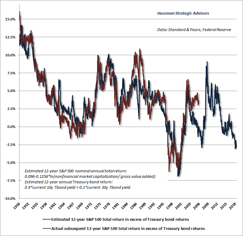
While it’s true that interest rates are low, I’ve regularly emphasized that if interest rates are low because growth rates are also low, no valuation premium is actually “justified” by low interest rates at all – a fact that one can demonstrate using any discounted cash flow method. As a result, objects like the “Fed Model” actually have a very poor relationship with actual subsequent market outcomes, and aren’t even well-correlated with subsequent “equity risk premiums” (the difference between stock market returns and Treasury bond returns).
For our part, we’ve found that the most reliable way to estimate the equity risk premium is to use valuations to estimate probable market returns, and then to subtract bond yields from that estimate. These estimates are presented below, along with the actual subsequent market return in excess of Treasury bonds. Note in particular that even at today’s low level of interest rates, we estimate that the S&P 500 will underperform Treasury bonds by roughly 3% annually over the coming 12-year horizon.
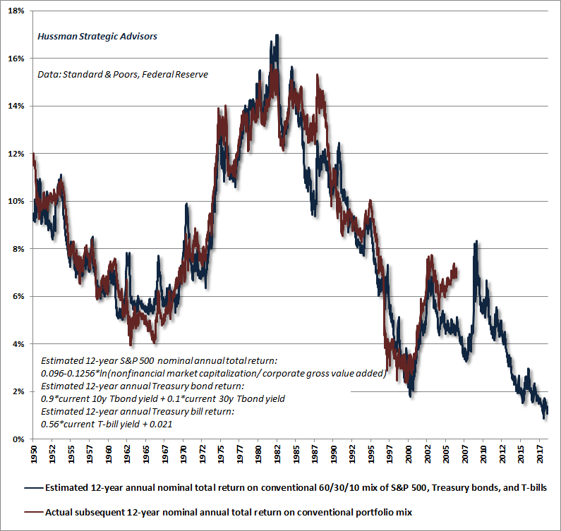
So the fact that interest rates are low doesn’t actually improve the outlook for investors. Rather, it adds insult to injury because security valuations are extreme across-the-board. The chart below shows our estimate of 12-year total returns on a conventional passive portfolio mix invested 60% in the S&P 500, 30% in Treasury bonds, and 10% in Treasury bills. The red line shows the actual subsequent 12-year total return of this asset mix. Presently, we expect a passive portfolio mix to underperform the return on risk-free Treasury bills over the coming 12-year period, mainly because the stock market component of passive returns is likely to be negative.
Real or nominal?
We’re sometimes asked why we use valuations to project nominal returns rather than real returns for the S&P 500. Probably the simplest way to address the question is to show that our valuation measures are effective for both. The chart below shows the relationship of our Margin-Adjusted CAPE and actual subsequent 12-year nominal S&P 500 total returns, in data since 1920.
The next chart shows the same valuation measure versus actual subsequent real, after-inflation, 12-year S&P 500 total returns.
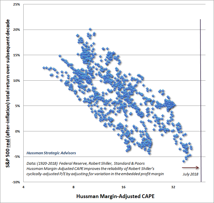
Notice that while reliable valuation measures are informative about subsequent market returns in both cases, the relationship is somewhat tighter for nominal returns than for real returns. This seems to upset some observers. Why get all upset over a fact?
The reason they get upset is because they believe in something called the “Fisher effect.” In theory, higher inflation should raise both the nominal growth rate of future cash flows, and the nominal rate that investors use to discount those cash flows back to present value. In theory, the effect of inflation changes on valuations should therefore be neutral. Inflation rates shouldn’t affect the level of valuations at all. As a result, valuations should be closely related to subsequent real returns, but not subsequent nominal ones. Likewise, higher inflation should result in higher subsequent nominal returns, but not higher subsequent real returns.
Unfortunately, that’s not how investors behave. If they did, they wouldn’t be driving valuation levels to record highs just because interest rates are low, particularly in an environment where the prospect for structural U.S. real GDP growth (the underlying growth of the economy that isn’t driven by fluctuations in the unemployment rate) has never been lower.
The following chart shows how investors do behave. The horizontal axis shows the average rate of CPI inflation over the prior decade. The vertical axis shows the average real, after-inflation total return of the S&P 500 over the subsequent decade. In theory, the past rate of inflation shoudn’t affect subsequent real, after-inflation market returns. In practice, the slope of the relationship is actually greater than 1.0. When inflation is high, investors overreact, driving valuations down far more than is justified, and setting the market up for glorious subsequent real returns. In contrast, when inflation is low, investors also overreact, driving valuations up far more than is justified, and setting the market up for dismal subsequent real returns. That’s exactly what they’ve done today.
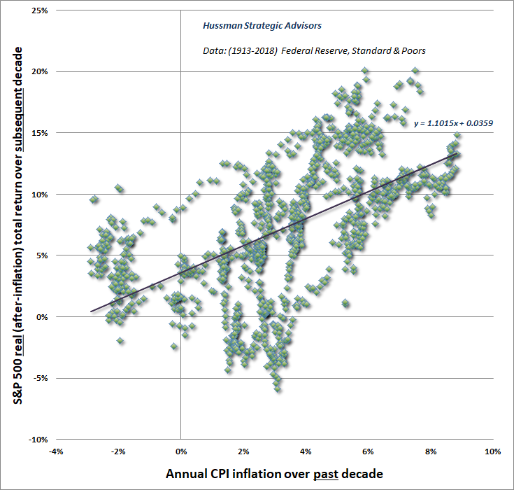
So yes, in theory, a perfect Fisher effect would create a situation where valuations are strongly associated with subsequent real returns, but not nominal ones. In practice, like it or not, investors respond to inflation by embedding it into valuations, and thereby into subsequent real returns. Investors ignore the fact that if interest rates are low because growth and inflation are also low, no valuation premium is “justified” at all. The end result of excessively embedding interest rates and inflation into market valuations is that good valuation measures are not just correlated with subsequent real returns – they are even more strongly correlated with subsequent nominal returns.
Distinguishing extraordinary climbs from long trips to nowhere
In my view, investors are setting themselves up for a very, very long period of zero or negative real returns in the stock market. In every market cycle, history has regularly offered better opportunities for long-term investors to embrace market risk.
One of the charts that has been making the rounds is a depiction of the cumulative S&P 500 real return, going back to 1871. The chart is usually accompanied by a diagonal trendline that gives the impression that long-term real returns are somehow fixed, that valuations can be ignored, and that passive investing always works out over time. Be careful, because the chart also makes the Great Depression look like a walk in the park, with the 1973-74, 2000-2002, and 2007-2009 collapses appearing as little bumps along the road. Very long periods of time also seem very short when they’re presented on a 147-year chart.
I’ve added some annotations to offer some context for investors with somewhat shorter horizons. The thin valuation line shows the ratio of the S&P 500 to the highest level of earnings achieved during the preceding decade. I would have preferred our Margin-Adjusted CAPE or an even more reliable measure, but it’s difficult to impute the required data prior to about 1920. Still, the price/peak-earnings multiple is sufficient to show what’s going on.
You’ll notice some red bars, for example, from the 1929 market top to the 1949 market low. The reason for the red bar, if you look at the valuation line, is that this was a period where valuations moved from elevated levels to depressed levels, with a rather long span of time in-between. Accordingly, even though the economy grew quite a bit in the intervening 20-year period, the real return on the S&P 500 was zero. The same thing happened between the early-1960’s and the early 1980’s.
Ditto for the period between 1996 and 2009 (and of course, even worse between the 2000 high and the 2009 low). Despite the long upward course for real S&P 500 total returns, the move from rich valuations to depressed valuations was accompanied by a 13-year period where the S&P 500 produced a real total return of zero.
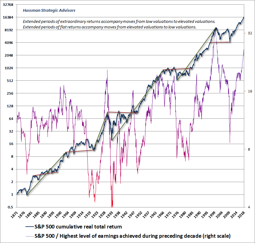
Put simply, despite long-term economic growth, the real return on stocks can be zero or negative for very extended periods of time when measured from a valuation extreme like today and a subsequent valuation trough years and years later.
Of course, there’s a positive flip-side to this story. Look at points between unusually depressed valuations and elevated ones. You’ll notice that the green lines connecting the corresponding market returns are fairly steep, as investors enjoyed strong real returns during those periods. When investors accumulate stocks at depressed valuations, they generally set themselves up to enjoy not only future growth in the economy and earnings, but prices that represent a rising multiple of those fundamentals.
It’s notable that even using price/record earnings – which is the most optimistic of all possible valuation measures and doesn’t make any downward adjustment at all for elevated profit margins – current valuation levels are higher than 1929, 1972, 2007, or any point in history except the very peak of the dot-com bubble. In my view, investors are setting themselves up for a very, very long period of zero or negative real returns in the stock market. In every market cycle, history has regularly offered better opportunities for long-term investors to embrace market risk.
Valuations and half-cycle returns
Back in March 2000, I wrote “Over time, price/revenue ratios come back in line. Currently that would require an 83% plunge in tech stocks (recall the 1969-70 tech massacre). The plunge may be muted to about 65% given several years of revenue growth. If you understand values and market history, you know we’re not joking.”
Given my tendency, at market extremes, to make preposterous projections that turn out rather well over the complete cycle, some insight into the relationship between price/revenue ratios and subsequent returns may be useful, particularly with respect to various market indices.
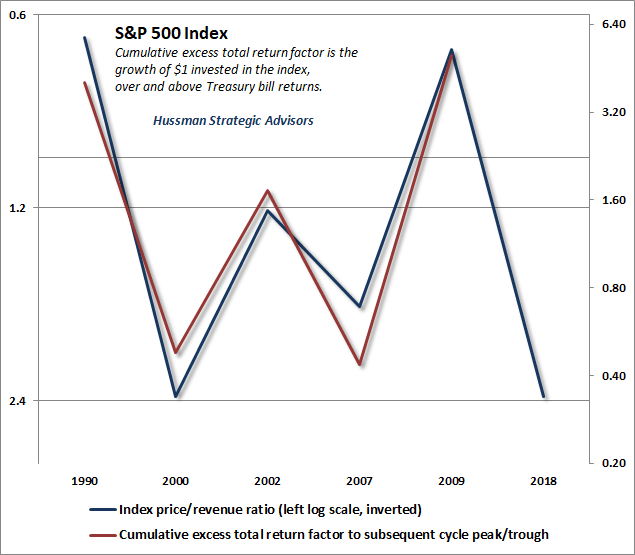
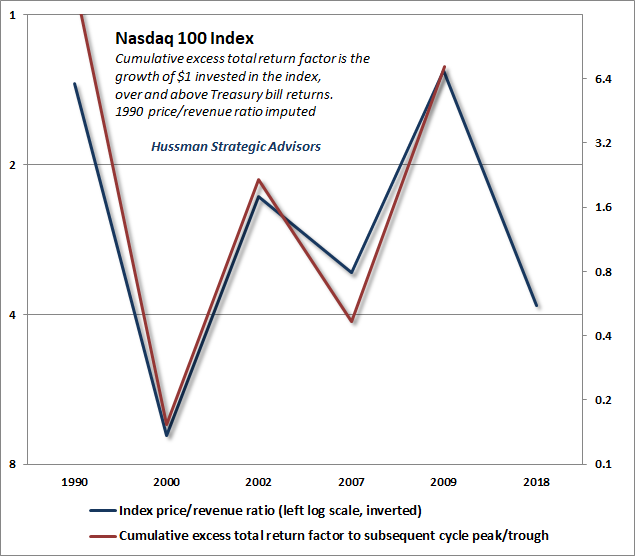
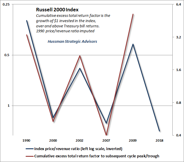
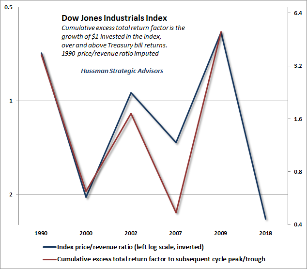
The next four charts all have the same structure. The blue line shows the price/revenue ratio of a given market index at cyclical peaks and troughs, specifically, the 1990 bear market low, the 2000 bull market high, the 2002 bear market low, the 2007 bull market high, the 2009 bear market low, and the recent 2018 market high. The blue line is shown on an inverted log scale, so higher levels represent undervaluation (and high expected future returns), while lower levels represent overvaluation (and low expected future returns).
The red lines (also on log scale) show the half-cycle return for each index, over and above Treasury bill returns. Specifically, these lines show the amount by which an initial dollar would have grown or contracted over the half-cycle that followed.
The first chart shows the S&P 500 Index. Based on the relationship between initial valuations and subsequent half-cycle returns, it should be reasonably easy to see, based on recent valuation extremes, why I expect a $1.00 investment in the S&P 500 to lose about two-thirds of its value over the completion of the current market cycle. The charts don’t exactly mirror our half-cycle estimates based on broader calculations, but they’re close enough to provide some sense of why our market loss projections over the completion of this cycle are so extreme.