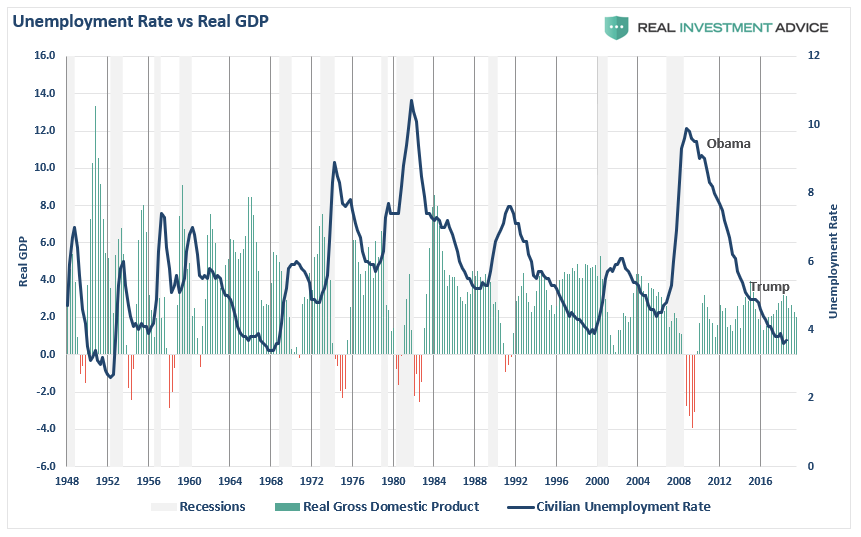
After the monthly jobs report was released last week, I saw numerous people jumping on the unemployment rate as a measure of success, and in this particular case, Trump’s success as President.
- Unemployment November 2016: 4.7%
- Unemployment August 2019: 3.7%
Argument solved.
President Trump has been “Yuugely” successful at putting people to work as represented by a 1% decline in the unemployment rate since his election.
But what about President Obama?
- Unemployment November 2008: 12.6%
- Unemployment November 2016: 4.7%
Surely, a 7.9% drop in unemployment should be considered at least as successful as Trump’s 1%.
Right?
Here’s a secret, neither one is important.
First, Presidents don’t put people to work. Corporations do. The reality is that President Obama and Trump had very little to do with the actual economic recovery.
Secondly, as shown below, the recovery in employment began before either President took office as the economic recovery would have happened regardless of monetary interventions. Importantly, note the drop in employment has occurred with the lowest level of annual economic growth on record. (I wouldn’t necessarily be touting this as #winning.)
Lastly, both measures of “employment success” are erroneous due to the multitude of problems with how the entire series is “guessed at.” As noted previously by Morningside Hill:
- The Bureau of Labor Statistics (BLS) has been systemically overstating the number of jobs created, especially in the current economic cycle.
- The BLS has failed to account for the rise in part-time and contractual work arrangements, while all evidence points to a significant and rapid increase in the so-called contingent workforce.
- Full-time jobs are being replaced by part-time positions, resulting in double and triple counting of jobs via the Establishment Survey. (Examples: Uber, Lyft, GrubHub, FedEx, Amazon)
- A full 93% of the new jobs reported since 2008 were added through the business birth and death model – a highly controversial model which is not supported by the data. On the contrary, all data on establishment births and deaths point to an ongoing decrease in entrepreneurship.
- Jobless claims have recently reached their lowest level on record which purportedly signals job market strength. Since hiring patterns have changed significantly and increasingly more people are joining the contingent workforce, jobless claims are no longer a good leading economic indicator. Part-time and contract-based workers are most often ineligible for unemployment insurance. In the next downturn, corporations will be able to cut through their contingent workforce before jobless claims show any meaningful uptick.
Nonetheless, despite a very weak payroll number, the general “view” by the mainstream media, and the Federal Reserve, is the economy is still going strong.
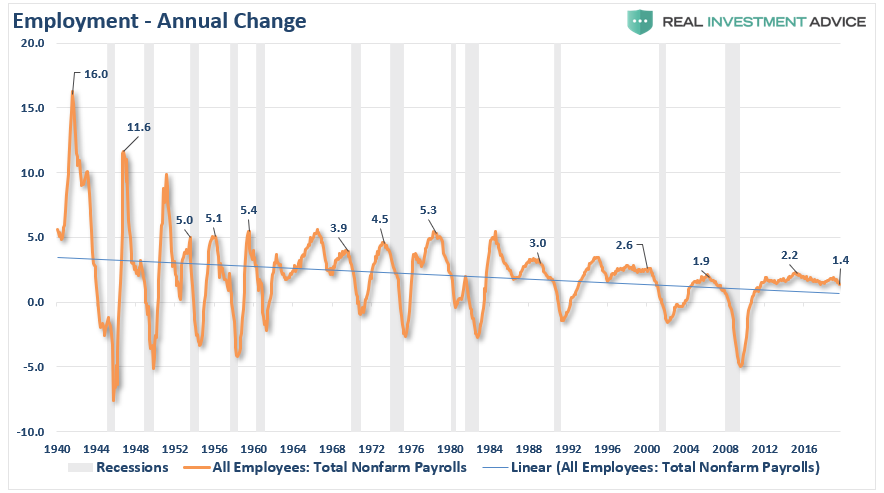
In reality, one-month of employment numbers tell us very little about what is happening in the actual economy. While most economists obsess over the data from one month to the next, it is the “trend” of the data which is far more important to understand.
The chart below shows the peak annual rate of change for employment prior to the onset of a recession. The current annual rate of employment growth is 1.4% which is lower than any previous employment level in history prior to the onset of a recession.
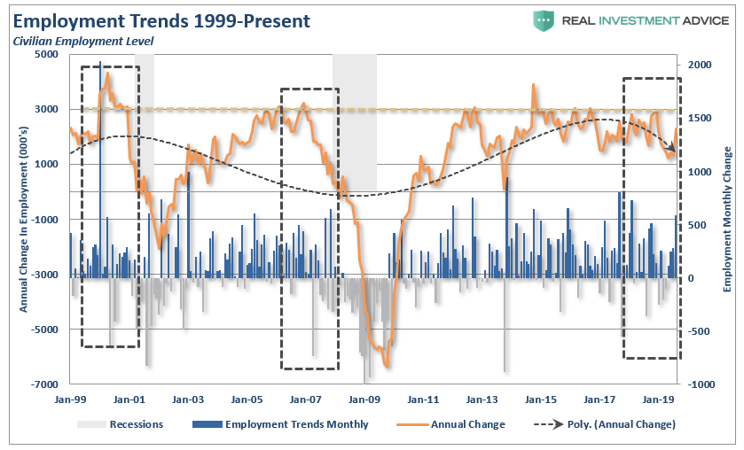
But while this is a long-term view of the trend of employment in the U.S., what about right now? The chart below shows the civilian employment level from 1999 to present.
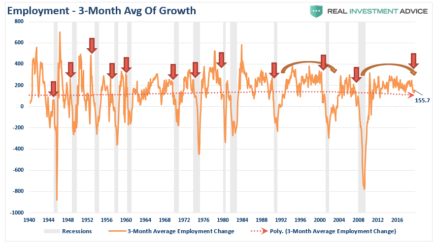
While the recent employment report was slightly below expectations, the annual rate of growth is slowing at a faster pace. Moreover, there are many who do not like the household survey due to the monthly volatility in the data. Therefore, by applying a 3-month average of the seasonally-adjusted employment report, we see the slowdown more clearly.
But here is something else to consider.
While the BLS continually fiddles with the data to mathematically adjust for seasonal variations, the purpose of the entire process is to smooth volatile monthly data into a more normalized trend. The problem, of course, with manipulating data through mathematical adjustments, revisions, and tweaks, is the risk of contamination of bias. A simpler method to use for smoothing volatile monthly data is using a 12-month moving average of the raw data as shown below.
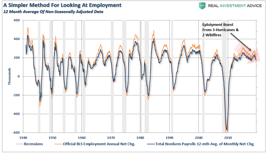
Near peaks of employment cycles, the employment data deviates from the 12-month average, but then reconnects as reality emerges.
Sometimes, “simpler” gives us a better understanding of the data.
Importantly, there is one aspect to all the charts above which remains constant. No matter how you choose to look at the data, peaks in employment growth occur prior to economic contractions, rather than an acceleration of growth.
But there is more to this story.
A Function Of Population
One thing which is not discussed when reporting on employment is the “growth” of the working-age population. Each month, new entrants into the population create “demand” through their additional consumption. Employment should increase to accommodate for the increased demand from more participants in the economy. Either that or companies resort to automation, off-shoring, etc. to increase rates of production without increases in labor costs. The chart below shows the total increase in employment versus the growth of the working-age population.
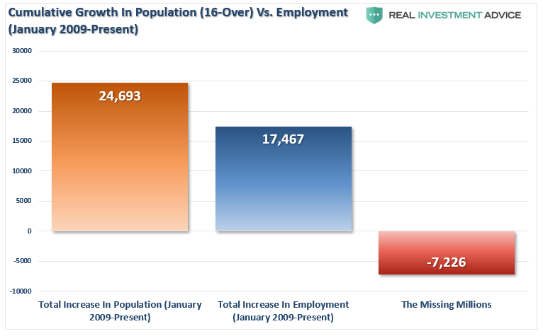
The missing “millions” shown in the chart above is one of the “great mysteries” about the longest economic booms in U.S. history. This is particularly a conundrum when the Federal Reserve talks about the economy nearing “full employment.” The disparity shows up in both the Labor Force Participation Rate and those “Not In Labor Force.”

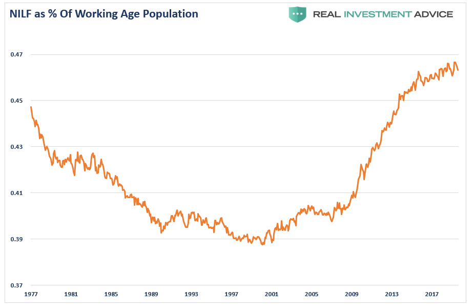
Note that since 2009, the number of those “no longer counted” has dominated the employment trends of the economy. In other words, those “not in labor force” as a percent of the working-age population has skyrocketed.
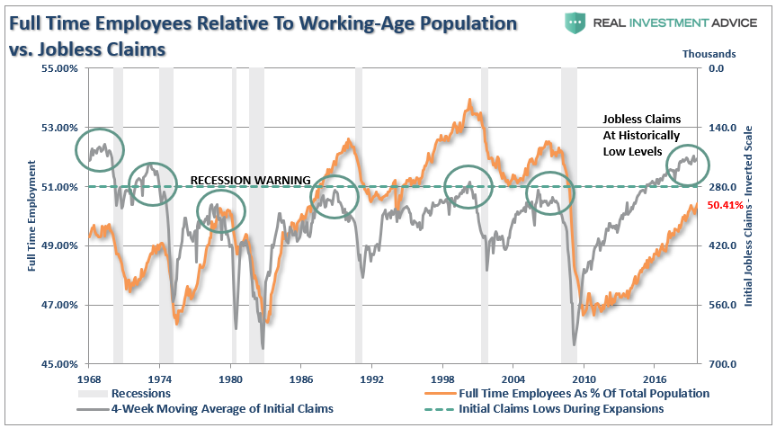
Of course, as we are all very aware, there are many who work part-time, are going to school, etc. But even when we consider just those working “full-time” jobs, particularly when compared to jobless claims, the percentage of full-time employees is still well below levels of the last 35 years.
It’s All The Baby Boomers Retiring
One of the arguments often given for the low labor force participation rate is that millions of “baby boomers” are leaving the workforce for retirement.
This argument doesn’t carry much weight given that the “Millennial” generation, which is significantly larger, is simultaneously entering the workforce. The other problem is shown below, there are more individuals over the age of 55, as a percentage of that age group, in the workforce today than in the last 50-years.
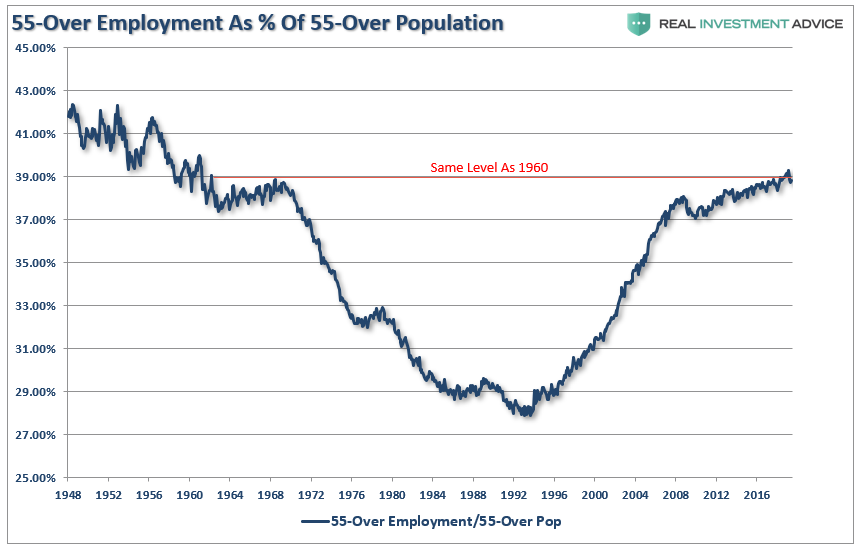
Of course, the reason they aren’t retiring is that they can’t. After two massive bear markets, weak economic growth, questionable spending habits,and poor financial planning, more individuals over the age of 55 are still working because they simply can’t “afford” to retire.
However, for argument sake, let’s assume that every worker over the age of 55 retires. If the “retiring” argument is valid, then employment participation rates should soar once that group is removed. The chart below is full-time employment relative to the working-age population of 16-54.
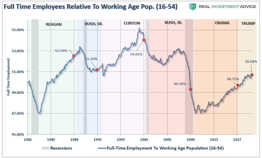
Nope.
The other argument is that Millennials are going to school longer than before so they aren’t working either. (We have an excuse for everything these days.)
The chart below strips out those of college-age (16-24) and those over the age of 55.
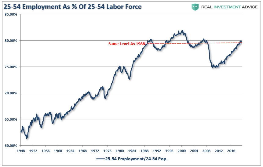
With the prime working-age group of labor force participants still at levels seen previously in 1988, it does raise the question o2f just how robust the labor market actually is?
Michael Lebowitz touched on this issue previously:
“Why are so many people struggling to find a job and terminating their search if, as we are repeatedly told, the labor market is so healthy? To explain the juxtaposition of the low jobless claims number and unemployment rate with the low participation rate and weak wage growth, a calculation of the participation rate adjusted unemployment rate is revealing.”
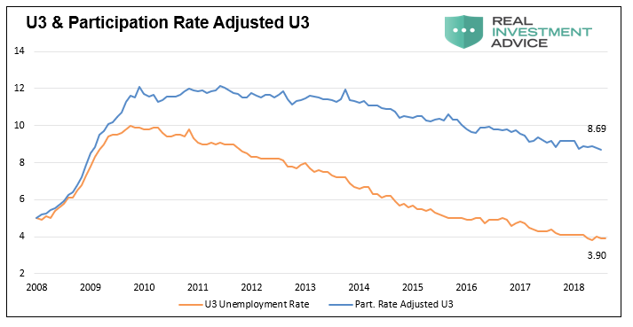
‘When people stop looking for a job, they are still unemployed, but they are not included in the U-3 unemployment calculation. If we include those who quit looking for work in the data, the employment situation is quite different. The graph below compares the U-3 unemployment rate to one that assumes a constant participation rate from 2008 to today. Contrary to the U-3 unemployment rate of 3.90%, this metric implies an adjusted unemployment rate of 8.69%.
Importantly, this number is much more consistent with the data we have laid out above, supports the reasoning behind lower wage growth, and is further confirmed by the Hornstein-Kudlyak-Lange Employment Index.”
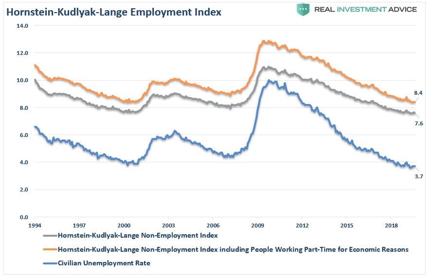
(The Hornstein-Kudlyak-Lange Non-Employment Index including People Working Part-Time for Economic Reasons (NEI+PTER) is a weighted average of all non-employed people and people working part-time for economic reasons expressed as the share of the civilian non-institutionalized population 16 years and older. The weights take into account persistent differences in each group’s likelihood of transitioning back into employment. Because the NEI is more comprehensive and includes tailored weights of non-employed individuals, it arguably provides a more accurate reading of labor market conditions than the standard unemployment rate.)
One of the main factors which was driving the Federal Reserve to raise interest rates, and reduce its balance sheet, was the perceived low level of unemployment. However, now, they are trying to lower rates despite an even lower level of unemployment than previous.
The problem for the Federal Reserve is they are caught between a “stagflationary economy” and a “recession.”
“With record low jobless claims, there is no recession on the horizon.” -says mainstream media.
Be careful with that assumption.
In November of 1969 jobless claims stood at 211,000, having risen slightly from the lows recorded earlier that year. Despite the low number of claims, a recession started a month later, and jobless claims would nearly double within six months.
This episode serves as a reminder that every recession followed interim lows in jobless claims and the unemployment rate. We are confident that the dynamics leading to the next recession will not be any different.
But then again, maybe the yield-curve is already giving us the answer.