I recently sat down with Peak Prosperity’s Chris Martenson to discuss an article I wrote last year on why another 50% correction is possible.
I have attached a link to the original article below the interview along with a the chart and explanation of the RIA Economic Composite Indicator I discuss with Chris.
Notes To Interview:
“During a bull market, prices trade above the long-term moving average. However, when the trend changes to a bear market prices trade below that moving average. This is shown in the chart below which compares the market to the 75-week moving average. During ‘bullish trends’ the market tends to trade above the long-term moving average and below it during ‘bearish trends.’”
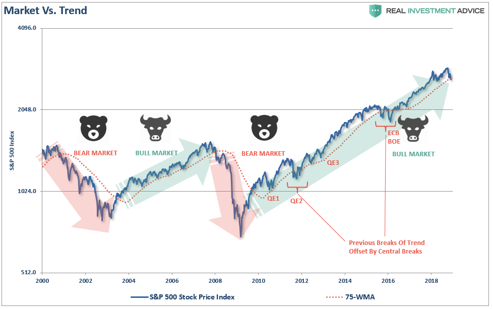
In other words, at least for me, it is the overall TREND of the market which determines a bull or bear market. Currently, that trend is still rising. But such will not always be the case, and we may be in the process of the “trend change” now.
Fed:

In 2008, when the Fed launched into their “accommodative policy” emergency strategy to bail out the financial markets, the Fed’s balance sheet was only about $915 Billion. The Fed Funds rate was at 4.2%.
If the market fell into a recession tomorrow, the Fed would be starting with roughly a $4 Trillion dollar balance sheet with interest rates 2% lower than they were in 2009. In other words, the ability of the Fed to “bail out” the markets today, is much more limited than it was in 2008.
Valuations
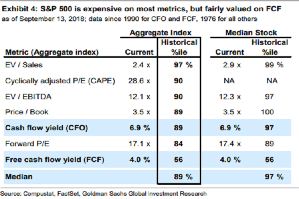
One of the most important issues overhanging the market is simply that of valuations. As Goldman Sachs pointed out recently, the market is pushing the 89% percentile or higher in 6 out of 7 valuation metrics.
So, just how big of a correction would be required to revert valuations back to long-term means? Michael Lebowitz recently did some analysis for RIA PRO:
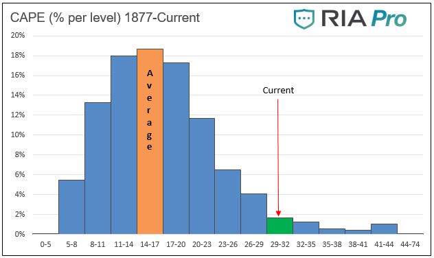
“Since 1877 there are 1654 monthly measurements of Cyclically Adjusted Price -to- Earnings (CAPE 10). Of these 82, only about 5%, have been the same or greater than current CAPE levels (30.5). Other than a few instances over the last two years and two others which occurred in 1929, the rest occurred during the late 1990’s tech boom. The graph below charts the percentage of time the market has traded at various ranges of CAPE levels.”
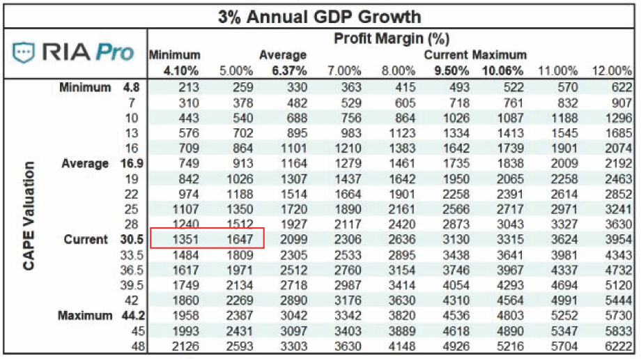
Given that valuations are at 30.5x earnings, and that profit growth tracks closely with economic growth, a reversion in valuations would entail a decline in asset prices from current levels to somewhere between 1350 and 1650 on the S&P (See table below). From the recent market highs, such would entail a 54% to 44% decline respectively. To learn how to use the table below to create your own S&P 500 forecast give RIA Pro a 14-day free trial run.
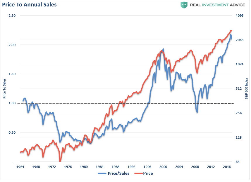
This also corresponds with the currently elevated “Price to Revenue” levels which are currently higher than at any point in previous market history. Given that the longer-term norm for the S&P 500 price/sales ratio is roughly 1.0, a retreat back towards those levels, as was seen in 2000 and 2008, each required a price decline of 50% or more.
Economy
I discuss with Chris our Economic Output Composite Indicator (EOCI):
To see this more clearly we can look at our own RIA Economic Output Composite Index (EOCI) which is an extremely broad indicator of the U.S. economy. It is comprised of:
- Chicago Fed National Activity Index (an index comprised of 85 subcomponents)
- Chicago Purchasing Managers Index
- ISM Composite Index (composite of the manufacturing and non-manufacturing surveys)
- Richmond Fed Manufacturing Survey
- New York (Empire) Manufacturing Survey
- Philadelphia Fed Manufacturing Survey
- Dallas Fed Manufacturing Survey
- Markit Composite Manufacturing Survey
- PMI Composite Survey
- Economic Confidence Survey
- NFIB Small Business Index
- Leading Economic Index (LEI)
All of these surveys (both soft and hard data) are blended into one composite index which, when compared to U.S. economic activity, has provided a good indication of turning points in economic activity. (Read More)
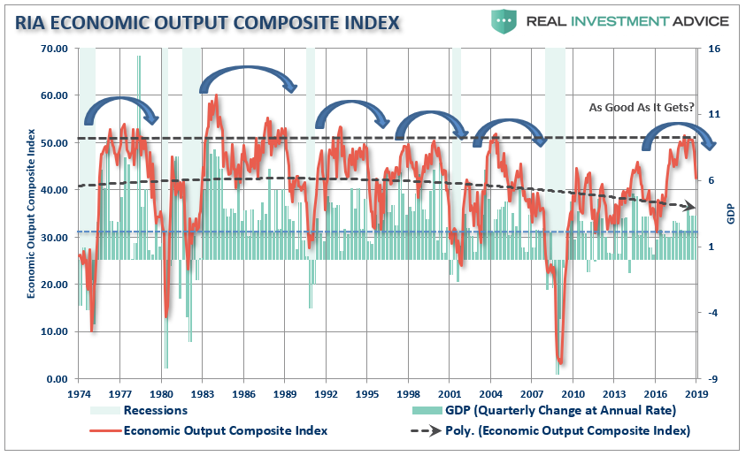
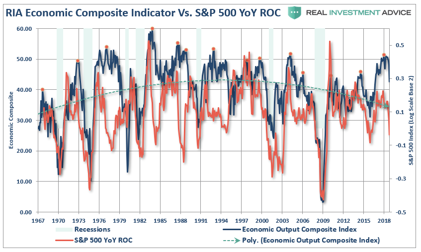
Economic growth is slowing and, as I penned just recently (see article for composite index makeup), the domestic economy has already shown early signs of a more significant slowdown. Given that corporate profits are a function of economic activity, it should not be surprising that the rate of change of the S&P 500 is closely tied to annual changes in the Economic Output Composite Index.
Pension Funds
“An April 2016 Moody’s analysis pegged the total 75-year unfunded liability for all state and local pension plans at $3.5 trillion. That’s the amount not covered by current fund assets, future expected contributions, and investment returns at assumed rates ranging from 3.7% to 4.1%. Another calculation from the American Enterprise Institute comes up with $5.2 trillion, presuming that long-term bond yields average 2.6%.
With employee contribution requirements extremely low, averaging about 15% of payroll, the need to stretch for higher rates of return have put pensions in a precarious position and increases the underfunded status of pensions.”
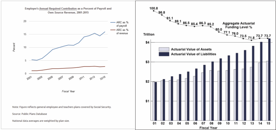
“With pension funds already wrestling with largely underfunded liabilities, the shifting demographics are further complicating funding problems.”
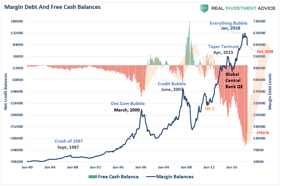
Leverage
“What is immediately recognizable is that reversions of negative ‘free cash’ balances have led to serious implications for the stock market. With negative free cash balances still at historically high levels, a full mean reverting event would coincide with a potentially disastrous decline in asset prices as investors are forced to liquidate holdings to meet ‘margin calls.’”
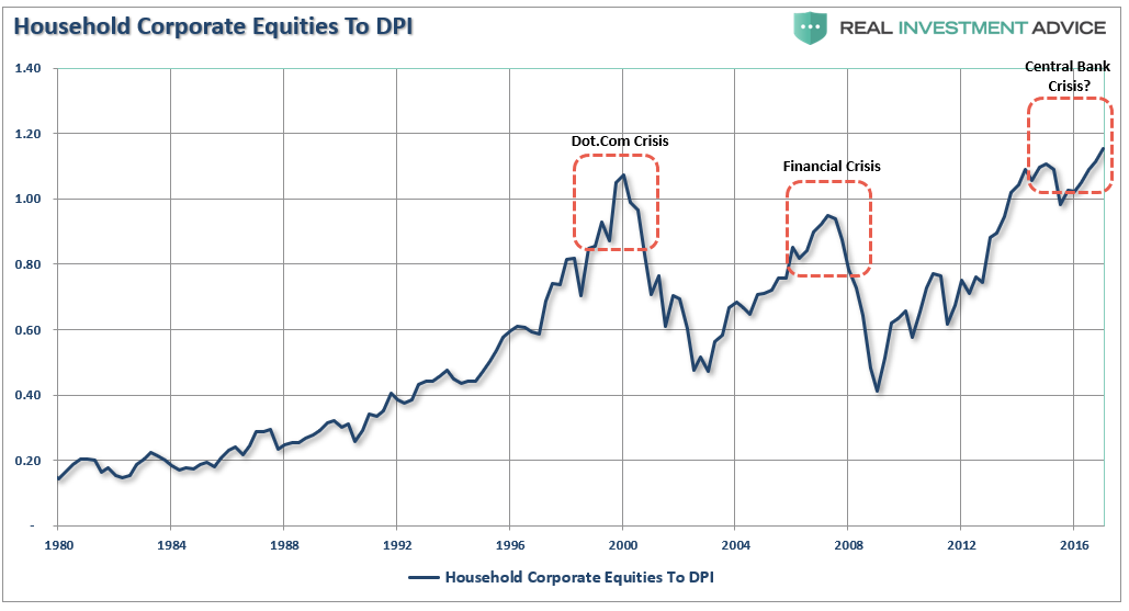
Asset Ownership
Of course, the key ingredient is ownership. High valuations, bullish sentiment, and leverage are completely meaningless if there is no ownership of the underlying equities. The two charts below show both household and corporate levels of equity ownership relative to previous points in history.
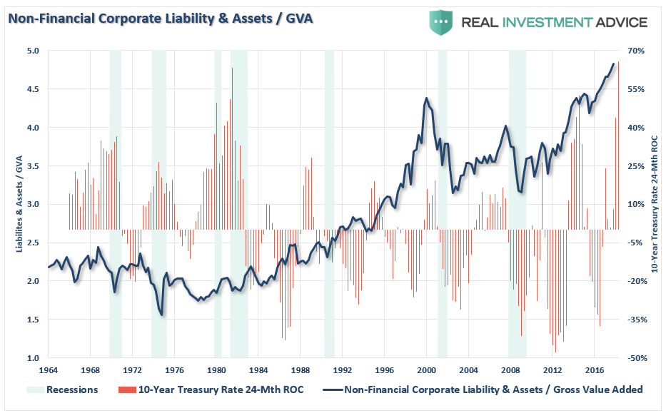
As can be clearly seen, leverage fuels both halves of the full market cycle. On the way up, increases in leverage provide the capital necessary for accelerated share buybacks and increased speculation in the markets. Leverage, like gasoline, is inert until a catalyst is applied. It is the unwinding of that leverage that accelerates the liquidation of assets in the markets causes prices to plunge faster and further than most can possibly imagine.
Momentum
The chart below shows the real price of the S&P 500 index versus its long-term Bollinger-bands, valuations, relative-strength, and its deviation above the 3-year moving average. The red vertical lines show where the peaks in these measures were historically located.
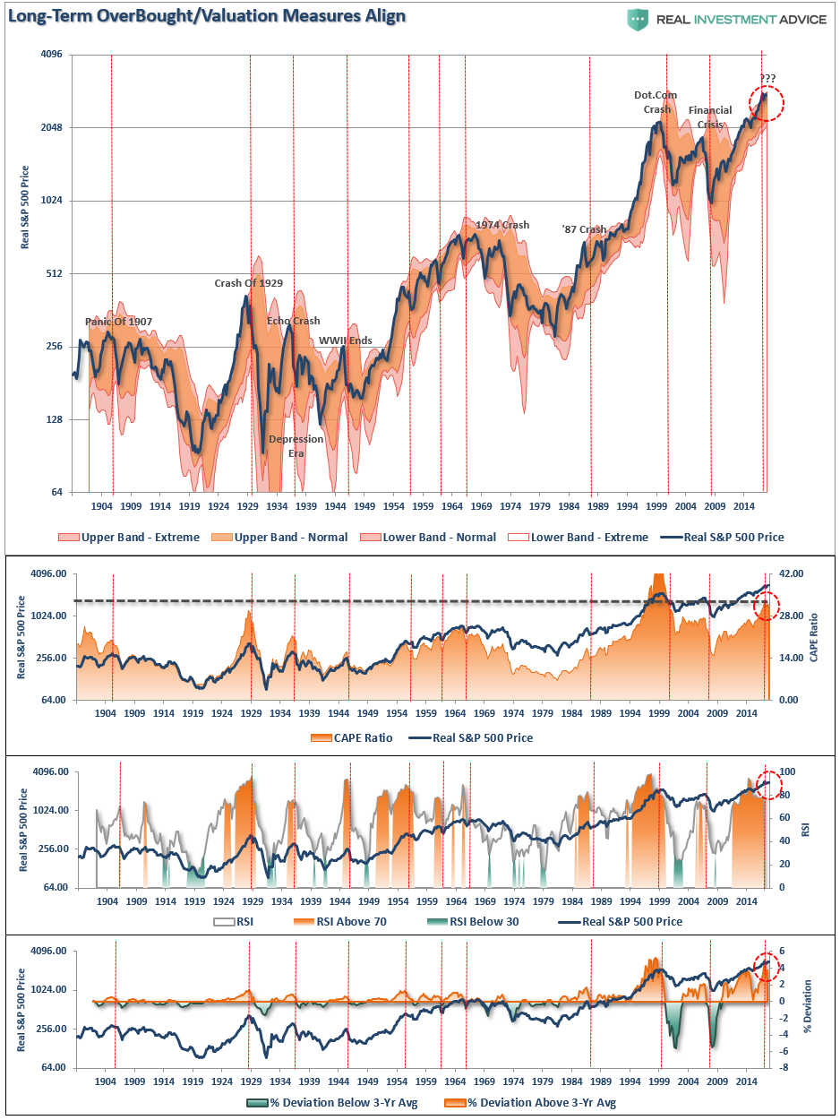
What causes the next correction is always unknown until after the fact. However, there are ample warnings that suggest the current cycle may be closer to its inevitable conclusion than many currently believe. There are many factors that can, and will, contribute to the eventual correction which will “feed” on the unwinding of excessive exuberance, valuations, leverage, and deviations from long-term averages.
The biggest risk to investors currently is the magnitude of the next retracement. As shown below the range of potential reversions runs from 36% to more than 54%.
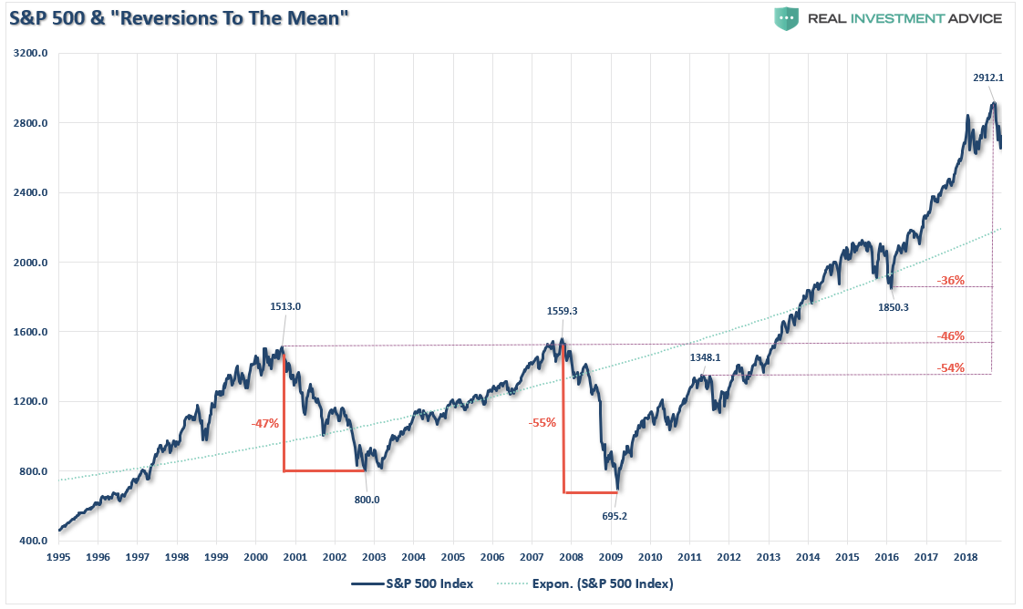
That can’t happen you say?
It’s happened twice before in the last 20 years and with less debt, less leverage, and better funded pension plans.
I leave you with a final thought:
“Stock prices have reached what looks like a permanently high plateau. I do not feel there will be soon if ever a 50 or 60 point break from present levels, such as they have predicted. I expect to see the stock market a good deal higher within a few months.” – Dr. Irving Fisher, Economist at Yale University 1929