Wolf Richter wolfstreet.com, www.amazon.com/author/wolfrichter
On Tuesday at the close of the market, the yield curve sagged further in the middle like a limp noodle, with these characteristics:
- At the short end, the 1-month yield rose to 2.46%, near the top of its recent range, and near the upper end of the Fed’s target range for the federal funds rate (2.5%).
- In the middle, the 3-year and 5-year yields both dipped to 2.18%, respectively the lowest since Jan. 2018 and Dec. 2017
- At the long end, the 10-year yield dipped to 2.41%, lowest since Dec 29, 2017, below the 1-year yield and shorter maturities; but it remained above the sag in the middle, including the 2-year yield, which also dropped.
- At the far end, the 30-year yield dipped to 2.86%, the lowest since Jan 2018, but remained above all the rest.
This produces a beautiful middle-age sag, so to speak, that started forming late last year and has been deepening in recent weeks. The chart below shows the yield curves on six dates. Each line represents the yields on that date, from the 1-month yield on the left to the 30-year yield on the right. The steeply ascending green line represents the yields on December 14, 2016, when the Fed got serious about rate hikes. The deeply sagging red line represents the yields on Tuesday, March 26:

The sag in the middle began last November as a flat spot between the 2-year yield and the 7-year yield. On rate-hike day (December 19, black line), the 3-year yield (2.61%) was already below the 2-year yield (2.63%). In other words, the sag in the middle had formed, and the yield curve was “inverted” in that range, with the longer-term yield being higher than the shorter-term yield. Since then, the sag has gotten deeper.
The yield curve for December 14, 2016, (green line) shows where yield had been when the Fed got serious about hiking its target range for the federal funds rate. The rate hikes pushed up short-term yields without breaking a sweat. Long-term yields however fell at first, with the 10-year yield hitting a historic low in July 2016. But eventually, the 10-year followed partially, but peaked in November last year, and has since meandering lower.
Note how the one-month yield has been continuing its upward creep since the last rate hike in December. And the six-month has been stuck at around 2.5% since early November, which gives it the odd-looking position of a pivot of sorts on the above chart, with shorter yields on its left rising and longer yields on its right falling.
The yield curve today is inverted in this odd way, where the 10-year yield, at 2.41% is lower than the 1-year yield and shorter maturities, but is higher than the yields from two years through seven years, as denoted by the sag in the middle.
There are several classic ways to track the inversion of the yield curve. And depending on which way you look at it, the yield curve is either inverted, or it is not inverted:
The 3-month-10-year spread: Subtract the 3-month yield (2.46%) from the 10-year-yield (2.41%). If the result is negative, the yield curve is inverted. At the close on March 26, the difference is a negative 5 basis points, and thus the curve is inverted.
The 1-year-10-year spread: At the close on March 26, the difference between the 1-year yield (2.44%) and the 10-year-yield (2.41%) is a negative 3 basis points, and thus the curve is inverted.
The 2-year-10-year spread: The difference between the 2-year yield (2.24%) and the 10-year yield (2.41%) is a positive 17 basis points, about where it had been late last year. And by this measure, the yield curve is not inverted. Historically, the 2-year yield inverts well before the 3-month yield. But not this time.
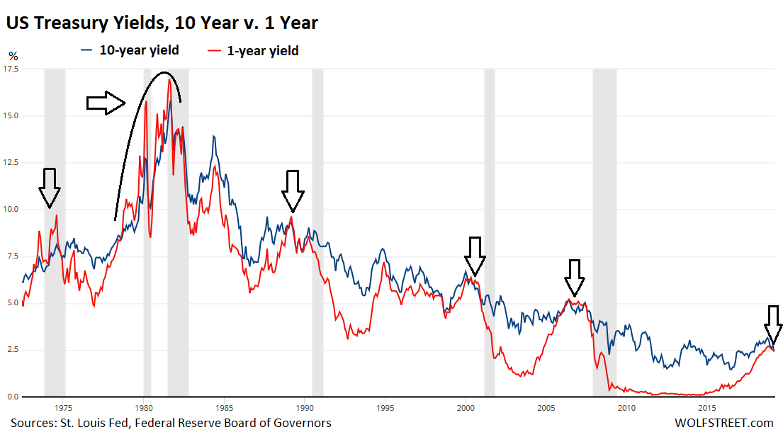
In recent decades, recessions have followed the 1-year-10-year yield curve inversion with a lag of about 12-18 months. This chart shows the 1-year yield (red) and the 10-year yield (blue). The inversions occurred where the red line is above the blue line. Note the lag to the subsequent recessions (gray columns). Click on the chart to enlarge it:
The fact that the 2-year-10-year is not
The weirdness could be resolved by three rough days of trading that might rearrange all the yield-curve spaghetti in a different manner, inverte it across the board, or un-invert it altogether.
Now everyone is trying to figure out what this weirdness means. In the US, the next recession – whenever it may eventually occur – will be the first recession when the Fed’s balance sheet is still swollen with assets, and when its policy rates are still low.
And when this recession occurs, it would do so despite enormous federal government deficits that act as stimulus. With $1 trillion a year of this type of stimulus deficit-spending, which amounts to 5% of GDP, it’s hard for a recession to even occur – unless it’s triggered by a crisis of some sort. Part of the reason why the yield curve is sagging so beautifully in the middle and is not inverted from the 3-year yield on up may be due to all these unprecedented elements coming together, that may make the next recession, when it finally occurs, a different and surprising animal altogether. It seems that’s the message this sag in the middle is sending out.