via upfina:
The US economy continues to outperform the rest of the world despite the fear of trade wars and with weakness in emerging markets and Europe. The chart below, using Haver Analytics data, gives an example of the stupendous U.S. growth.
Source: Haver Analytics
The current vertical increase is rivaling the improvement from 2010 to 2013 as there has been a boom in investment due to the tax cuts and a rebound after the 2015-2016 weakness. Capex investments spur a virtuous cycle of business activity and lending. The tax cuts didn’t just benefit businesses; they spurred private sector investment which has been needed in this cycle as productivity growth has been weak. Private fixed non-residential investment looks just like this chart of capex as growth was negative from Q1 to Q3 2016 and was 8.4% as of Q1 2018. Productivity growth remains low at 1.3% as of Q1 2018.
An Old Expansion?
There’s a key distinction between forecasting economic cycles based on rate of change series’ and purely based on the notion that the expansion has been long. When a series is strong or weak, it’s natural to check the rate of change to get an idea of when the cycle might turn. Just deciding that the cycle has been too long doesn’t cut it in terms of forecasting. You can do specific analysis on the exact percentage chance a recession will occur after an expansion reaches each number of years. However, it still isn’t rigorous analysis that will give you an investment edge. There is no such thing as ‘due for a change’ unless a catalyst is present. For example, Venezuela isn’t going to have a rebound just because it languishes for a certain length of time. In the case of Venezuela, changes which embrace free market capitalism are necessary for the country to see improvement. This point is pertinent in the current situation because investors have been looking for a bear market recession for a while just because one hasn’t occurred in about 9 years. There will always be a mindset ingrained in investors’ that there needs to be an end to this long expansion. This causes them to be too bearish. You can always point to previous long cycles in other countries, but the best way to rid yourself of this bias is to recognize the 2015-2016 weakness was a bear market recession.
The terminology is semantics because claiming the only way a bear market occurs is if the S&P 500 falls 20% is very specific. It’s great to have a consistent term with a defined meaning because it can’t be manipulated. However, it is causing investors to lose sight of how weak 2015-2016 was. If you understand the weakness and change your mind from thinking the stock market is on a 2 year run instead of a 9 year run, you can allow yourself to be bullish if the facts such as private domestic fixed investment and capex spending growth support this narrative.
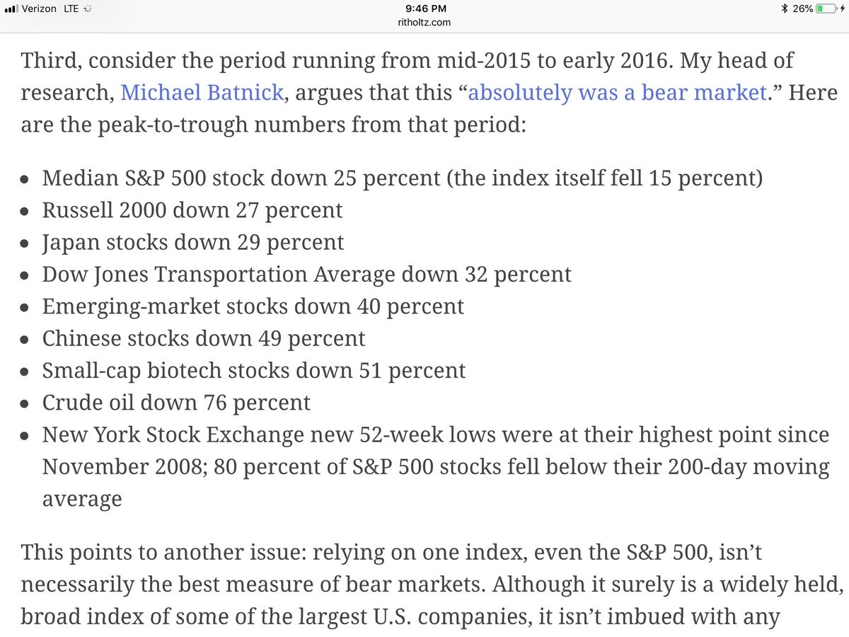
The list above gives credence to the argument that this isn’t a 9 year expansion. As you can see, the median stock fell 25% from mid-2015 to early-2016. The Russell 2000 fell 27% and emerging markets fell 40%. Japanese stocks fell 29%, Chinese stocks fell 49%, and oil fell 76%. When you see such declines, it makes you second guess the idea of checking only the S&P 500 to determine if it fell 20% to qualify it as a bear market – that is too simplistic.
The argument that stocks fell into a bear market could suggest that the bull market is still just beginning. Adding in the point that the cycle fell into a mini-recession from 2015-2016 means there might not be risk that the economy falls into another recession in the next few quarters. The 6 charts below gave a complete argument as to why the economy fell into a recession.
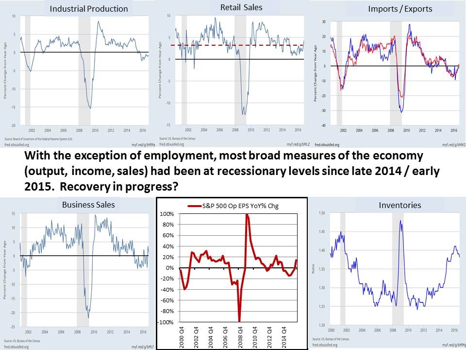
Source: FRED
It was a recession without the label since there weren’t two straight quarters of negative GDP growth. This mini-recession was sharper than a normal mid-cycle slowdown, but shallower than the 2001 recession, which was relatively weak compared with 2008. It’s important to point out that the 2008 recession was a once in a lifetime event in terms of its severity, as we have pinpointed previously. Anticipating and more importantly betting financially for another such devastating recession to happen, immediately following the 2008 financial crisis, from a probability standpoint, is impractical. During the 2015-2016 period, industrial production fell, imports/exports fell, business sales fell, and operating S&P 500 EPS fell. Retail sales didn’t go negative, but they only grew in the low single digits. Also, inventories increased. During this weak economic period many investors expected a recession in 2016, awaiting for 2 negative GDP quarters, but few expected an economy that’s very weak to narrowly avoid a recession. The manufacturing cycle turning positively helped bring economic growth back in 2017.
Yield Curve: Battle Of The Stats
The yield curve matters to stocks, but there is a short delay between when it occurs and when the economy and stocks falter. Therefore, some are focusing on the argument that an inversion doesn’t matter because stocks have rallied after it happens. Bullish investors are ready to pick up pennies in front of a steamroller. In the past five cycles, it took an average of 21.3 months from inversion to a recession. This provided average gains of 12.7%. Specifically, the 2 year 10 year bond curve inverted in December 1988, May 1998, and January 2006. These inversions led to stock market peaks 19, 22, and 21 months later with gains of 33.2%, 39.6%, and 22.3%.
However, it’s not smooth sailing as the inversion leads to a bear market after those peaks. It’s also worth pointing out that you can’t expect to garner all the gains up until the peak because it’s almost impossible to time the market perfectly. The chart below shows the stock market’s performance subtracted by bond returns starting from an inversion and a normal curve.
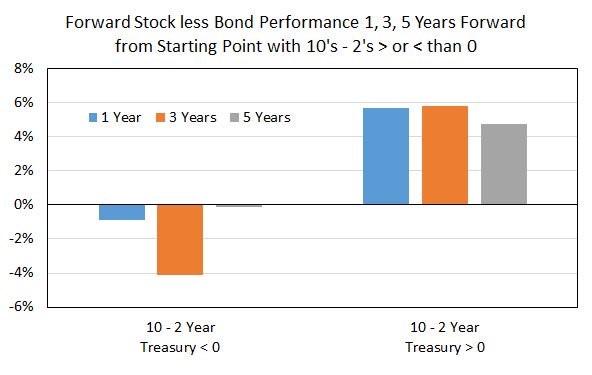
Source: Twitter @EconomPic
When the curve is inverted, there is a sharp 4% annualized loss in the following 3 years. That’s about 10% less returns per year than if the curve is normal.
The chart below shows the real next month annualized returns from 1976 to 2017 when the curve is normal, inverted, and in every circumstance.
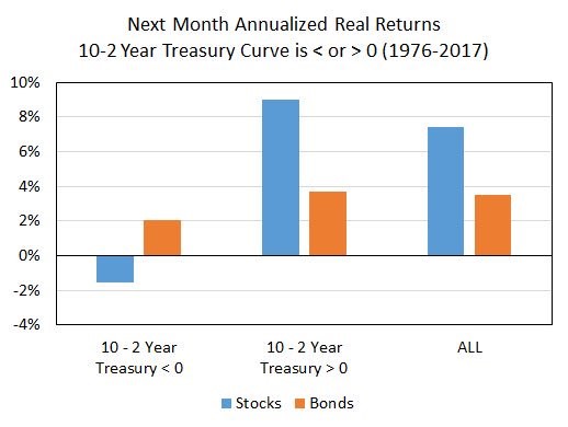
Source: Twitter @EconomPic
Stock returns are negative when the curve is inverted and sharply positive when the curve is normal. Don’t get too excited about the idea that the recovery has only lasted 2 years because the 10 year minus 2 year yield spread is only 30 basis points which means an inversion can occur by the end of this year.