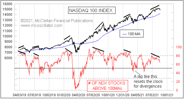
There have been “breadth divergences” galore piling up recently, and there are lots of ways to measure or depict that. Among these is the indicator shown in this week’s chart, which measures the number of stocks in the Nasdaq 100 Index (NDX) which are above their own 100-day moving averages.
In the energetic part of a new uptrend, it is normal to see this measure jump up to a really high level. Then as the uptrend ages, the component stocks start getting tired before the final index price top, which shows up as a bearish divergence. We have such a divergence now, and the action in stock prices following the Aug. 16 price top says that it is finally starting to matter.
A bearish divergence is a useful condition to recognize, but chartists should remember that a divergence is a “condition”, and not a “signal”. Divergences can persist for a long time before they finally matter, and they won’t tell you the moment when they are going to start mattering. For that you need to turn to other tools.
Apparent divergences can also sometimes be “rehabilitated”. If this indicator were able to surge up to a higher high, then there is no divergence, and no bearish message. That is possible. It is unlikely, but possible. So any bearish divergence is only a temporary message, and subject to revision.
The indicator in this week’s chart uses 100-day moving averages for each of the NDX stocks. When I first constructed it, I initially used 200MAs, thinking that such a lookback period would be ideal. I was not greatly satisfied with the result, and so I set about tinkering with the lookback period. I tried lots of values, and eventually found that 100 trading days seemed to work better than the others I tried. This was highly subjective, and I did not attempt to mathematically optimize it. 100 days just seemed to be better back then, and still provides for a good indicator now.
This is a longstanding phenomenon. Here is a look back at the 2000 top:
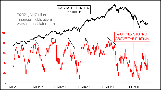
Notice that when the final March 2000 top came for the Nasdaq 100, there was a pretty monstrous divergence between prices and this indicator. At the price top, fewer and fewer NDX stocks were still above their own 100MAs. We saw similar bearish divergences at other meaningful tops back in the 1990s.
Remember, though, that all of those were “potential” divergences until they were proven to be meaningful by subsequent action.
It is reasonable to examine each of these example divergences, and note that the bigger and hairier ones tended to result in more significant declines. The 2000 divergence is a great example, and so was the one in 1998, when global currency crises eventually came around to bite the US stock market in August 1998. The current divergence now in 2021 is a gentler one, so perhaps not foretelling great calamity this time, but still saying that the energy of the advance has been waning, and setting up for a decline of some kind.
I report the value of this indicator every day in my Daily Edition, for those who wish to track it on an ongoing basis.
Tom McClellan
Editor, The McClellan Market Report