Summary
- This week the themes are “mixed signals” and “indecision”.
- The mixed signals include some very compelling bullish signs, yet also some concerningly bearish signs.
- It makes for an internally consistent situation of indecision, and means those sensitive to short-term moves will need to shorten-up time frames and tighten-up risk management.
- This idea was discussed in more depth with members of my private investing community, Weekly Best Idea.
Those that follow my personal account on Twitter will be familiar with my weekly S&P 500 (SPY) #ChartStorm in which I pick out 10 charts on the S&P 500 to tweet. Typically, I’ll pick a couple of themes and hammer them home with the charts, but sometimes it’s just a selection of charts that will add to your perspective and help inform your own view – whether it’s bearish, bullish, or something else!
The purpose of this note is to add some extra context beyond the 140 characters of Twitter. It’s worth noting that the aim of the #ChartStorm isn’t necessarily to arrive at a certain view but to highlight charts and themes worth paying attention to.
So here’s the another S&P 500 #ChartStorm write-up!
1. Lending Standards vs. the S&P 500: First up is an old favorite of mine, it uses the Fed’s Senior Loan Officer Opinion Survey – specifically, the net change in lending standards for commercial and industrial loans to large and medium firms. The line is shown inverted, so basically when lending standards tighten, it points to downside risk for the market (because this both reflects weaker conditions and can lead to a credit crunch). But at the moment, this indicator is giving the green light for stocks. Definitely one to keep on top of as the cycle progresses.
Bottom line: Loan officers are giving a green light for stocks.

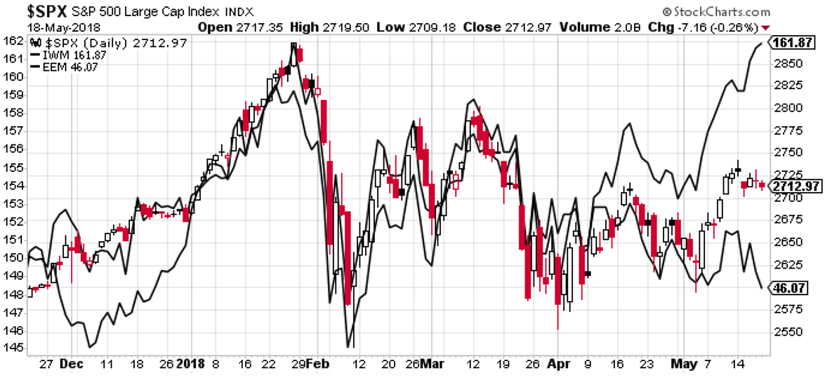
2. The line in the sand: Back on to the chart with the key lines – this has been a running feature the last few weeks as the 200-day moving average and the downward sloping trendline set the parameters for what looks like an increasingly indecisive market. So far, we have seen an upside breakout of the downtrend line, but at this point it doesn’t look overly convincing.
Bottom line: The market has tapered off after the upside breakout.

3. Small Caps vs. Emerging Markets: A similar chart to this one was featured last week too. It shows the S&P 500 against small cap ETF (NYSEARCA:IWM) and emerging market equities ETF (NYSEARCA:EEM), basically these are two different macro stories that are playing out in the background. The stronger dollar is positive for US small caps, and is putting EM under pressure. With the S&P 500 obtaining over a 3rd of its income offshore, the strong US dollar story is well worth paying attention to as it logically creates winners and losers. Keep this one on the front of mind.
Bottom line: Small caps point to upside, EM equities point to downside.
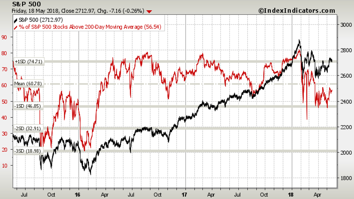
4. 200-day Moving Average Breadth: Back on the topic of 200-day moving averages, as the chart below shows, while the S&P 500 index itself is above its own 200-day moving average, there’s still just under half of companies trading below. As implied with the previous chart, the market breadth picture shows that under the surface things are actually less than clear cut.
Bottom line: Market breadth shows a lack of consistent strength, echoing the theme of indecisiveness.
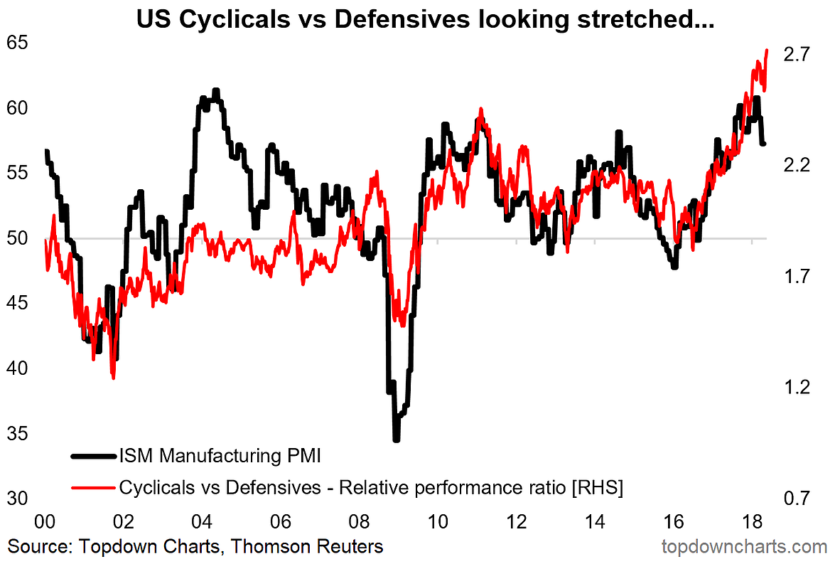
5. US Cyclicals vs. Defensives: This is something I’ve been talking about for a while – the astonishing outperformance seen in US cyclicals vs. defensives. Overall, the relative performance line looks stretched. Perhaps more interestingly though is the apparent divergence opening up between the softening ISM manufacturing PMI and cyclicals vs. defensives relative performance. It may just be a case of the ISM reverting from overly enthusiastic readings (as the Markit PMI actually is moving upwards towards the falling ISM PMI). Anyway, I still see this as a potential vulnerability for the market… for now it basically confirms/represents the strong cyclical undertones that have been playing out over the past year, but it’s certainly another issue to stay on top of.
Bottom line: US cyclicals vs. defensives relative performance looks stretched.
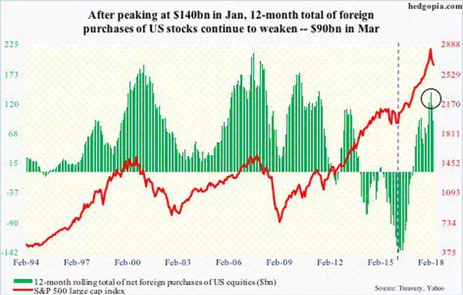
6. Foreign Buying of US Stocks: Interesting chart here from hedgopia, it shows the rolling 12-month sum of foreign net-purchases of US stocks. The key point is that it peaked in January along with the market. Interesting to note how this indicator surged in the last phases of the bull market in 2017. I wonder whether a strengthening dollar might actually encourage more foreign inflows (as then they would also get a kick to returns from a strengthening US dollar relative to their home currency). Meantime, it looks like this tailwind is turning.
Bottom line: Foreign purchases of US stocks peaked in January.
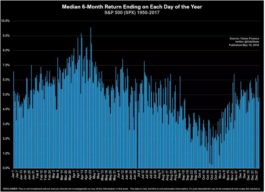
7. Median 6-Month Return by Calendar Day: Here’s some odd stats from the Twitter account known as @OddStats. The chart shows the median 6-month return ending on each calendar day of the year over the period 1950 to 2017. Looks like the best time to buy historically was around September-October, and the best time to sell (or realize those 6-month gains) was around April.
Bottom line: Tracking the 6-month median historical return by day provides another view on seasonality.
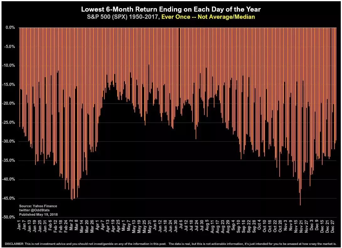
8. Worst 6-month Return by Calendar Day: Again, the same analysis, but this time looking at the lowest/worst 6-month return by calendar day. There’s a similar clustering effect going on here with the worst returns clustering around February-March and October-November. I suppose you could also say that in the months April-July there was historically less incidence of catastrophic market collapses. Something to think about… less chance of a big crash around this time of the year (although I would note that the worst 6-month returns were still around -20%).
Bottom line: There is a similar clustering effect for the worst 6-month returns by calendar day.
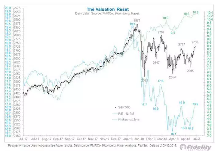
9. Forward PE Valuation Reset: While we certainly did get a selloff/stock market correction, you could argue that there has been a much deeper “stealth correction” in valuations. This chart from Jurrien Timmer of Fidelity Investments shows the S&P 500 (where price has basically gone sideways), next 12 months’ earnings (which have been steadily trending upwards), and the forward PE ratio which has dropped from about nineteen and a half to 17x, and from top to bottom fell close to -20% vs. just over 10% for the S&P 500 index. If price continues to range trade and remain locked in this zone of indecision and you get earnings just continuing on that upward path, it will only improve the valuation picture further. So maybe there is a benefit to all this humming and hawing after all.
Bottom line: S&P 500 valuations are improving as price goes sideways and earnings go up.
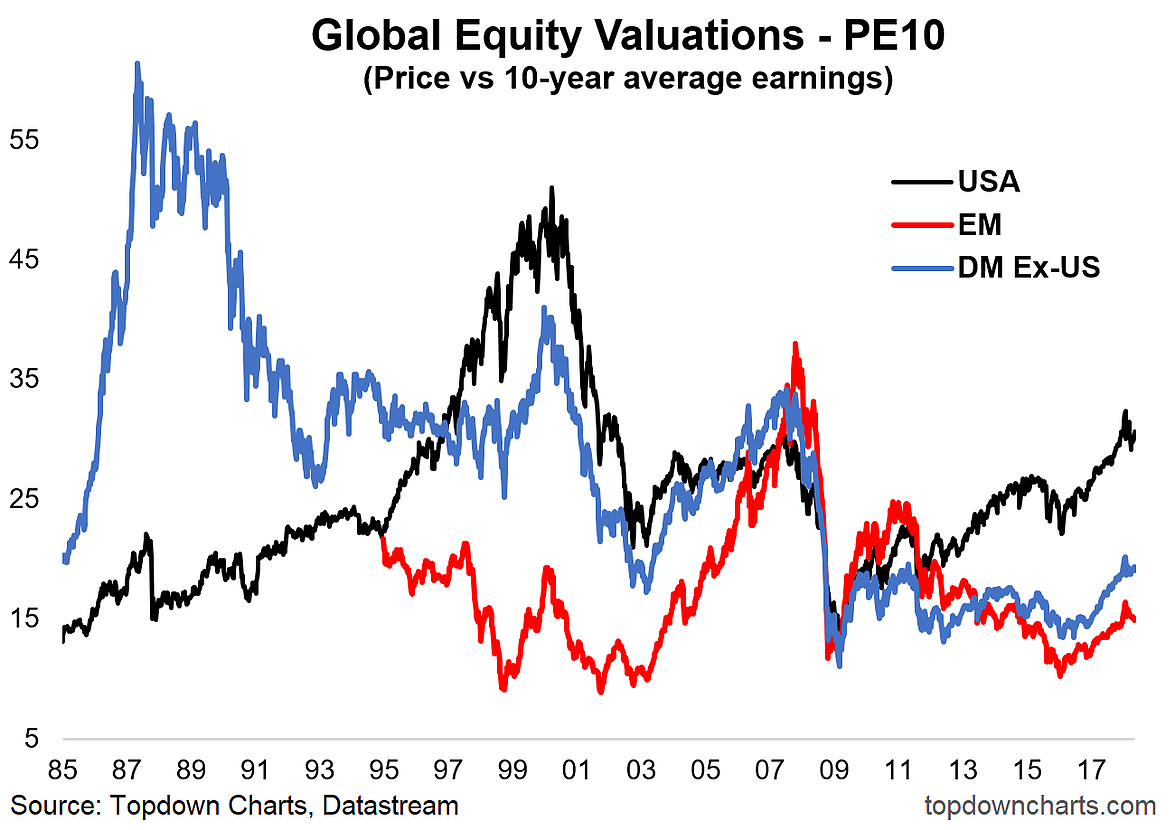
10. PE10 Valuations Picture: Last one focuses on the PE10 – which in contrast to the previous chart which uses price divided by consensus forward earnings, uses price divided by the average earnings of the previous 10 years. The point of using trailing average 10-year earnings is to smooth out the distorting effect of gyrations in earnings caused by the business cycle. The key point for this one is that on all counts across the major global equity markets, the global stock market correction drove a slight but noticeable reset in valuations. But while some things change, others remain the same. The US PE10 remains relatively lofty vs. history, and the relative value case still substantially favors global ex-US equities, with EM in particular still the cheapest. So the open question is, yes, we have seen a reset in valuations, but is it enough of a reset in valuations?
Bottom line: After a slight reset, the US PE10 is still quite high vs. history and global equities.
So where does all this leave us?
This week there’s probably 2 main categories of charts or themes.
1. Mixed Signals
On mixed signals, to the positive side was the still lax lending standards, the solid performance in small caps, the upside breakout, and reset in forward PE valuations… while on the negative side was the peak in foreign buying, the softness in EM equities, the stretched situation in cyclicals vs. defensives (and bearish divergence of the ISM), and still relatively high PE10 valuations.
2. Indecisive Markets
On indecision was the less than convincing breakout through the short-term downtrend line, the generally tight range that the market has been trading in, and the middling market breadth picture.
Summary
This week the themes were mixed signals and indecisive markets. Indeed, in many ways, at first glance it seems confusing, yet also is basically internally consistent and rational. What I mean is, that it’s quite realistic and logical to see such indecision in the market given the abundance of mixed signals. Usually you get indecision when there is conflicting evidence… if it was all one way then the collective decision would be easy. So investors are left to either take one of two approaches: stay focused on the long term and tune out the noise, or shorten-up time frame, tighten up risk management, and pay close attention to the indicators for a more compelling lead either way.