Authored by David Stockman via Contra Corner blog,
According to the mainstream narrative, we were all born yesterday. There is no such thing as context, history or critical analysis – just cherry-picked short-term data-deltas, which are held to be either awesome or at least much improved from last time.

That’s why we predictably got this headline from the Wall Street Journal with reference to today’s June employment release, which allegedly showed “employers added 850,000 jobs last month”: Stocks Tick Higher With Strong Jobs Report
Well, no, it wasn’t and they (employers) didn’t.
In fact, total hours worked in June actually declined from the May level, and, far more importantly, were still down 4.4% from the pre-Covid peak in February 2020.
When expressed in total hours, there is absolutely nothing “strong” at all about the numbers. To wit, at the end of Q2 2021 total hours employed in the nonfarm economy were still down 8 billion hours from the Q4 2019 level.
That’s right. Eight billion worker hours are MIA, yet the lazy shills at the WSJ, Bloomberg, Reuters et. al. keep pumping out bilge about an awesome economic rebound!
Actually, what has never been noted notwithstanding the fact that it sits there in plain sight on the BLS website is that Dr. Fauci and his economy wreckers dug a far deeper hole in the main street labor market last spring than the narrative led you to believe. At the pre-Covid peak in Q4 2019, the nonfarm economy utilized 257.2 billion labor hours at an annualized rate, but that plunged by nearly -12% to just 227.6 billion hours in Q2 2020.
So doing, Fauci & Co wiped out all of the aggregate nonfarm labor hours gain since Q4 2011. That is to say, it obliterated the awesome gains that had been contained in 102 monthly Jobs Friday reports in the interim. And now, after $4 trillion of freshly printed fiat cash and $6 trillion of stimmies and other bailouts and free stuff only 73% of the state-imposed shrinkage of hours worked has been recovered as of June 2021.
Indeed, the not-at-all awesome June jobs report was even more squirrely than usual. Our memory may fail, but we are quite sure that back in the day, June was the time when school let out. The city kids all got to got to go to the beach, and we farm kids got to pick the berries, cherries, sweetcorn, cucumbers, peaches and tomatoes, as they took their turn in rotation.
Perhaps, no longer. The BLS claims that state, local and private educational institutions went on a hiring binge during June, bringing on a total of 269,000 new teachers to superintend presumably empty classrooms!
Moreover, when you add in the 192,000 bartenders and waiters who were rehired in June, that adds up to 461,000 jobs or 54% of the ballyhooed 850,000 gain during the month.
Meanwhile, when it comes to the high pay, high productivity jobs in construction, manufacturing, mining and energy, not so much. Those sectors accounted for 23.338 million jobs in May and reported an increase of, well, 20k jobs in June. That’s a 0.0008 gain, if you have your HP 12c set to four decimal places.
More importantly, the 20.358 million goods producing jobs reported for June were still down by 780,000 from the pre-Covid peak in February 2020; and, on the more appropriate and accurate hour-based measurement, employment in the goodsproducing sector truly remains mired in the dumps.
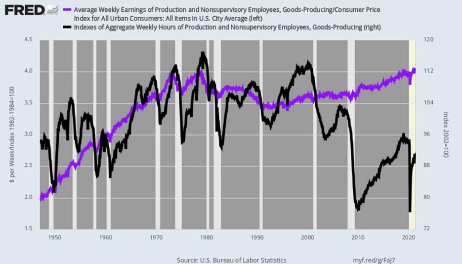
Thus, the index of aggregate hours worked for June (black line) was down by -6.4% from its 2019 interim high, and off by -21.1% from its turn of the century level, -23.1% from its all-time peak in March 1979 and down by -4.8% from the level first attained in, well, May 1947!
You can’t make this up. Employment in the goods-producing sector of the US economy has been dying on the vine for a half century. And even as these jobs paid a living wage of $56,000 per annum in the month of June, the purchasing power of those paychecks was no higher than January 1979 on an inflation-adjusted basis (purple line).
In summary, after real wages in the goods-producing sector doubled between 1947 and 1979, what has followed is one-half century of real wage stagnation, coupled with a 23% shrinkage of hours worked. That alone should ixnay the “strong” and “blow out” descriptions that have been used hundreds of times in the interim to describe the Jobs Friday reports.
Real Weekly Earnings Versus Aggregate Weekly Hours, Good-Producing Sector, 1947-2021
Then again, there is truly no mystery as to where the Fed’s endless injections of fiat credit have come out in the wash. For three decades, the nation’s central bank has been primarily inflating financial asset prices on Wall Street, not jobs, incomes and prosperity on main street. And that’s especially been the case since the pre-crisis peak in Q4 2007, when today’s $8.1 trillion Fed balance sheet stood at just $800 billion.
For want of doubt, you only need to ponder the message of the chart below in order to ascertain what an 8X increase in the Fed’s balance sheet has actually generated. Since Q4 2007, cumulative gains have been as follows:
- Nonfarm Labor Hours (red line): +4.3%;
- Nonfarm Output (black line): +24.8%;
- Nominal GDP (blue line): +50%;
- NASDAQ 100 (purple line): +600%
Q.E.D.
Do these knuckleheads have the slightest idea that this is their true handiwork?
Really, is there any more proof needed that all of their lunatic money-pumping never actually leaves the canyons of Wall Street?
Cumulative Gains Since Q4 2007: Stocks Versus Main Street

So we perforce return to the central topic. Namely, that the Fed’s MOAAR inflation mantra is one of the most perversely idiotic and inequitable public policies ever imposed by an arm of the state.
In fact, hitting the “averaged over time” 2.00% inflation goal remains the only reason for the Fed’s $120 billion per month of what amounts to financial fraud. After all, with employers from coast-to-coast scrambling to find workers, continued money-pumping is surely not needed to further the so-called “full-employment” goal. For crying out loud, private employers are already on it.
Then again, would it be too much trouble for these power-intoxicated, groupthinkinebriated dolts to examine exactly what their pro-inflation policies have actually produced? And we mean over an extensive period of time where the cumulative impact can be clearly observed?
Well, here’s an inflation-targeting stopper if there ever was one. During the approximate half century since real hourly rates peaked in 1972, the average American worker has been on the mother-of-all-treadmills:
Change From 1972 Through 2020:
- Nominal hourly wages: +533%;
- Real hourly earnings: +2.2%
It doesn’t get any more dramatic than that. Even the proverbial squirrel in the cage would have gotten the bends after that 50-year journey to nowhere.
50-Year Trend: Nominal Versus Inflation-Adjusted Hourly Earnings
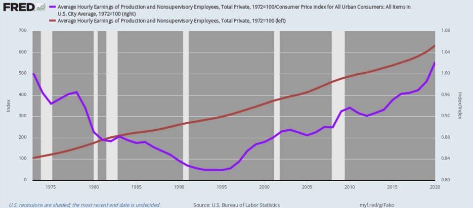
As is evident in the chart above, the Fed made a cataclysmic mistake in the 1990s and thereafter. Due to the high inflation of the 1970s and to a lesser extent through the 1980s, nominal hourly wage had tripled between 1972 and 1995, when Mr. Deng’s shiny new export factories were cranking up with ultra-cheap labor drained out of China’s endless rice paddies and peasant villages.
And, thank you, all that 200% gain in nominal wages had not done domestic workers one damn bit of good. In 1995, real hourly wages (purple line) were actually 18% below the level that had obtained in 1972, when Fed Chairman Arthur Burns, to his everlasting shame, grabbed his ankles upon Nixon’s presentation of what amounted to an election year bar of soap.
Nixon got his temporarily booming economy and landslide election victory, of course, but that had also set up the hard hats, Nixon labor Dems and forgotten middle class like sitting ducks vis a vis the new Chinese (and Mexican et. al.) export factories. By the mid1990s the dollar wage gap was now enormous—so what was needed was deflation of domestic prices, wages and costs, not more of the same.
As it happened, under Greenspan’s phony “disinflation” policies and then Bernanke’s formal inflation-targeting regime thereafter, the domestic price level was inflated by another 70% or 2.14% per annum between 1995 and 2020. What that meant was fully two-thirds of the gain in average hourly wages during that period was eaten-up by domestic inflation when the order of the day should have been wringing out some of the staggering 240% increase in the domestic price level that had occurred between 1972 and 1995.
Yes, inflation-adjusted hourly wage rates (purple line above) did manage to crawl back to their 1972 starting point by 2020, but at the expense of another doubling of nominal wage rates. That is to say, the Fed’s idiotic pro-inflation policies drove the wage gap between domestic factories and the new low wage export economies dramatically wider. In all, average dollar wages in the US were 533% higher by 2020 than they had been when Nixon destroyed the gold-backed dollar in 1971-1972.
Needless to say, when the average domestic wage rate went from $3.90 per hour in 1972 to $24.68 per hour in 2020 at absolutely no purchasing power benefit to workers, it left corporate executives with no choice except to outsource and off-shore to the maximum feasible extent. And that set in motion the hollowing out of America’s industrial economy.
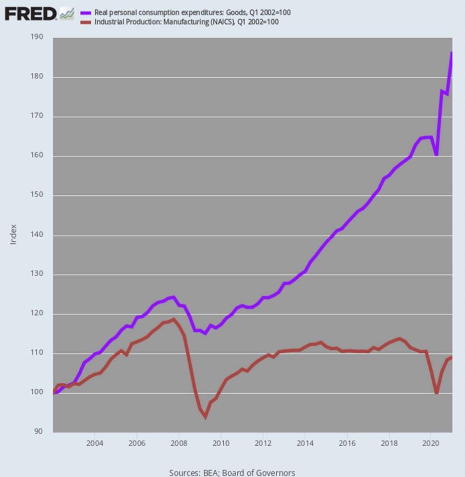
The chart below is surely the smoking gun implicit in the Fed’s Faustian bargain. That is, it got its fetishistic 2.00% inflation and showered the household sector with cheap debt to augment living standards that would have otherwise diminished owing to the export of good jobs.
As a result, real consumption spending (PCE) for goods rose by 87% or 3.0% per annum between Q1 2002 and Q1 2021. Yet during the same 19 year period, the industrial production index for manufacturing rose by only 9% or barely 0.41% per year.
Needless to say, we are not talking here about some marginal item that is better produced abroad where some venue has comparative advantage as Adam Smith originally saw it. To the contrary, this is the entire goods economy and for all practical purposes the growth in consumption of goods during this century to date has been supplied by imports.
It is no wonder, therefore, that the burned out zones of the rust belt voted for “high tariff man” Trump. Twice.
Real PCE For Durables Versus Manufactured Goods Output, Q1 2002-Q1
2021 In throwing good-producing workers under the China/import bus, the powers that be urged them to make up the difference by buying stock. Wall Street had plenty of rapidly inflating shares on offer, and the Donald could not stop telling workers to check their 401ks.
But here’s the thing. To ride the drastically inflated stock market higher, you had to have material savings to invest, and growing wages to allocate to investment rather than current consumption.
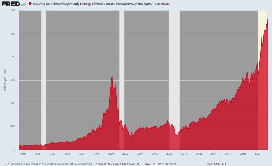
Alas, American workers had neither. When Greenspan was nominated to head the Fed in July 1987, the average wage was $9.12 per hour and the NASDAQ 100 index stood at 196. That is, it took about 22 hours of work to buy the index.
At the close of June 2021, the average hourly wage– as we learned this AM—was $25.68 per hour, while the NASDAQ 100 had taken flight to another financial planet, posting at 14,554. That is, it now took 566 hours of work to buy the index or 26X more than when Greenspan inaugurated wealth effects monetary policy.
To paraphrase a famous black panther slogan of the 1960s, trickle-down might have been televised on CNBC, but it most definitely did not happen.
Number Of Worker Hours to buy the NASDAQ-100, 1987-2021
What happened, of course, is them’s that had, got.
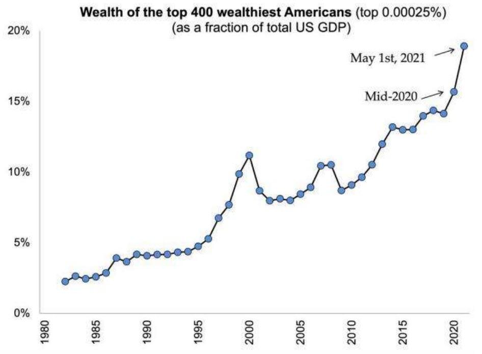
Our friend Tim Knight, who publishes at the must read Slope of Hope, captured the moral of this story about as well as can be said, while his accompanying chart truly does tell you all you need to know.
Well, if you weren’t born yesterday.
The economy, the capital markets, and wealth distribution have become more grotesquely-distorted, perverted, and warped than at any other time in human history. I have written about this endlessly and prefer to simply point you to this page where I’ve stacked up countless charts to make the point about the maldistribution of wealth.