Wolf Richter wolfstreet.com, http://www.amazon.com/author/wolfrichter
How do they stack up against the most splendid housing bubble in America? Holy cow!
Canadian housing markets are in a category of their own. No housing market in the US – no matter how crazy Housing Bubble 1 was, which began to implode in 2006, or how crazy Housing Bubble 2 is or was – can hold a candle to the most splendid housing bubbles in Canada. Instead of a Financial Crisis and a mortgage crisis and Housing Bust 1, the bubbliest Canadian markets only had a little-bitty dip, and within months were back on track to what would be an 18-year housing boom that is now coming undone.
Vancouver:
In the Vancouver metro, home prices fell 0.7% in February from January, and are down 3.9% from the peak in July 2018, according to the Teranet-National Bank House Price Index. This 3.9% decline in seven months was the sharpest seven-month decline since February 2013:
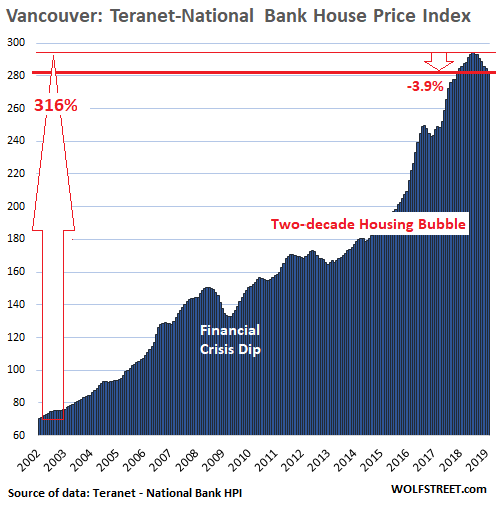
From January 2002 to the peak in July 2018, the index soared 316%, the biggest increase of any major housing market in Canada over this period — and as we will see in a moment, far more splendid than anything the US has to offer. When something is up 316% (the index for Vancouver soared from 70.7 in January 2002 to 294 at the peak in July 2018), it means that it more than quadrupled.
The Teranet-National Bank House Price Index tracks the rate of change of single-family house prices, based on “sales pairs,” similar to the S&P CoreLogic Case Shiller index for US housing markets. It compares the sales price of a house in the current month to the prior transaction of the same house years earlier, based on property records (methodology). Using “sales pairs” frees the index from the issues that plague median-price indices and average-price indices.
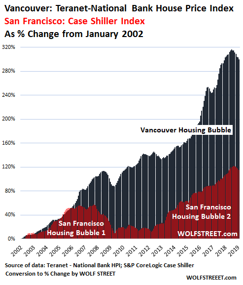
So now let’s have some fun and let’s compare Vancouver to the crazy insane mind-blowing Housing Bubble 1 and Housing Bubble 2 in the five-county San Francisco Bay Area that I feature prominently in the Most Splendid Housing Bubbles of America.
Since the Case Shiller Index and the Teranet-National Bank HPI both use “sales pairs” as their method of tracking price changes, it makes them comparable. To do that, I converted the index data of price changes into “percent change from January 2002.” So this tracks the same data, but is denominated in “%-change,” and the chart looks the same. I did this for Vancouver and the San Francisco Bay Area, which allows me to put both indices on the same %-change scale on the same chart.
Holy Cow!
Vancouver house prices soared 316% since January 2002 through the peak (July 2018); San Francisco Bay Area house prices soared 121% through the peak (November 2018). And what we get is a chart that shows how the majestically splendid housing bubble in Vancouver (black) totally crushes, annihilates, and ridicules the crazy insane mind-blowing house price increases in San Francisco (red):
Toronto:
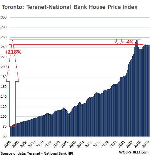
Staying on the same scale to show how housing markets in Canada vary, with less bubbly markets showing more white space, we move on to Toronto. House prices fell 0.2% in February and are down 4.0% from the peak in July 2017. Mild as it seems, it was the steepest 19-month decline since May 2009.
From January 2002 through the peak in August 2017, the index skyrocketed 218%. That’s huge. It means house prices more than tripled. But it’s not even in the same ballpark as Vancouver, where house prices more than quadrupled. So in the chart below, there is a little more white space above the index. Note the utterly nutty spike from January 2016 through July 2018, peaking with a 40% year-over-year gain:
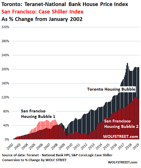
I converted this Toronto index to “percent-change since January 2002” and compared it to the crazy insane mind-blowing housing bubble in the San Francisco Bay Area. And Toronto just blows away the Bay Area for another holy-cow moment:
Montreal:
In Montreal, home prices ticked up to a new record in February, the only city in the 11-city index to see a month-to-month gain and a new record. The index is now up 158% from January 2002, and even this gain, which seems rather lousy compared to Vancouver’s 316% gain, beats San Francisco’s gain (121%) by a big margin. But the white space is beginning to get ample:
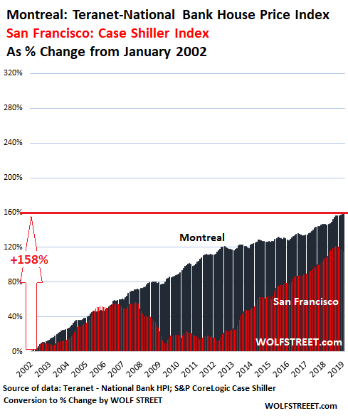
The Montreal index never experienced any kind of measurable dip. It trucked right along with San Francisco up through Housing Bubble 1. But during the Financial Crisis, when the San Francisco index imploded, the Montreal index just kept on trucking with the cruise control set on max, varying the speed only slightly for seasonal reasons.
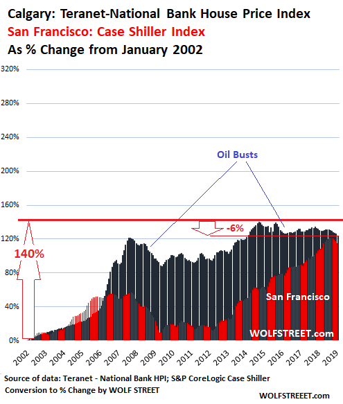
Calgary:
The housing market of oil-boom-and-bust town Calgary experienced a blistering boom in 2005 to mid-2007, along with the oil boom. When the price of oil collapsed, the housing market went south. Then there was another oil boom and the index reached a new peak in October 2014, at the time 140% up from January 2002.
And you know what’s coming. That oil boom too turned into a bust in the fall of 2014, and home prices have since zigzagged lower. In February, the index was down 6.3% from its peak in October 2014. But it remains 124% up from January 2002. So even oil-bust town Calgary is beating San Francisco:
No magic involved.
These home prices in Canada are no miracle. The index measures how the price of the same house changes over time. This house didn’t get bigger or better or more opulent. It just got older.
What has changed in a major way is the purchasing power of the Canadian dollar with regards to assets, particularly with regards to homes: This purchasing power has plunged. And what you’re seeing here are the effects of asset price inflation, or more precisely home price inflation.
These “sales pair” indices are a good measure of inflation for home prices, as they track the price changes of the same house, just like consumer price indices are a measure of consumer price inflation by tracking price changes of individual items. No magic involved – just the loss of purchasing power of the Canadian dollar, and thereby the loss of purchasing power of Canadian labor that is paid in these dollars.
The San Francisco Bay Area and Seattle lead with biggest multi-month drops since 2012; San Diego, Denver, Portland, Los Angeles decline. Others have stalled. A few eke out records. Read… The Most Splendid Housing Bubbles in America Get Pricked