- A few thoughts on bubbles
- Technical comments on the Dow Jones Internet Commerce Index
- China on the brink
via Martin Pring
Last week, I pointed out that most of the FAANG stocks remained in uptrends, with the possible exception of Netflix and the confirmed bear market in Facebook. The Dow Jones Internet Commerce Index is designed to measure the performance of the 40 largest and most actively traded stocks of U.S. companies in the internet industry. As such, it not only monitors FAANG, but is a broader measure of internet stocks.
I am bringing it up because any weakness here might spread into a more generalized market retreat. Jeffrey Gundlach, the extremely insightful founder and CIO of DoubleLine Funds, classifies the Index as the third largest bubble of the past 40-years. (I think he may have overlooked Bitcoin). At bubble peaks, it’s amazing how it’s often possible to quote various statistics demonstrating how ridiculously overvalued things have become. In the late 1980’s Japanese real estate boom, the value of the Emperor’s palace was said to be greater than all of the state of California. At the peak of the tech boom, the capitalization of Priceline.com exceeded that of all the major airlines combined. Included in chart notes of a recent presentation, Gundlach points out that the U.S tech market cap ($6.0 trillion) exceeds that of all companies in the Eurozone ($5.0 trillion). Also, Facebook with 25,000 employees has a market cap greater than the country of India with 1.3 billion people. Something seems to be seriously amiss here!
Technical comments on the Dow Jones Internet Commerce Index
Chart 1 shows that the Dow Jones Internet Commerce Index remains in an uptrend, both in its own right and against the NASDAQ Composite, as featured in the middle window. I would expect to see some deterioration in relative action prior to any final peak, but apart from a small correction since the early summer no long-term negative divergence has yet appeared. I count eight times that the relative line has been touched or approached. Which means that it represents a very significant level of dynamic support. Since the line is also currently intersecting with the 12-month MA, that again reinforces it as a support zone. The Index itself remains comfortably above its 2009-18 bull market trend line and 12-month MA. Since the long-term KST, in the bottom window, is still bullish it’s all systems go on the absolute price front.
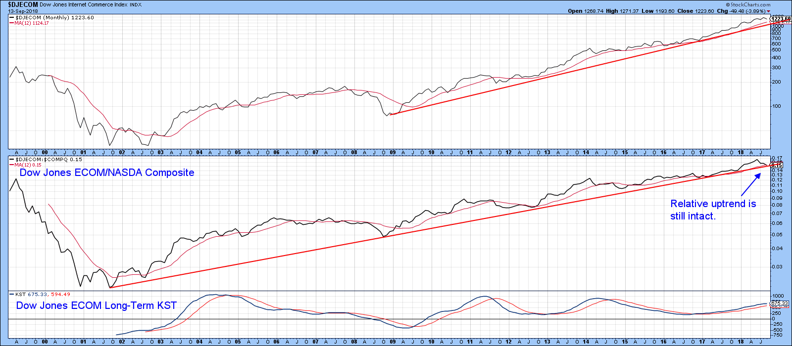 Chart 1
Chart 2 looks at the technical position from a slightly shorter-term viewpoint. Once again, we see the Index itself resting on a trend line, but the 2017-18 uptrend remains intact. However, the relative strength line, this time calculated against the S&P Composite, has completed its 2018 head and shoulders top. The RS line is now resting on its 200-day MA. The two long-term KSTs remain in bullish territory but have started to flatten. That’s something to monitor, but not to get alarmed about yet. Remember, you can update any of these charts by just clicking on them.
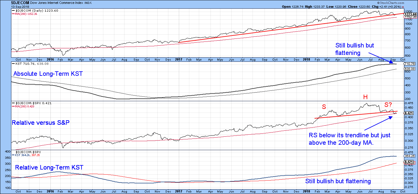 Chart 2
Finally, Chart 3 shows that on an intraday daily basis, the Index is really having trouble remaining above those two red trend lines. The bulls could argue that it’s also having trouble staying below them. Both have a point. A rally above the green trend line at just under 1300 would signal the all clear for a new high, but the Index first needs to reverse that bearish signal from the short-term KST in the lower window.
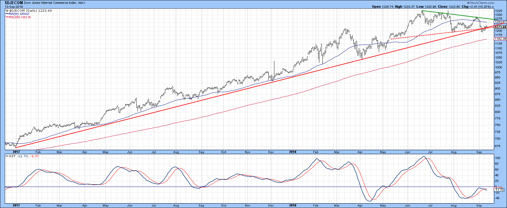 Chart 3
Bottom line, the trend of the Index remains positive, but a little weakness could certainly turn some of the shorter-term indicators into a negative mode. Major peaks are usually associated with a wild ride as buyers and sellers battle it out. The absence of that kind of volatility leads me to believe that the odds narrowly favor a melt-up before a melt-down.
China on the brink
Chart 4 shows that the Shanghai Composite is standing on the brink, in the form of its 1995-2018 secular up trendline. It’s a very important line, which if broken, will signify that there is a lot more to come on the downside. Note that the long-term KST is bearish, but the gentle declining slope close to the equilibrium level means that it would not take much to reverse this indicator to the upside. At this point though, the predominance of technical evidence points to a primary bear market since the Index is also below its 12-month MA.
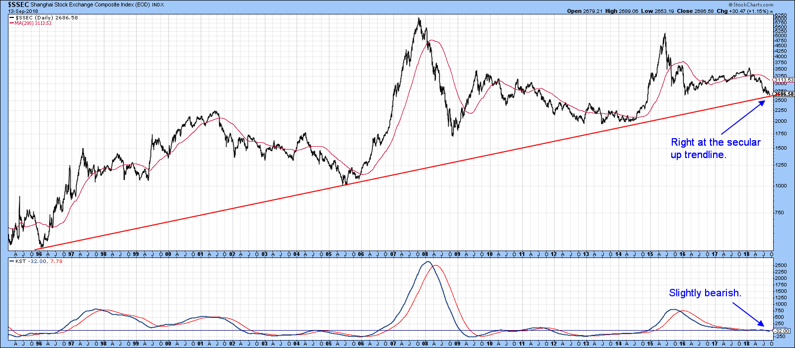 Chart 4
Some hope is being offered from Chart 5, where you can see that the two ROC’s have been diverging positively with the price since mid-summer. Also, the diverging solid green trendlines indicate the possibility that a broadening wedge may be in the process of forming. Its completion would require a break above the upper solid green line as well as the 50-day MA at 2,770, an event that would also confirm the positive momentum divergences. Such a break if it materializes, would clearly avoid a secular trendline break, at least for the time being. Reversing the bear market status though, would be something entirely different. Clearing the 200-day MA would be one step in that direction, but Chart 5 shows that, at 3105 there is a long way to go.
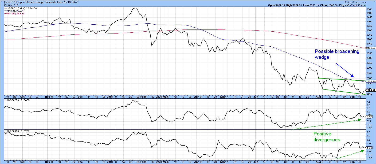 Chart 5
With global markets ex the US in a generalized retreat, the fate of the Shanghai Composite vis a vis its secular up trend line is something well worth monitoring. Further weakness in the stock market of the world’s second largest economy could prove to be contagious as it was a few years ago.
Good luck and good charting,
Martin J. Pring