via blogmaverick
I wanted to get an understanding of what opening meant to businesses around Dallas. Were they opening? What precautions were they taking? Were employees in safe environments? And bigger picture, I wanted to know if these are places that I would feel safe taking my family to.
So I hired a company that specialized in this type of project, https://shiftsmart.com/, and asked them to let me know how Dallas businesses were responding to the Open Order for Texas.We will do this again a couple more times so we can learn what the trends are and try to learn from it.
This is what we found:
Methodology:
- We called ~1000 restaurant and retail locations based on popularity (we used # of reviews on Yelp by category as a proxy) to assess full re-open rate (open for dine-in, in-person shopping etc.)
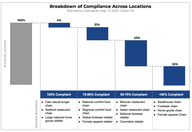
- We conducted physical audits at ~300 locations across restaurants and retail locations in Dallas to assess compliance against state re-opening protocols
Overview:1)Re-opening Rate: Only 36% of businesses chose to open on the opening weekend. Media coverage, showcasing owner sentiment and infection statistics, paint a picture of a large degree of latent fear in the marketplace.2) Aggregate Degree of Safety Protocol Compliance – By Locations: Overall – 96% of businesses were non-compliant across all mandatory protocols and all locations. The extent of non-compliance is dramatic with ~1/3 of all locations being <50% compliant across mandatory protocols as established by the Governor’s office. The chart below breaks out the degree of compliance across mandatory compliance % buckets.3)Aggregate Degree of Safety Protocol Compliance – By Protocols: On average, ~60% of mandatory protocols were followed and ~54% of all suggested protocols were followed. In aggregate – locations followed ~58% of all mandatory + suggested protocols. The following chart shows an aggregate view of all protocols and the degree of *non-compliance* (the top is what is not followed and the bottom is what is more followed) in order of most to least non-compliant across locations.……