
Last week, the Bureau of Labor Statistics (BLS) published the August monthly “employment report” which showed an increase in employment of 201,000 jobs. It was also the 94th consecutive positive jobs report which is one of the longest in U.S. history.
There is little argument the streak of employment growth is quite phenomenal and comes amid hopes the economy is beginning to shift into high gear.
But while there were a reported 201,000 jobs created in the month of August, the two prior months were quietly revised lower by 50,000 jobs. For the 3-months combined, the average rate of job growth between June and August was just 185,333 which stands decently below the 211,000 average rates of job growth over the last five years.
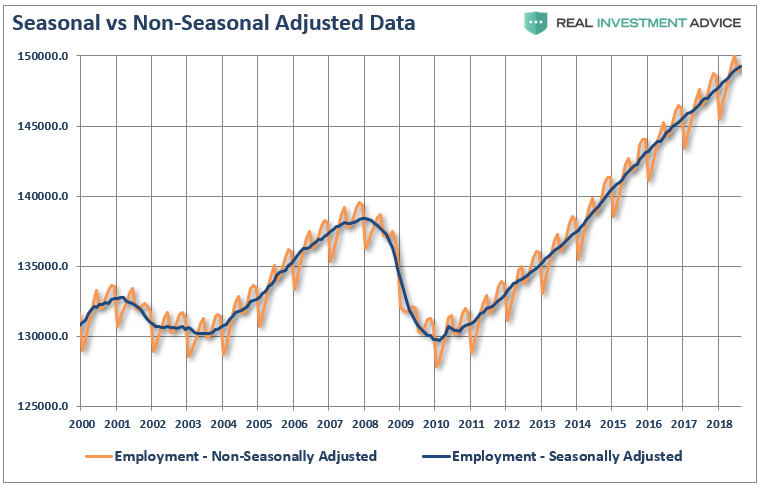
Then there is the whole issue of seasonal adjustments which try to account for temporary changes to employment due to seasonal workers. The chart below shows the swings between the non-seasonally adjusted and seasonally adjusted data.
But while most economists focus at employment data from one month to the next for clues as to the strength of the economy, it is actually the “trend” of the data which is far more important to understand.
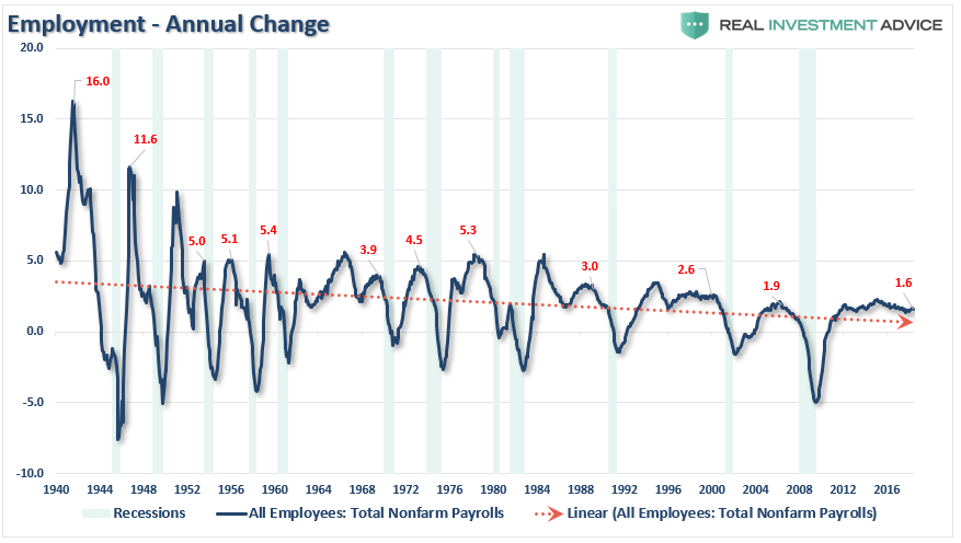
The chart below shows the peak annual rate of change for employment prior to the onset of a recession. The current annual rate of employment growth is 1.6% which is lower than any previous employment level prior to a recession in history.
But while this is a long-term view of the trend of employment in the U.S., what about right now? The chart below shows employment from 1999 to present.
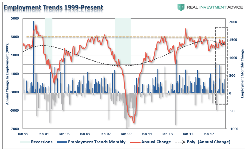
While the recent employment report was slightly above expectations, the annual rate of growth is slowing. The chart above shows two things. The first is the trend of the household employment survey on an annualized basis. Secondly, while the seasonally-adjusted reported showed 201,000 jobs being created, the actual household survey showed a loss of 423,000 jobs which wiped out all of the job gains in June and July as summer workers returned to school.
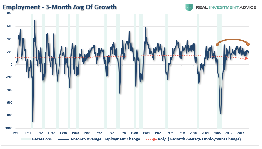
There are many that do not like the household survey for a variety of reasons. However, even if we use the 3-month average of the seasonally-adjusted employment report, we see the exact same picture. (The 3-month average simply smooths out some of the volatility.)
But here is something else to consider.
While the BLS continually adjusts and fiddles with the data to mathematically adjust for seasonal variations, the purpose of the entire process is to smooth volatile monthly data into a more normalized trend. The problem, of course, with manipulating data through mathematical adjustments, revisions, and tweaks, is the risk of contamination of bias. A simpler method to use for smoothing volatile monthly data is using a 12-month moving average of the raw data as shown below.
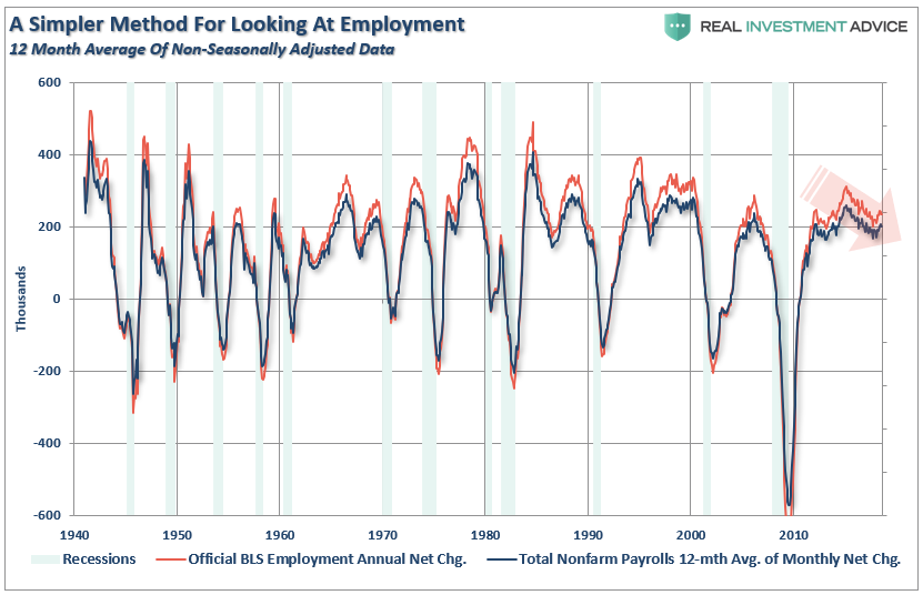
Notice that near peaks of employment cycles the employment data deviates from the 12-month average but tends to reconnect as reality emerges.
Sometimes, “simpler” gives us a better understanding of the data.
Importantly, there is one aspect to all the charts above which remains constant. No matter how you choose to look at the data, peaks in employment growth occur prior to economic contractions rather than an acceleration of growth.
But there is more to this story.
A Function Of Population
One thing which is never discussed when reporting on employment is the “growth” of the working age population. Each month, new entrants into the population create “demand” through their additional consumption. Employment should increase to accommodate for the increased demand from more participants in the economy. Either that or companies resort to automation, off-shoring, etc. to increase rates of production without increases in labor costs. The chart below shows the total increase in employment versus the growth of the working age population.
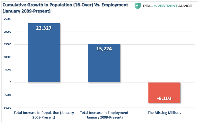
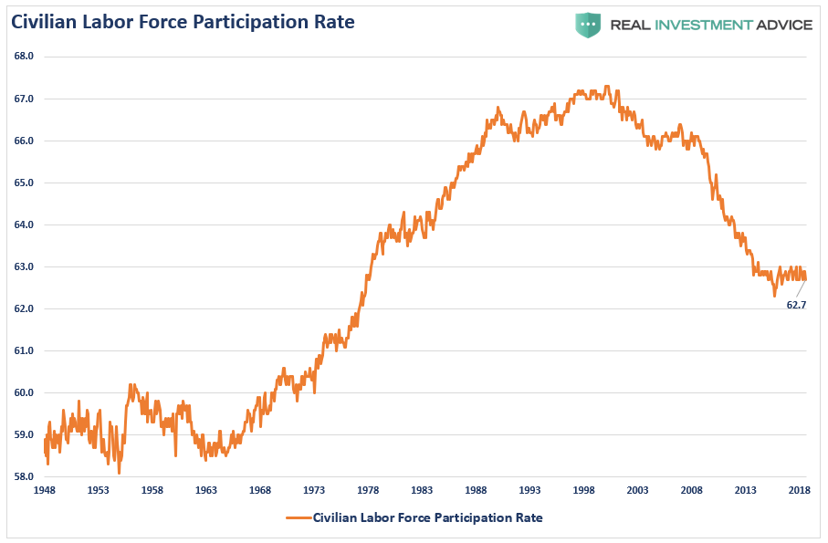
The missing “millions” shown in the chart above is one of the “great mysteries” about one of the longest economic booms in U.S. history. This is particularly a conundrum when the Federal Reserve talks about the economy nearing “full employment.” The Labor Force Participation Rate below shows this great mystery.
Of course, as we are all very aware, there are many people who are working part-time, going to school, etc. But even when we consider just those working “full-time” jobs, particularly when jobless claims are reaching record lows, the percentage of full-time employees is still well below levels of the last 35 years.
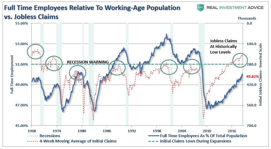
“With jobless claims at historic lows, and the unemployment rate at 4%, then why is full-time employment relative to the working-age population at just 49.82% which is down from 49.9% last month?”
It’s All The Baby Boomers Retiring
One of the arguments often given for the low labor force participation rate is that millions of “baby boomers” are leaving the workforce for retirement. This argument doesn’t carry much weight given that the “Millennial” generation, which is significantly larger, is simultaneously entering the workforce. The other problem is shown below, there are more individuals over the age of 55, as a percentage of that age group, in the workforce today than in the last 50-years.
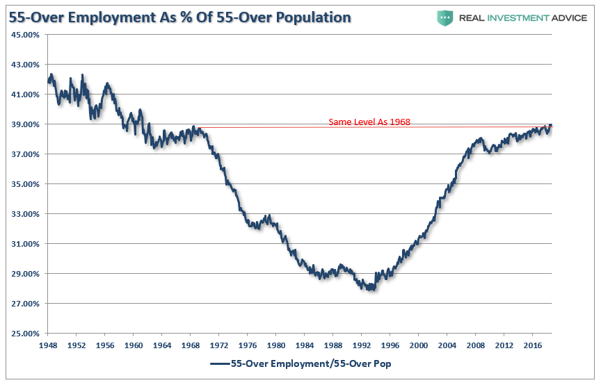
Of course, the reason they aren’t retiring is that they can’t. After two massive bear markets, weak economic growth, questionable spending habits,and poor financial planning, more individuals over the age of 55 are still working because they simply can’t “afford” to retire.
However, for argument sake, let’s assume that every worker over the age of 55 retires. If the “retiring” argument is valid, then employment participation rates should soar once that group is removed. The chart below is full-time employment relative to the working-age population of 16-54.
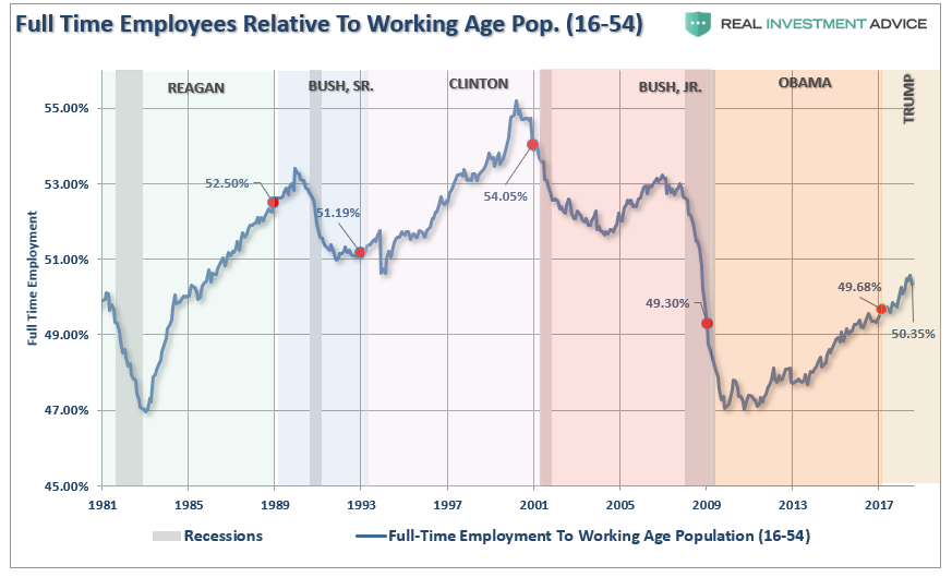
Importantly, note in the first chart above the number of workers over the age of 55 increased last month. However, employment of 16-54 year olds declined from 50.43% to 50.35%. It is also, the lowest rate since 1985, which was the last time employment was increasing from such low levels.
The other argument is that Millennials are going to school longer than before so they aren’t working either. (We have an excuse for everything these days.) The chart below strips out those of college age (16-24) and those over the age of 55.
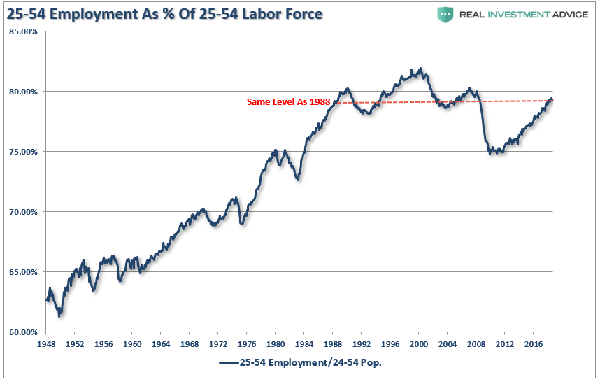
With the prime working age group of labor force participants still at levels seen previously in 1988, it does raise the question of just how robust the labor market actually is?
Low initial jobless claims coupled with the historically low unemployment rate are leading many economists to warn of tight labor markets and impending wage inflation. If there is no one to hire, employees have more negotiating leverage according to prevalent theory. While this seems reasonable on its face, further analysis into the employment data suggests these conclusions are not so straightforward.
Strong Labor Statistics
Michael Lebowitz recently pointed out some important considerations in this regard.
“The data certainly suggests that the job market is on fire. While we would like nothing more than to agree, there is other employment data which contradicts that premise.”
For example, if there are indeed very few workers in need of a job, then current workers should have pricing leverage over their employers. This does not seem to be the case as shown in the graph of personal income below.

Furthermore, a closer inspection of the BLS data reveals that, since 2008, 16 million people were reclassified as “leaving the workforce”. To put those 16 million people into context, from 1985 to 2008, a period almost three times longer than the post-crisis recovery, a similar number of people left the workforce.
Why are so many people struggling to find a job and terminating their search if, as we are repeatedly told, the labor market is so healthy? To explain the juxtaposition of the low jobless claims number and unemployment rate with the low participation rate and weak wage growth, a calculation of the participation rate adjusted unemployment rate is revealing.
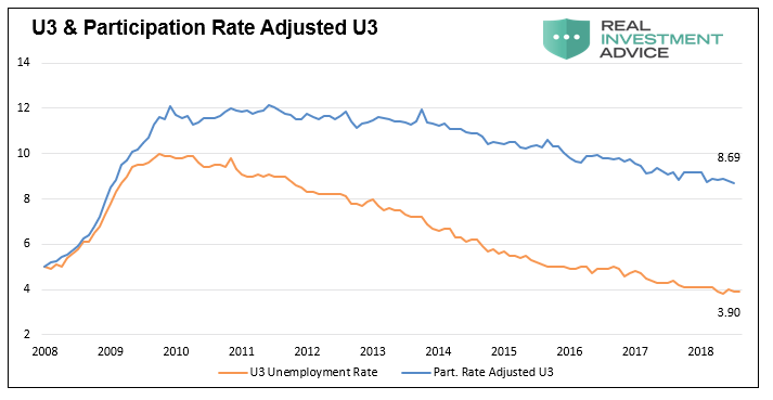
When people stop looking for a job, they are still unemployed, but they are not included in the U-3 unemployment calculation. If we include those who quit looking for work in the data, the employment situation is quite different. The graph below compares the U-3 unemployment rate to one that assumes a constant participation rate from 2008 to today. Contrary to the U-3 unemployment rate of 3.90%, this metric implies an adjusted unemployment rate of 8.69%.
Importantly, this number is much more consistent with the data we have laid out above, supports the reasoning behind lower wage growth, and is further confirmed by the Hornstein-Kudlyak-Lange Employment Index.

(The Hornstein-Kudlyak-Lange Non-Employment Index including People Working Part-Time for Economic Reasons (NEI+PTER) is a weighted average of all non-employed people and people working part-time for economic reasons expressed as the share of the civilian non-institutionalized population 16 years and older. The weights take into account persistent differences in each group’s likelihood of transitioning back into employment. Because the NEI is more comprehensive and includes tailored weights of non-employed individuals, it arguably provides a more accurate reading of labor market conditions than the standard unemployment rate.)
One of the main factors driving the Federal Reserve to raise interest rates and reduce its balance sheet is the perceived low level of unemployment. Simultaneously, multiple comments from Fed officials suggest they are justifiably confused by some of the signals emanating from the jobs data. As we have argued in the past, the current monetary policy experiment has short-circuited the economy’s traditional traffic signals. None of these signals is more important than employment.
As Michael noted:
“Logic and evidence argue that, despite the self-congratulations of central bankers, good wage-paying jobs are not as plentiful as advertised and the embedded risks in the economy are higher. We must consider the effects that these sequences of policy error might have on the economy – one where growth remains anemic and jobs deceptively elusive.
Given that wages translate directly to personal consumption, a reliable interpretation of employment data has never been more important. Oddly enough, it appears as though that interpretation has never been more misleading. If we are correct that employment is weak, then future rate hikes and the planned reduction in the Fed’s balance sheet will begin to reveal this weakness soon.”
As an aside, it is worth noting that in November of 1969 jobless claims stood at 211,000, having risen slightly from the lows recorded earlier that year. Despite the low number of claims, a recession started a month later, and jobless claims would nearly double within six months. This episode serves as a reminder that every recession followed interim lows in jobless claims and the unemployment rate. We are confident that the dynamics leading to the next recession will not be any different.
But then again, maybe the yield-curve is already giving us the answer. With the Fed already slated to hike interest rates further, the only question is “what breaks first?”