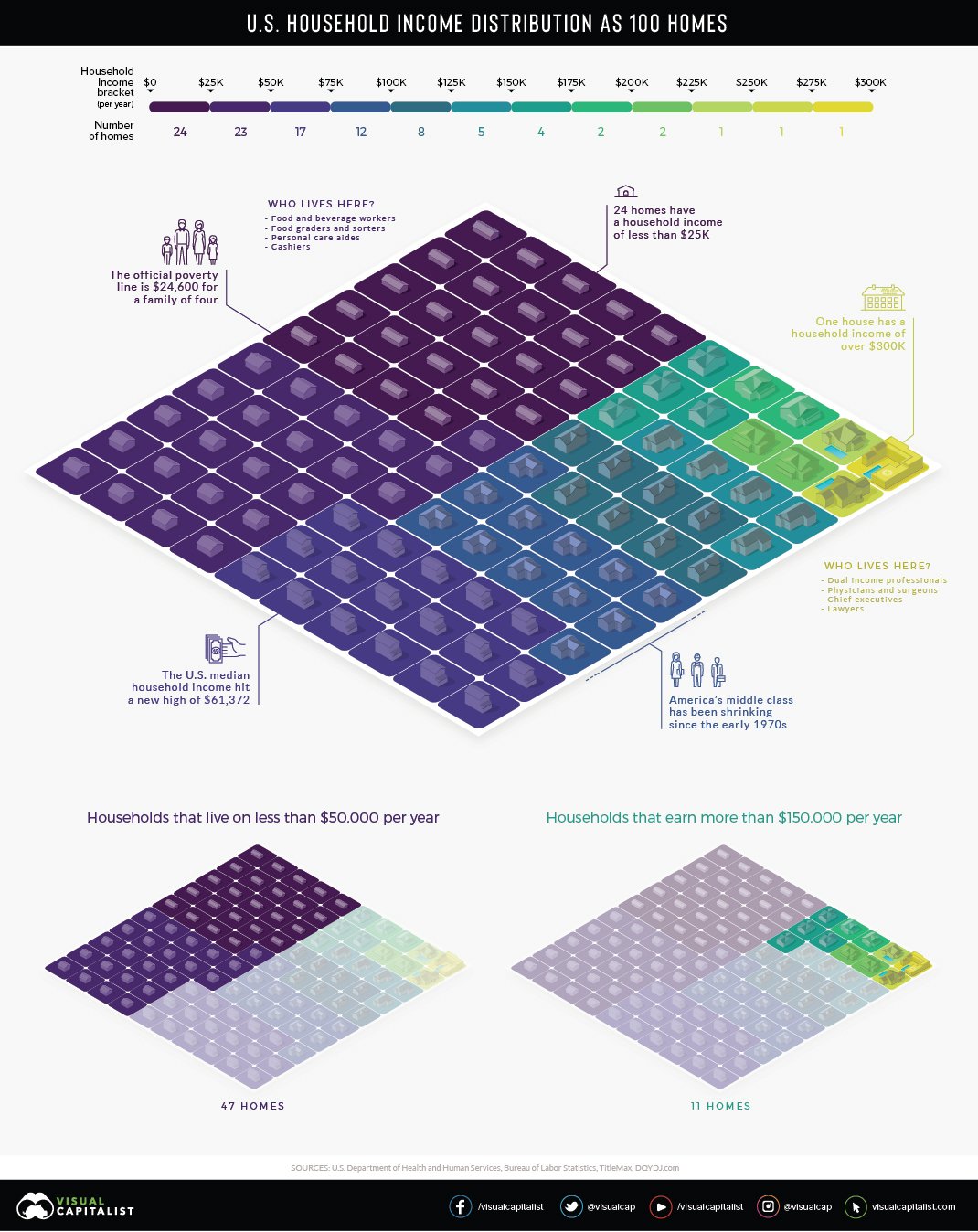
via visualcapitalist:
View a high resolution version of this graphic.
Inequality in America has become a major talking point in recent years. For many people though, the concept of inequality – the idea that wealth is spread very thinly at the lower end of the socioeconomic ladder – is still an abstract concept.
There are over 125 million households in the United States, each with their own unique structure and financial situation, so understanding such a complex issue requires reducing it to proportions we can understand.
AMERICAN HOUSEHOLDS AS A NEIGHBORHOOD
In the visualization above, American households are distilled down into 100 homes, then color-coded into $25,000 income increments.
One house is allocated for those making $300,000 and more per year. On the other end of the scale, we can see that 24 of the households earn $25,000 per year or less, and nearly half of the households have an annual income lower than $50,000.
Here is a more granular breakdown of numbers, this time from a slightly different data source (U.S. Census Bureau’s 2017 Household Income Survey):
| Income Bracket | Households (Millions) | Share of Total |
|---|---|---|
| Less than $15,000 | 14.1 | 11.2% |
| $15,000 – $24,999 | 12.1 | 9.6% |
| $25,000 – $34,999 | 11.9 | 9.4% |
| $35,000 – $49,999 | 16.3 | 12.9% |
| $50,000 – $74,999 | 21.5 | 17.0% |
| $75,000 – $99,999 | 15.5 | 12.3% |
| $100,000 – $149,999 | 17.8 | 14.1% |
| $150,000 – $199,999 | 8.3 | 6.6% |
| $200,000 and up | 8.8 | 7.0% |
Households between $35,000 and $100,000 are generally considered middle class. That said, the geographical location of where a household is located also makes a big difference.
THE POWER OF PLACE
Not surprisingly, cost of living strongly influences your household’s place on the income spectrum.
In El Paso, Texas, a $50,000 income places a household of four people in the middle class. However, in a more expensive metro area, like San Diego, that same income lands your household in a lower income tier. Here’s a closer look at the cost of typical expenses in the two metros:
| Expense | El Paso, TX | San Diego, CA | Cost difference |
|---|---|---|---|
| Home price | $239,285.67 | $755,273.67 | ⬆︎ 216% |
| Apartment rent | $945.92 | $1,961.55 | ⬆︎ 107% |
| Energy cost | $133.53 | $213.96 | ⬆︎ 60% |
| Dentist visit | $89.08 | $104.25 | ⬆︎ 17% |
| Coffee | $4.47 | $5.39 | ⬆︎ 20% |
| Hamburger | $3.56 | $4.35 | ⬆︎ 22% |
| Gasoline | $2.31 | $3.31 | ⬆︎ 44% |
MIXED MESSAGES
The median household income in the U.S. continues setting new monthly records, and we’ve just seen this decade’s largest year-over-year increase in individual wages.
One side effect of this economic growth is that households in the top wage bracket – the well-appointed yellow square in our visualization – have a tendency to reap outsized rewards. So, for now, as America’s economy trends upward, so does its Gini Coefficient.