by Econimica
July 31…Debt Ceiling Deal – July 31st of this year, Senate Democrats carried President Trump’s budget deal eliminating the debt ceiling through July 31st of 2021. This after a majority of Trump’s House Republicans voted against the budget deal but House Democrats overwhelmingly passed it. And thus the debt ceiling was no more. Since July 31st, the Treasury has issued over $1 trillion in net new debt but that is just the start.
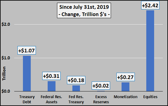 In percentage terms in just four months, total US debt is up 4.8%, Federal Reserve held assets up over 8%, Fed held Treasuries up 8.6%, excess reserves up just 1.2%, direct monetization up over 18%, and equities up over 8% (chart below). Not shown is in addition to all this, the Federal Funds rate was also reduced by 35%.
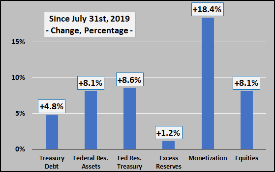 Summary
Trump and the Democrats agreed to spend without limits, Trump and the Federal Reserve agreed to QE4 and mainlining the digitally created cash into the economy (errr…financial assets) via direct monetization. The result has been to massively enrich the few who own the vast majority of all assets which are surging upwards and pass all the debt along to the working stiffs.
Post Script – Context
And for those who stuck around, I’ll try and put the above in a wider context. The chart below details why this is the greatest asset bubble in modern history. The chart shows the market value of all household assets (stocks, bonds, real estate, etc.) as a percentage of disposable personal income (simply put, the value of all assets held by US citizens versus their total national income that may be invested or saved after all taxes are paid). As the chart below details, as rates go up, asset valuations go down…and vice versa. And never have asset valuations been so far beyond underlying incomes to support those valuations as now.
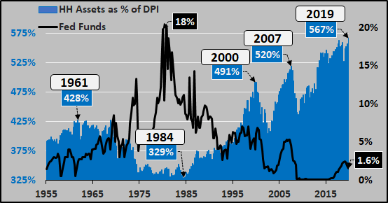 Since 1981, household assets as a percentage of disposable personal income versus federal funds rate with primary sources of debt detailed below. The breakdown of mortgage debt and surge of federal debt since 2008 are not so hard to see. Plus the Federal Reserve balance sheet is included as those assets will only be increasing from here on out.
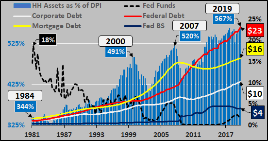 Debt creation by periods, 1960 through 2000, 2000 through 2008, and 2008 through 2019. Relatively stable corporate debt creation, collapsing mortgage debt, and surging federal debt. And collapsing mortgage debt and surging federal debt is only just getting started, because…
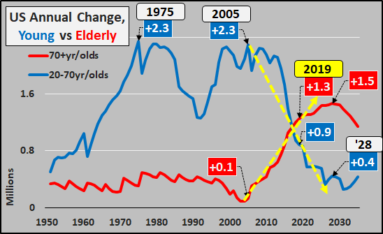
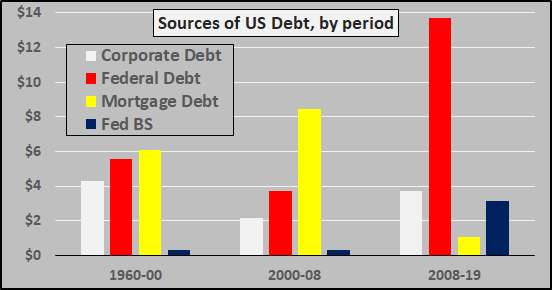 And finally, why mortgage debt won’t be rising anytime soon and all debt creation will be up to the federal government. The chart below shows the annual change in young (working age) versus elderly…a surging population of elderly versus huge deceleration of growth among the working age population. Just a reminder, elderly earn and spend half as much as working age persons and “destroy money” via deleveraging while working age persons “create money” via undertaking new loans (debt). The current and future situation is one of collapsing credit and collapsing money creation as the growth of deflationary elderly overwhelms inflationary working age growth…and into that entirely predictable situation, steps the Federal government, Federal Reserve, and ludicrous politicians to serve the interests of the few at the expense of the many.