via Ronald Surz
- Four years ago I thought I had discovered a leading indicator of market crashes that was flashing red at that time.
- Then again 2 years ago I thought that surely this indicator was calling an end to the bull market. I was wrong again.
- You be the judge. Is the indicator a false alarm, or well overdue? The warning is now 60% stronger than the previous high.
- Yes, I know. Sooner or later the indicator will be “right.” I just thought you’d like to know how unprecedented the US market composition is currently.
| Four years ago I thought I had discovered a new leading indicator of stock market crashes, and wrote about it in “A New Leading Indicator of Stock Market Direction”. Two years later, the US market was still going up, and so was my indicator, so I warned readers again in This Warning Is Flashing Brighter Red. This is my third warning. Of course I feel silly for being wrong twice so far, so this time I’ll phrase it a little differently: no warning – just an observation.The US stock market is currently 60% more top heavy than it has been in the last 20 years. In the past, a top heavy market peak has preceded a market correction, but not so in this current bull market, at least not yet. How tall can this tree grow? |
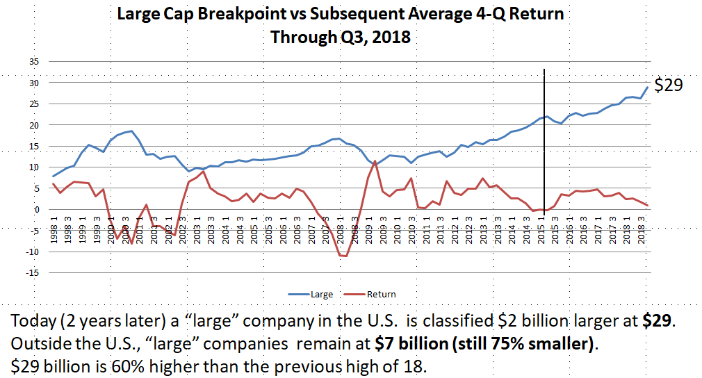
The following graph appears in my 2016 article. It shows the history of the indicator going back to 1998. It forecast the market declines in 2000 and 2008, and was forecasting another market correction in 2016. A high indicator precedes a market sell-off. A low indicator signals a recovery, and a flat indicator is a predictor of average returns. The returns shown in the graph are the average quarterly returns over the year following the indicator date. They’re rolling 4-quarter averages.

Fast forward another two years to the next graph. There’s been a 7% increase in the indicator, from $27 billion to $29 billion. Most importantly, the market is still going up, although there was a minor setback in October 2018. As described in the following section, the indicator is a measure of top heaviness, The current top heaviness is unprecedented at 60% higher than the previous high.
The Indicator
I created and maintain the Surz Style Pure® indexes that break the stock market into large, middle and small, and within each of these sizes into value, core and growth. Morningstar style boxes use a similar approach, and were introduced several years after I launched my indexes. My index definition for large companies is the top 65% of the market. I sort the 5000 companies in the US stock market by capitalization and start adding until I get to 65% of the total capitalization. I use these style classifications in my annual commentary and in the Next Generation of Style Analysis. Alas, this is the last year for my indexes and related tools.
The breakpoint for large companies has recently reached its highest point ever — $29 Billion. A large company by my definition is currently above $29 Billion. There are currently 230 U.S. companies that meet this rule, with total capitalization of $23 Trillion, which is 65% of the $35 Trillion total market size. This large company breakpoint is the indicator shown in the graph above. It has successfully predicted the last two market cycles
Now What?
Much has been written about the FAANG stocks. They’re like the Nifty 50 of the 1960s, and we know what happened then. Will top heaviness topple the US stock market? A more likely cause for the next meltdown is our incredible debt, but that’s a different warning that hasn’t worked, yet.