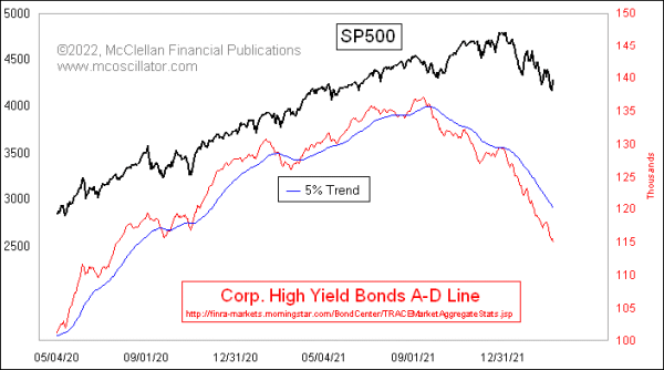
The Daily A-D Line for corporate high yield bonds continues to look quite ugly. That is a concern for the overall stock market because high yield bonds drink from the same liquidity pool as stocks do, and these bonds are arguably more sensitive than stocks are to liquidity problems.
So it is not good news to see these canaries in the coal mine still doing poorly. Their message is that liquidity is still in short supply, so much so that these least deserving of issues are going hungry. That says conditions are not good for the rest of the stock market.
There is the possibility, though, that we are seeing a case of too much of a bad thing, which could turn into a good thing. When an A-D Line is so negative for so long, it can create an oversold condition that we look for and find in certain indicators. The McClellan Summation Index that my parents developed is particularly well suited for that task.
This next chart shows a Ratio-Adjusted Summation Index (RASI) for these A-D data on high yield bonds. It is currently showing us a pretty deeply oversold indication. But there is more to the story it tells us.
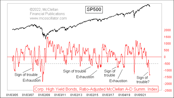
When there has been a long quiet period for this indicator, with mostly positive indicator readings, then that period of calm begs for a corrective period. But what we have seen since 2005 (when these data first began in FINRA’s dataset) that there is an interesting two-step pattern to the major corrective periods.
The first step is a type of a warning shot, or a “sign of trouble” to come. That leads first to a rebound, and then to a more permanent exhaustion event some months later, which finishes the corrective period. This current dip arguably fits into that “sign of trouble” category.
Frustrating that categorization was the last such dip, which occurred in March 2020 during the Covid Crash. That is an obvious exception that does not fit my nice categorization, and which I propose to set aside as an anomaly, brought about by a government shutdown of the economy, and not by a cyclical liquidity phenomenon.
If this hypothesis is correct about the current dip being a “sign of trouble”, and if there is another bout of weakness yet to come, then this downtrend is not yet over. We don’t have enough samples since 2005 to say exactly what the “flash to bang time” is between the sign of trouble and the exhaustion event, but it should be at least a few months.
That is a point for the really long term buy-and-hold crowd to focus on. Traders can take note of this big oversold condition, and even it if is just a “sign of trouble”, it can still lead to an impressive bounce before the real trouble comes in the “exhaustion event”. That remains a task for the market to perform several months from now, and at some point soon we should get to see the hesitant bounce from this “sign of trouble” oversold condition.
Tom McClellan
Editor, The McClellan Market Report