by John Ward
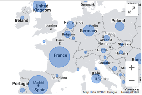
Type ‘Covid19’ into Google these days, and the map above is ever-present. As you can tell straight away, Coronavirus has mutated into large, ugly blue bubons all across the continent, and the spikes are at their peak in France, Spain, Britain, Italy, Germany and Poland.
Note, as ever, the absence of numbers. So, vigilant as ever about the spread of iniquitous disinformation, I’m going to add them now:
UK – 13, France – 20, Spain – 40, Germany – 6, Italy – 10, Poland – 14.
I wonder when, finally, the accepting majority will ask themselves why the bigging-up of Covid19 continues.
We have seen PHE disgraced and disbanded for overcounting fatalities by more than 20%.
And now – in the last week, the CDC in the US has finally relented and done an analysis of how many C19 deaths that were pure, single pathogen related – ie, Coronavirus only. The answer?
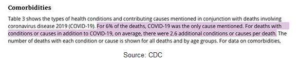
Just 6%. As for US citizens testing positive, any element resembling Covid19 in the blood earns a positive result.
Pretty much everything designed to make a relatively harmless virus resemble a plague mowing down humanity indiscriminately has been tried by the 3%.
1,019 students at S Carolina University have got Covid19, screamed the New York Times last Wednesday.
You had to dig right down to the local newspaper before reading that 1 guy is dead.
So that’s a 0.097% death rate. Oh my God.