by econimica
Summary
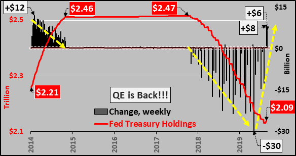
After 250 weeks without a purchase of Treasuries (since Oct. 2014), for the second week in a row, the Federal Reserve bought Treasuries.
The $14 billion in purchasing is in stark contrast to zero purchases since Quantitative Easing ended and selling during Quantitative Tightening.
When the Fed sells Treasuries, asset prices struggle, but when the Fed buys Treasuries, asset prices have surged.
Chart below shows the Fed’s total Treasury holdings (red line) versus the weekly change in Treasuries (black columns) since 2014. The QE taper is visible with the first dashed yellow line, the Quantitative Tightening the second dashed yellow line, and then the QT taper highlighted by the third dashed yellow line. Now, the Fed seems to have begun a new period of Treasury purchasing…but for how long and for what purpose, only Mr. Powell knows.
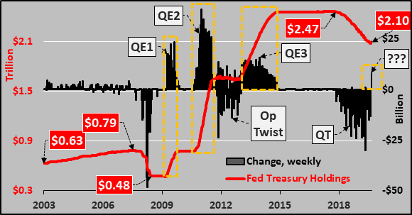
To put things in perspective, the chart below shows the Fed holdings of Treasuries (red line) and weekly change in Treasury buying (black columns) since 2003. Clearly visible is the activist role the Fed has taken since the GFC…QE1, QE2, Operation Twist, QE3, Quantitative Tightening…and now???
Since March 2019, when the Fed rolled out its latest plan…The Fed has ended its Treasury runoff sooner than communicated, cut rates as they said they would not, and is buying mid and long duration bonds while aggressively rolling off / selling off notes and bills…again, opposite to what they previously communicated or insinuated. From a duration perspective, the significant increases have come in the Fed’s 7 to 10 year bond holdings (+$43 billion since May) and essentially zero roll-off / sell-off of long bonds going all the way back to 2016.
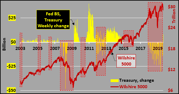
And just to highlight the immediate and incredible impact of the Federal Reserve purchasing of Treasuries on equity prices, the chart below is weekly changes in Treasury purchases (yellow columns) versus the Wilshire 5000 (red line), representing all publicly traded US equities.
Data via St. Louis FRED.