Wolf Richter wolfstreet.com, http://www.amazon.com/author/wolfrichter
Chicago, Dallas-Fort Worth, Atlanta, Minneapolis, Charlotte, Detroit, Cleveland.
In the 20 US housing markets covered by the CoreLogic Case-Shiller Home Price Index, there are some that form “The Most Splendid Housing Bubbles in America.” And there are some where home prices have not yet reached these splendid levels, or never experienced Housing Bubble 1 and are still crushed, or skipped Housing Bubble 1 and Housing Bust 1 but are now fully embroiled in Housing Bubble 2. So here we go.
Chicago:
Single-family house prices in the vast and diverse Chicago metro ticked up 0.6% in March from February, according to the CoreLogic Case-Shiller Home Price Index released on Tuesday. This was only about half of the seasonal gain in March last year of 1.1%, a phenomenon also seen in the Most Splendid Housing Bubbles, where seasonal gains in March were a lot weaker than in March last year. This whittled down the year-over-year gain to just 1.8%:
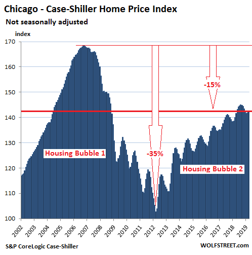
Chicago has had a steamy Housing Bubble 1. The Core-Logic Case-Shiller Home Price Index was set at 100 for January 2000 for all cities it covers; Chicago’s index value of 169 in July 2006 means single-family house prices have soared 69% in the six-and-a-half years from January 2000. Then the market crashed, with the index for houses plunging 35%. Since then, prices have risen, but are still 15% below their crazy levels of 2006.
The index is a rolling three-month average; yesterday’s release tracks closings that were entered into public records in January, February, and March.
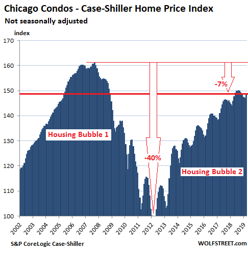
Condo prices are more volatile than houses, plunging faster and more deeply than house prices, and if lucky, rising faster than house prices. In Chicago’s case, condo prices plunged 40% during Housing Bust 1, according to Case-Shiller data. Since then, they have surged but remain 7% below the crazy peak of Housing Bubble 1.
In March, Chicago condo prices rose 1.2% from February, same seasonal increase as in March last year. This left the year-over-year increase steady at 2.1%:
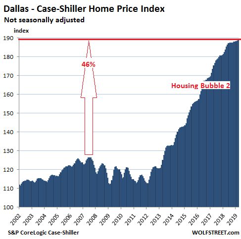
The charts on this list are all on the same scale with the vertical axis of the Case-Shiller values ranging from 100 to 175. This fits Chicago’s Housing Bubble 1 and shows the remaining charts on this list in the same light – including Detroit’s and Cleveland’s, with chilling effects. The only exception is the Dallas-Fort Worth metro, whose price surges have shot beyond that upper limit.
Dallas-Fort Worth:
The Dallas-Fort Worth metro skipped most of Housing Bubble 1 to the great frustration of homeowners and speculators in the area, and then it skipped most of Housing Bust 1, but then it made up for it. From the prior peak in June 2007, the Case-Shiller Home Price Index has surged 49%, in relentless up-moves – though those moves started to slow mid-2018. In March, the index ticked up 0.3% from February, less than half the seasonal uptick in March last year of 0.7%. This trimmed down the year-over-year gain to 3.0%, the slowest since April 2012:
Minneapolis:
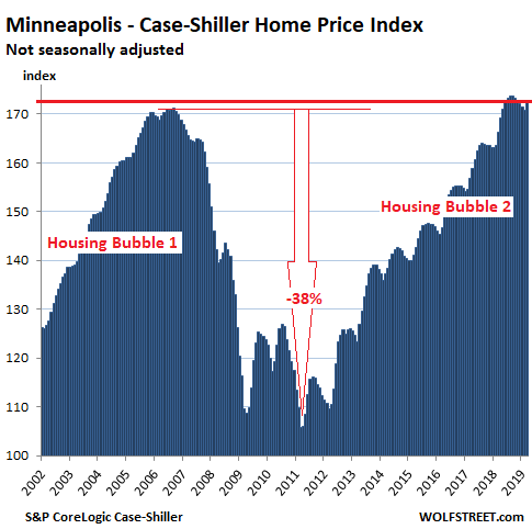
The Case-Shiller index for the Minneapolis metro rose 1.1% in March from February, also less than the seasonal gain in March last year of 1.7%. This whittled down the year-over-year gain to 3.7%, the slowest since September 2015 (it was 6.1% in March last year). In June 2018, the index had first surpassed its prior peak of September 2006. The chart is on the same scale as Chicago’s:
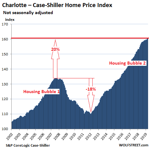
Charlotte:
House prices in the Charlotte metro rose 0.8% in March, to a new record, according to the Case-Shiller index, but that gain too was smaller than the seasonal gain in March last year of 1.0%, which trimmed down the year-over-year gain to 4.0%, the slowest since February 2016:
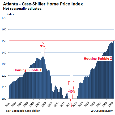
Atlanta:
In the Atlanta metro, home prices rose 0.7% in March from February to a new high, but that gain that too was below the seasonal gain in March last year of 0.8%. This trimmed down the year-over-year gain in March to 4.7%, the slowest since April 2012.
The chart for Atlanta’s index is on the same scale as Chicago’s. Note the larger amount of white space, and the 40% plunge to levels not seen since 1996, bottoming out at 82.5 in March 2012. Prices have shot higher since then, with the index at nearly 150 in March, indicating that prices have risen 50% since January 2000:
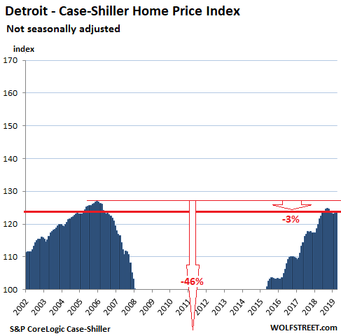
Detroit:
House prices the Detroit metro ticked up 0.4% in March from February, less than half the seasonal gain in March last year of 1.0%. This trimmed down the year-over-year gain to 3.3%, the thinnest since January 2015 (in March last year, the year-over-year gain was 7.7%). The index remains 3% below its record in December 2005. The chart is on the same scale as Chicago’s:
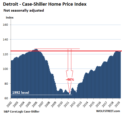
During Housing Bust 1, which coincided with Detroit’s relentless process toward bankruptcy, the Case-Shiller index plunged 46% to levels not seen since 1992, proving that even a weak housing market can get a lot weaker. From the low point in April 2011, the index has surged 92%, but it has still not set a new record. The chart below puts Detroit’s housing market on a scale of its own:
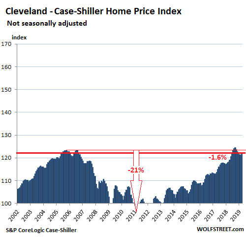
Cleveland:
In the Cleveland metro, the weakest housing market in the 20-City Case-Shiller index, house prices rose 0.9% in March from February, and 3.5% year-over-year, but remain 1.7% below June 2018; and 1.6% below their previous peak in 2006.
With an index value of 122.3, the index indicates that home prices have risen 22.3% since January 2000. The national Housing Bubble 1, the national Housing Bust 1, and the national Housing Bubble 2 have left skid marks on Cleveland though home prices in Cleveland are far from being in any kind of bubble. The chart is on the same scale as Chicago’s:
The Case-Shiller methodology is based on “sales pairs,” tracking the sales price of a house in the current month to the prior transaction of the same house. The index in effect tracks how many more (or fewer) dollars it takes to buy the same house, and thus it tracks the purchasing power of the dollar with regards to houses. When a house doubles in price, it didn’t get twice as big. It just got older. What changed was the purchasing power of the dollar with regards to that house. In other words, these charts are a measure of house-price inflation.