
by C Hamilton
I’m going to suggest that the Corona-virus is more a window or a marker that separates what will be seen as the end of an era and the beginning of another. Corona-virus is serious, global, and appears it will cause significant death and disruption. But Corona-virus itself isn’t the problem (no more than Spanish Flu was in 1918/1919). There is likely to be 9 to 18 months of global pandemic with large scale loss of life, but after the pandemic, things are more likely to return to “normal”. And it’s the discussion of what is the “normal” we have seen over the past 7 decades versus the current and coming decades that I hope to spur.
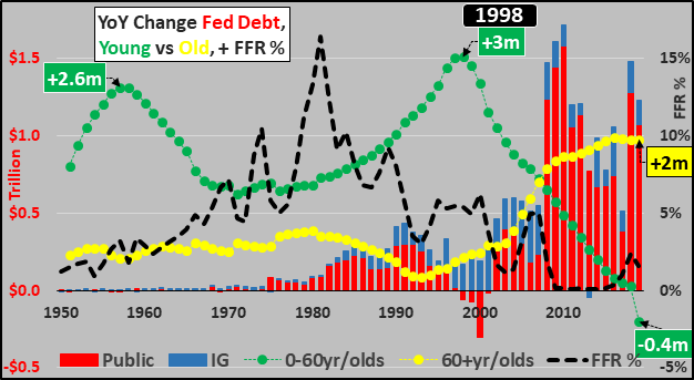
To begin, the chart below shows the annual change in the under 60 year old US population (green line) versus annual change in 60+ year old US population (yellow line). Also shown is annual US federal deficit split between public debt (red columns) and Intragovernmental (IG…blue columns representing Social Security, etc.), and lastly the federal funds rate (black line). Simply, as population growth of the working age population slowed, first large scale legal and illegal immigration was utilized to maintain economic and financial growth. However, since 2008, working age population growth has rapidly decelerated and immigration slowed…and in their place have come interest rate cuts to zero and accompanying massive debt (I show federal debt below, but corporate debt has also binged of the nearly free money to buy their own stock and pay dividends). 2019 was the first year in US history the working-age population declined…and of course all net population growth now comes among the elderly. The elderly who, on average, earn/spend half as much, are highly credit averse, and prefer to pay down existing mortgages and debt.
Consider the relationships.
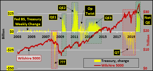
Changing gears but still tangentially, the weekly change in Federal Reserve holdings of US Treasury bonds (yellow columns) and the impact of that purchasing on the Wilshire 5000 (red line representing all publicly traded US equities). Look again at the chart above of the fast decelerating growth of potential employees, potential consumers, potential stock purchasers among the working-age. Consider the mandatory selling of the elderly…and then…
Consider the rationale and relationship for the Fed’s “activism”.
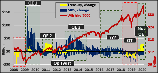
Broadening out to show the weekly change in Federal Reserve held mortgage backed securities (MBS…blue columns), Treasuries (yellow columns), and again the Wilshire 5000 (red line).
Again, consider the Fed’s motivation and the relationship of Fed buying and asset prices sky-rocketing.
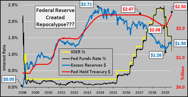
Next, perhaps also worthy of some discussion is the Fed’s experiment to control interest rates via interest paid on excess reserves (IOER). Just a reminder, prior to ’08, banks collectively held literally a few billion in excess reserves but in the ’09 GFC, the Fed stuffed them with excess reserves. The excess reserves peaked just prior to the end of QE and began precipitously declining years prior to any balance sheet reductions by the Fed. However, during that intermediate period while the Fed was raising the Federal Funds Rate, the Fed also raised the interest paid to the largest banks on those trillions in excess reserves. Despite the fast rising, Fed sponsored, risk-free returns for lending no money, excess reserves plummeted. What is so fascinating is that when the Fed felt compelled to begin cutting the FFR (and the IOER’s), reducing the returns on those excess reserves…the Fed also restarted QE (or “Not-QE”) and magically bank excess reserves ceased declining and began rising!?! An increase in excess of $400 billion in Fed held Treasuries has coincided with a nearly $250 billion increase in excess reserves?!?
However, despite the $1.5 trillion in excess reserves, banks (and others) are oversubscribing Fed repo auctions at record levels…perhaps this is worthy of some discussion?
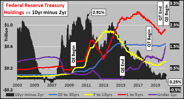
Next, consider the Fed’s holdings of US Treasuries by durations and the resultant impact on the spread of the 10 year Treasury minus the 2 year Treasury. Prior to the GFC, the Fed conducted their policy rather banker like, in a rather boring fashion. However, since the GFC, the Fed is spastically dumping one duration while pouring into another.
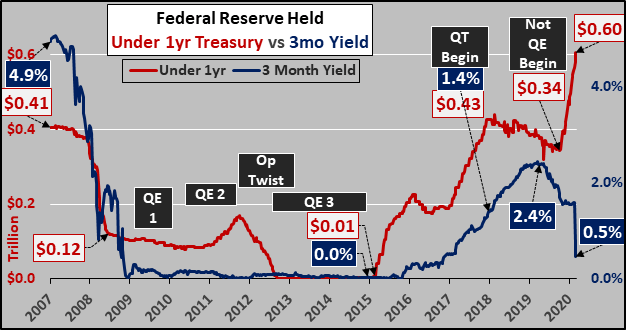
And a focus on the Fed’s holdings of short term US Treasury bills versus the yield on the 3 month Treasury bill. Check out the action on the far right…and perhaps this is discussion worthy? The Fed is currently buying every duration, but more than anything, is sucking up bills at an unprecedented rate?!? Uhhh!
Global
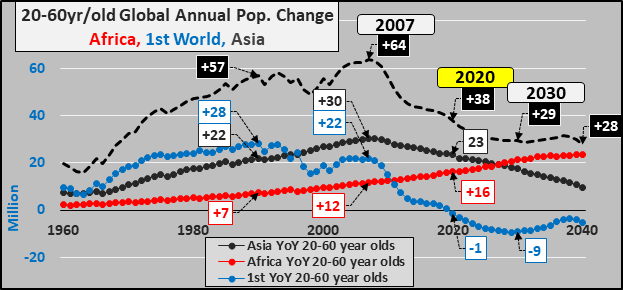
But now widen out and put all this into a global scope. If we look at annual global working-age population growth (black dashed line below) split among the 1st world (blue line), Asia (excluding East Asia), and Africa (red line)…the picture of what is happening in the US makes a little more sense. The working-age population of the 1st world begins a secular decline as of 2020. For those curious, the 1st world below is collectively including all of the Western Hemisphere, Europe, Oceania, Russia and Eastern Europe, plus East Asia (China, Japan, S/N Korea)). The 1st world consumes 75% of all commodities, has over 80% of the income, and consumes even more of the global exports…this is the population that takes out over 90% of the credit. And as for Africa and Asia (excluding East Asia), they are totally reliant on the first world growth to export their cheap labor, cheap commodities, and finished goods. Without growth in the first world consumer base, these 2nd and 3rd world nations haven’t an oar in the water.
And all this was before any inclusion of a likely pandemic. Now, disruption and dislocation is likely on top of 1st world working age depopulation. Discuss.
0 views