by smurfin101
So I believed in global warming, man made climate change, etc. for my entire life until I became a data scientist and started to do my own research and look at the real data for myself. I quickly realized that the data doesn’t support this at all. Also, when they show the data, they’re only showing 100 years of the 4.5B years that earth has been around which captures 0.000002222222222222222% of earths existence. This alone is proof that we shouldn’t be concluding anything but I’ll show you guys how they do it.
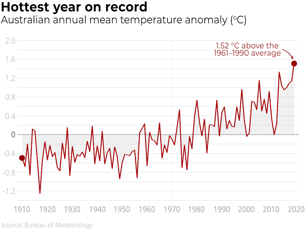
Here’s a recent climate change propaganda post from Australia’s Bureau of Meteorology – Weather bureau says hottest, driest year on record led to extreme bushfire season
Here’s the chart they’re using to show this
You’ll notice that the Y-axis is showing “temperature anomalies”. This isn’t the actual annual temperatures and this is how they are able to fake these trends. You’ll see that they’re comparing annual temperatures to the average between 1961-1990. They chose this timeline because the temperatures during this time are actually lower than using data from before the 1960s.
Let’s look at sunspot patterns from the past 100 years – http://sidc.oma.be/silso/yearlyssnplot
It’s a known fact that temperatures increases with an increase in sunspots and decreases when there’s a low number of sunspots. You can clearly see that the timeline they selected is a period of lower sunspots. You can clearly see that 1900 -> 1960 that there was a consistent increase in sunspots which means the temperature was most warmer than 1960 -> 1990. If they used the past 100 years I doubt it would produce the same trend that they’re showing.
I’ve been trying to find the raw annual temperature data but all of the government agencies don’t release this to the public. If I could find that data then I could most likely debunk all of their charts where they use the “anomaly” metric. This is how they’re able to get away with this since nobody can access the actual annual temperature data. They use this same technique for any charts where they’re showing “anomalies” because they come up with anomalies that will shift the data in their favor.
If anyone’s interested, here is a short research paper that still debunks the global warming hoax using the anomaly data