by
I have been writing for many years that the US in particular and the Western “developed” world in general were approaching a time where none of our choices would be good.
We have arrived. Any choice the government and central banks of the US and the rest of the world make will ultimately lead to a crisis. Just as the choices that Greenspan and Bernanke made about monetary policy created the Great Recession, Yellen and Powell’s choices will eventually lead us to the next crisis and ultimately to what I call The Great Reset.
I believe we have passed the point of no return. Changing policy now would create a recession as big as Paul Volcker’s in the early ‘80s. There is simply no appetite for that. Further, the national debt and continued yearly deficits force monetary policy to stay accommodative.
Today we will look at these problems through the lens of inflation. In general, consumers agree inflation is undesirable. They don’t want the prices of things they buy to go up.
But let’s talk about academics and central bankers. A little inflation makes sense from their viewpoint. They want to always have room to cut interest rates, should the economy falter. They would prefer to avoid negative interest rates. They need “normal” interest rates a comfortable distance above zero. That’s hard to maintain unless the economy has some degree of inflation. So, they tolerate a little inflation and, when necessary, actually encourage it.
But this raises another question: How do central bankers, or anyone else, actually know how much inflation exists? They depend on data, and data can be twisted, misinterpreted, or just plain wrong. Sometimes all at once.
I touched on this problem last week in Everything Is Broken. So much of our broken economy is the result of broken monetary policy, resulting from broken data. This affects everything. If Federal Reserve officials think inflation is low when it’s actually high, or vice versa, they will set interest rates too high or low. Governments, businesses, and consumers will all make similarly bad decisions, all of which will eventually coalesce into a catastrophe like the Great Recession. And it will all trace back to a data problem.
Inflation is far from the only data problem but it is probably the most consequential. So today we’ll dive deeper into this subject. Our distorted inflation data has a lot to do with housing “prices.” I use quote marks there because price may not be the right word, as you will see.
Housing vs. Shelter
We have to start with a definitional issue. For most people, housing is a major expense, and often the single largest one. Hence it is rightly a big part of the Consumer Price Index (CPI) and Personal Consumption Expenditures (PCE).
The Federal Reserve favors the PCE measure, while for whatever reason, the business media seems to focus on CPI. Typically, the core CPI and PCE move more or less in tandem. But notice that both measures use housing as their biggest component. This table shows the weightings.
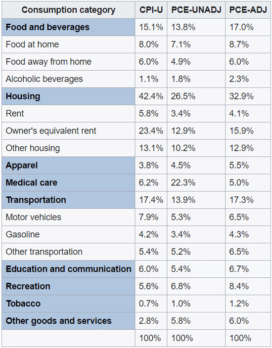
Source: Wikipedia
Notice that owner’s equivalent rent (OER) in the CPI is 23.4%, but total housing costs are weighted at 42.4%. The BLS tries to take into account how many people own their home, rent their home, and then what the other costs of housing are. Some people own their home outright and other people have large mortgages. As you will see, there is a lot of guesswork involved.
First, do you actually “consume” housing? In one sense, no. The house is still there after you sleep in it, just slightly used. You didn’t consume the house itself. You consumed the shelter it provided you for that particular night. I know, a subtle distinction. But it matters to academics and the way we measure housing/shelter inflation.
Shelter is a service; a house is a capital good. When you buy one you aren’t consuming; you are investing. Since 1981, the inflation benchmarks haven’t measured housing prices directly. They measure something called “Owner’s Equivalent Rent” (OER).
So where do the benchmarks get that OER number? They do a monthly phone survey. Respondents are asked if they own or rent their home. Renters state how much they pay. Easy enough. Homeowners are asked what they “would” charge someone else to live in their same home, if it were empty and unfurnished.
See a problem? This is completely subjective. Have you done the market research to see what you would charge to rent your home? Have you actually tried to rent it at that price? Probably not. So OER is uninformed guesswork from the start. Nonetheless, the survey responses go into a giant formula that looks like this…
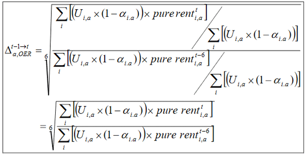
Source: BLS
… from which they derive the monthly change in OER for a given area. The “sixth root” of this relative number is the one-month change in OER. Simple, unless you have a swimming pool or other complications, in which case they make adjustments.
I believe the wonks who calculate all this are smart, dedicated public servants. They want to get it right. They have unfortunately been given a difficult and maybe impossible task. Adjusted subjective opinions of how much rent a given residence in a given place would fetch in a given month are a huge part of our inflation measures.
As an aside, the BLS typically sends out price checkers to verify prices for the various items they measure. But lately, due to COVID, they have not sent humans but instead relied on phone calls and estimates, as noted in their February release. How big a distortion is this? No one really knows.
There is no reason to think these inputs reflect reality, and many reasons to suspect they don’t. This has consequences.
Assumed Supply
Housing prices have no direct influence on our inflation measures. They do have indirect influence via the imputed, subjective “owner’s equivalent rent” methodology. Its accuracy is questionable at best.
What’s not questionable, though, is that home prices have a direct impact on the homeowner’s spending power. The mortgage payment is a function of the home’s purchase price and, if higher, reduces the amount the homeowner can spend on other goods and services. The impact varies, of course. Maybe you got a great deal on your house years ago, then prices rose even more in your area. You have a lot of equity which raises your net worth and probably makes you confident enough to raise other spending. But it can go the other way, too.
In any case, the size of your mortgage payment (even if it is zero because you don’t have one) certainly affects the amount you would want to rent your home to someone else. So do other factors: property taxes, expected maintenance costs, the tax impact of having rental income. Furthermore, your mortgage payment itself may be a moving target if you have a variable rate.
There’s more. If, hypothetically, you are going to move out of your home and rent it to someone else, where will you go? How much will it cost? Have you even thought about it? Maybe not. But you would have to consider all these things to properly estimate your OER.
Econ 101 also tells us cost doesn’t set prices. Supply and demand set prices. In this case, though, you are told to simply assume you would supply your home for rent, and estimate a price at which you would do so. That’s not how real life works. You can’t instruct people to imagine doing something that may be inconceivable to them and expect to get any kind of reliable answer.
Yet that’s how we arrive at a number that is the largest single input into (arguably) the single most important economic data point, which a committee at the Fed looks at when setting the single most important price in the world. See the problem?
Broken Inflation
Central banks all over the world, including the Federal Reserve, have an aspirational goal of 2% inflation. If you are age 30–40, that means every dollar you save today will lose half its value by the time you need it for retirement. And that’s what passes for planning by a committee. They literally plan on destroying the value of your dollar. The only real debate is over how fast to destroy it.
But forget that for a moment. The problem is we would already have 2% inflation, and probably more, if we correctly measured housing in the PCE and CPI with the actual cost of homeownership instead of imputing it via OER, as is done in both CPI and PCE.
Despite all the issues described above, housing prices and OER actually stayed fairly close for many years. I remember writing about OER in 2005 when it was much closer to being an acceptable measure of housing price inflation. Up until about 2000 or so, home prices and OER moved more or less in in tandem most of the time, though with OER far less volatile.
I argued back then it didn’t matter which measure you used as long as you were consistent. That is no longer the case because OER and housing prices are no longer consistent. And they diverged because home prices took off higher when Greenspan kept rates artificially low, creating a housing bubble which led to a subprime bubble. Bernanke piled on (remember subprime is under control?) and then Yellen and now Powell.
Mish Shedlock has a great chart showing the disconnect between CPI, OER, and housing prices.
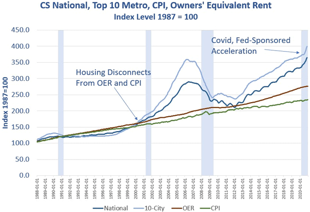
Source: MishTalk
Starting about 2000, and becoming increasingly severe, there was a huge divergence between housing prices and OER. The gap shrank as the Great Recession unfolded, but took off again as it became clear the Fed wouldn’t tighten policy. The 2013 “Taper Tantrum” looks like a turning point in that regard.
And here we are. OER is the single biggest component in CPI at 24%. It rose 2% in the last year. The Case Shiller Home Price Index is up over 10% in the same period. Substituting the Case Shiller index for OER, as Mish did in this next chart, shows 3.5% total inflation, not the 1.4% that the CPI suggests, and which is even less in the PCE measure.
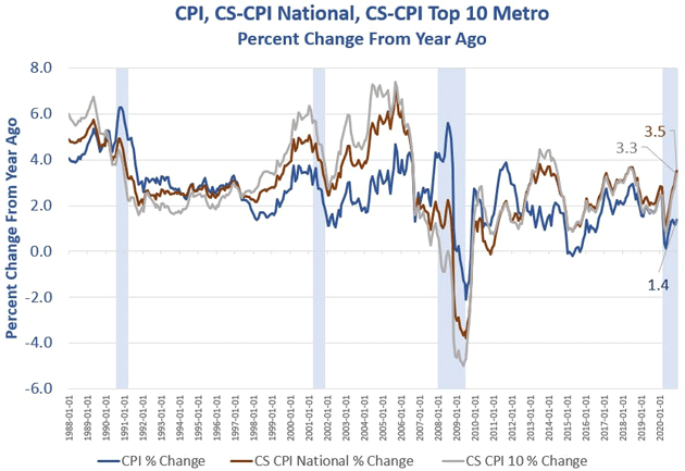
Source: MishTalk
Painful Solution
Now, imagine an alternate universe in which, ahead of the Great Recession, the Fed had looked at inflation based on housing prices instead of implied OER. Instead of cutting rates to stimulate growth, they would have likely raised rates to fight the obvious inflation.
You can go back even further. If Greenspan had raised rates because of rising inflation starting about 2003–4, there would have been no housing bubble, no subprime crisis, no overheated stock market, and no stock market crash. We would not have had the worst unemployment numbers since the Great Depression. Retirees and everyone else would have been able to earn reasonable yields on fixed income instruments.
Wouldn’t higher rates have killed the stock market? I don’t think so. It might have risen less, but based on productivity and profits instead of irrational exuberance. I think most investors would prefer reasonable growth and no market crashes.
People hail Greenspan and Bernanke as some kind of maestros who orchestrated an economic symphony. I disagree. I think their actions were the root cause of the Great Recession, just as Yellen and now Powell and his successor will cause the next crisis. Artificially low inflation benchmarks, due in large part (though not exclusively) to the housing mismeasurement, give them the justification they need to give Wall Street (and increasingly Main Street) what it wants.
The data is very clear to anybody who wants to look, and especially to the Fed. They simply refuse to pay attention because it doesn’t fit the narrative they want everyone to believe.
You could argue that the Fed should normalize rates based on the above measurement. Paul Volcker in the 1970s was the last Fed chairman willing to do that. There is zero appetite at any central bank in the world to embrace such a philosophy.
Thanks to years of mistakes, Powell is locked into a policy trajectory that leads nowhere good but also can’t be changed without enormous pain.
What Will Inflation Be?
Inflation in February was benign. But starting with March, because of the COVID effect, the year-over-year comparisons will begin to show higher inflation. If you go back two years inflation will still look benign, but that is not what the BLS or the media will do. They will focus only on one-year change. And for March through June/July, the comparisons will probably show inflation rates well above 2%. Before the end of summer, combined with the recent stimulus package, it could actually approach 3%.
I believe this will be transitory, but the bond markets will see those numbers and want to push interest rates higher. The Fed will tolerate higher interest rates on the 10-year bond up to a point. They have said they would be willing to accept 3% inflation for a time, but they also want to keep interest rates down. Without actually implementing Yield Curve Control, per se, they can simply modify their bond buying to include longer maturities, and/or increase the volume of US government bonds they buy.
The previous administration was certainly willing to run up the deficit. The current administration is going to do so on steroids with infrastructure and other programs, on top of the just-passed COVID relief. The Federal Reserve’s balance sheet is around $7.5 trillion now, and rising some $120 billion per month.
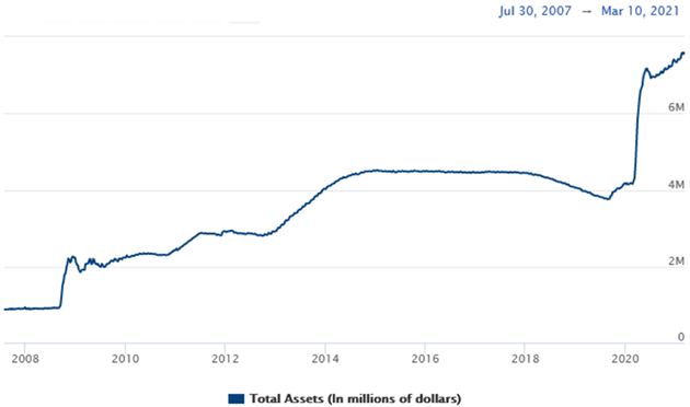
Source: Federal Reserve
The fiscal 2021 US deficit will certainly be more than $4 trillion and approaching $5 trillion, and the Treasury has more debt that has to be rolled over. The US government simply can’t afford higher interest rates. Financing costs would overwhelm the budget. Further, we are beginning to see Treasury auctions coming in “weak,” meaning investors demand higher yields.
The Federal Reserve is going to become the buyer of last resort, exactly like the central banks in Japan, the ECB, and to some extent the UK are. I expect the consequences will be much the same: lower GDP growth.
I’m asked all the time, how long can this go on? Probably longer than we can imagine. It will continue until it doesn’t. The Federal Reserve will continue to hold rates down, punishing savers and retirees. Their policies will aggravate wealth and income differences but no one will deal with the actual causes.
In summary, nothing is really going to change in terms of Federal Reserve policy. It will keep using broken data to justify its loose monetary policies, the monster deficits will require them to purchase even more Treasury bonds and, given their presuppositions, they really have no choice.
They will continue on that course until there is a crisis, and then they will double down. There is absolutely no way to know when that will happen. Japan and Europe have gone on for a long time. There is no reason to think the US can’t. Powell and whoever succeeds him will echo Mario Draghi’s “Whatever it takes” line.
I don’t want you to fight the Fed, but at the same time you don’t have to play the game. You have alternatives. Think in terms of an absolute return strategy, combined with value-oriented companies and more active management. Friends don’t let friends buy passive index funds. Not in these times.
What’s in Your Investment Kitchen?
To that point, a brief commercial. In a world of high valuations, zero-bound Treasury rates, and junk bonds yielding 4.1%, what does an investor do? You look for new portfolio ingredients. At CMG and our partners (like my old friends at Alphacore who have joined the Mauldin Team), we now have scores of offerings designed to help you meet your personal goals. Cash flow/income strategies in the mid-to-high single digits, absolute return strategies uncorrelated with market fluctuations, highly targeted dividend strategies, and exciting growth opportunities from my network of relationships. We have begun to refer to all of the above as the Mauldin Kitchen. To show you what’s in our kitchen, whether you need an appetizer (a single idea) or a full portfolio meal, I have prepared a short special report called “What’s in Your Investment Kitchen?” Simply click on the link to get your copy. I would be very surprised if some of the ideas in my kitchen don’t tempt your investment palate. And I’ll be making a few calls myself to get a feel for what it is that you are really thinking about, what’s important to you, and what you need. So don’t be surprised if you get a call from me.
Puerto Rico and the Future of Travel Plus SIC
I am still here in Puerto Rico, enjoying the gym and beaches and my unusual research/writing, visiting with friends, but I am so ready to get back on a plane and travel a little bit. The key words in that last sentence are “a little bit.” I’ve been talking with numerous friends who prior to the pandemic did a lot of traveling for both business and pleasure. Without exception, every one of them says that, while they are looking forward to traveling for pleasure, they anticipate significantly less business travel.
While all the “futurists” told us that we would be doing more videoconferencing instead of travel, the predictions in 2019 were that that future would arrive somewhere in the middle of the 2020s. We would gradually get used to it. The pandemic forced it on us faster. And the reality is that where in the past you might go to see a client and talk to 10 people, now you will probably find three in the office and the rest patched in by video. You might as well do a video unless a face-to-face meeting is required.
I fully intend to start traveling again after my second vaccine shot and SIC. First up will likely be a trip to New York City, for both business and pleasure. I have so many friends there and I enjoy the conversations around the dinner table. Plus media and business. Over the last decade I averaged around 200,000 air miles per year. I’ll bet I struggle to get 100,000 in the future. It is going to be a long time before I travel to in-person conferences in Europe and Asia. It is basically the same with my friends—though I think leisure travel may actually increase for a few years. People are ready to get out.
I’ve been spending a great deal of time filling out the final sessions for the Strategic Investment Conference. This is clearly going to be the best ever. If you have attended SIC before, you know what I mean. Of course it will be virtual, and you can sign up here. It will be five days over May 5–14, with the most powerful lineup and panels we have ever had. You’re going to want to join us. You can watch it live or at your convenience, plus get transcripts and bonuses. We are doing this right.
With that, let me hit the send button and wish you a great week.
Your looking forward to the future with optimism analyst,

John Mauldin