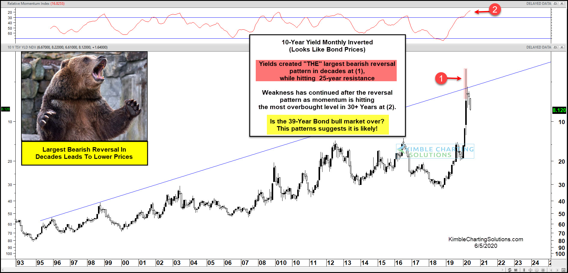
10 Year US Treasury Bond Yield “inverted” Chart
This chart should look familiar, as I’ve shared and updated it a few times to alert clients and readers.
It is the 10 Year US Treasury Yield Chart… inverted.
As you know, bond yields and price move in opposite directions. So this is a way to analyze and think about bonds. And as I’ve pointed out before, inverted charts can also reduce bias.
As you can see, bond yields created the largest reversal pattern in decades. When inverted (as this chart is), yields look like bond prices. So this is action is very bearish for bond prices on a long-term historical basis.
Could the 39 year bull market in bonds be over? Sure looks like it. Stay tuned!
Trending:
- Deutsche Bank Is On The Brink Of Collapse: Get Prepared For The Next Lehman Brothers Moment
- The Truth About the Uprising in Israel
- Hillary Clinton leaked emails reason to get rid of Gadaffi
- The recession is here, the market crash is next.
- Shocking Biden hot-mic reveals how handlers program his every move WATCH. Yes, this is 100% real.
- Forget the Global Collapse. Be Mad at Trump and Putin Instead.
- The Most Common Lie Used to Justify Third World Immigration Was That It Would “Improve” Western Economies
- Woman beats herself with hammer to frame boyfriend for abusing her and it worked until her friend released this footage…
- Trans terrorist kills Christian kids. Media:
- The ‘Trans Resistance Network’ has released a statement that Audrey Hale is the real victim in the Christian school shooting
Views: 4