Wolf Richter wolfstreet.com, http://www.amazon.com/author/wolfrichter
Top 20% households made out like bandits, bottom 40% got crushed.
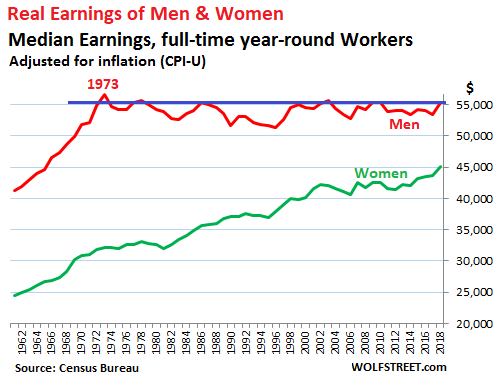
The median earnings of men working full time year-round in 2018 ticked up to $55,291. Adjusted for inflation, this was below the amount they earned in 1973, according to the annual data trove released by the Census Bureau today. In other words, there has been a “real” income decline for men over the past four-plus decades!
Women have seen a lot of progress in their real earnings, but they started out much lower, and they still haven’t caught up with men – whose earnings are sitting ducks. The median earnings of women working full-time year-round in 2018 ticked up to $45,097, a new record. Since 1973, women’s earnings adjusted for inflation have surged by 40%. The female-to-male earnings ratio hit a record in 2018 of 81.6%, up from 56.6% in 1973:

“Median earnings” means half earn more, and half earn less. Even though the Census Bureau publishes the earnings history of men and women for all to see, in the media you will not readily find this history – that the real earnings of men in 2018 were below where they’d been over 45 years ago.
It’s a very uncomfortable topic: Women deserve every penny in earnings increases, and there should have never been such a gap between men’s and women’s earnings in the first place. But men’s real earnings are a fiasco.
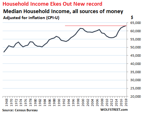
What you will find in the media instead is “household income,” total, all forms of income combined by all members of the household – which is politically a lot more correct.
Household income, adjusted for inflation but before taxes, doesn’t look that hot either. But soothingly, in 2018 it set a new record of $63,179. This was up 19% from 1973, roughly the average of the 40% surge for women and the slight decline for men:
“Earnings” in this data are the fruits of labor – wages, salaries, and the like (first chart).
“Household income” (second chart) includes “earnings” and other “money income” from all household members, from these income sources:
- Earnings from work
- Unemployment compensation
- Workers’ compensation
- Social security
- Supplemental security income
- Public assistance
- Veterans’ payments
- Survivor benefits
- Disability benefits
- Pension or retirement income
- Interest
- Dividends
- Rents, royalties, and estates and trusts
- Educational assistance
- Alimony
- Child support
- Financial assistance from outside of the household
- Other income
“Household income” is measured on a pretax basis. But it does not include noncash benefits, such as food stamps, subsidized housing benefits, or healthcare benefits — a biggie for executives at big companies. And it does not include capital gains, a biggie among the top income groups.
The income from investments (items 10, 11, 12, and 13 in the list above) play a critical role at the upper end of the distribution of household income.
And this is how the median household income, pretax and adjusted for inflation, has changed since 1967, by income segment (quintiles) and for the top 5% (red line):
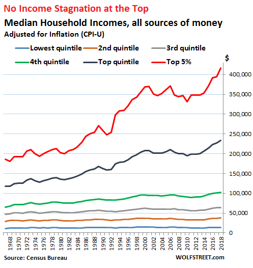
Since 1967, the inflation-adjusted household income of the top 5% has soared by 125%, or by $231,224, to $416,520 in 2018 (not including capital gains).
But at the lowest quintile, household income ticked up only by $3,228 over the same period to just $13,775 and for the second quintile, it rose only by $8,072 to $37,293.
In 1967, the top 5% of households made 17.6 times more money than the lowest quintile. In 2018, the top 5% made 30 times more – not including the huge capital gains in recent years.
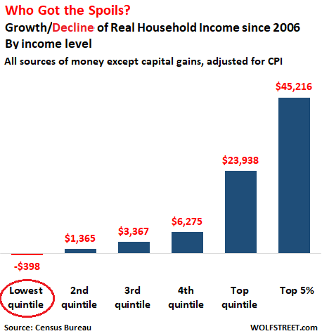
In terms of a more recent time frame: Over the 12 years since 2006 – so just before the Financial Crisis – the median household income, adjusted for inflation, at the lowest quintile fell by $398 to $13,775, while for the top 5%, it soared by $45,216 to a glorious $416,520:
And among men… Given that the median earnings adjusted for inflation have declined over the past four decades, even as earnings at the top have zoomed higher, the earnings at the lower end for men have seen substantial shrinkage.
This real-wage repression has occurred as a result of inflation, an insidious process whereby nominal wages inch up, but not quite enough to keep up with the Fed-engineered loss of purchasing power of the dollar that labor is denominated in.
And it gets a lot worse: “Inflation” as measured by CPI and “cost of living increases” are entirely different animals.
Many goods and services, including new cars and trucks, have seen very little or no “inflation” over the past 20 years as measured by CPI, though their actual prices have risen by a lot. As these products or services have gotten a better (in cars, it’s safety features, performance, additional equipment, and the like), you have to pay more. But because you get more, those increases in price that are related to quality increases are not considered “inflation,” though they raise the “costs of living” (here’s my story on how this works, including a chart about new vehicles inflation). And it makes sense to distinguish the two.
But the result is that the real earnings of men can no longer buy what they used to be able to buy, and their standard of living has sagged.
If you want to know why so many men are seething, it’s because the incomes of men in the lower half of the income spectrum gotten crushed by real-wage repression over the past decades, while incomes at the upper echelons have skyrocketed. For those whose incomes have skyrocketed, the surge in costs, such as housing costs, is no problem; but for those at the lower echelons, it’s an existential crisis.