Authored by David Stockman via Contra Corner blog,
If you want to understand why we are heading for a financial Gotterdammerung, just consider the specious nonsense and mendacious cant that issued from JayPo’s post-meeting presser last week. It’s all the worse because this drivel is not just his opinion – it embodies the oppressive groupthink of the entire central bank and its Wall Street megaphones, servitors and overlords ( e.g. Goldman Sachs).

In again insisting there were no visible signs of excessive speculation and threats to financial stability ( viz. why would Wall Street admit otherwise?), Powell claimed, among other things, that the undeniable eruption of business borrowing since the financial crisis was no sweat whatsoever.
In fact, he claimed that business and household debt were two of his four measures of financial stability and that all was copacetic on those fronts:
In terms of households and businesses, households entered the crisis in very good shape by historical standards. Leverage in the household sector had been just kind of gradually moving down and down and down since the financial crisis. Now, there was some negative effects on that. People lost their jobs and that sort of thing. But they’ve also gotten a lot of support now. So, the damage hasn’t been as bad as we thought. Businesses, by the same token, had a high debt load coming in. Many saw their revenues decline. But they’ve done so much financing, and there’s a lot of cash on their balance sheet. So, nothing in those two sectors really jumps out as really troubling.
WTF is he talking about?
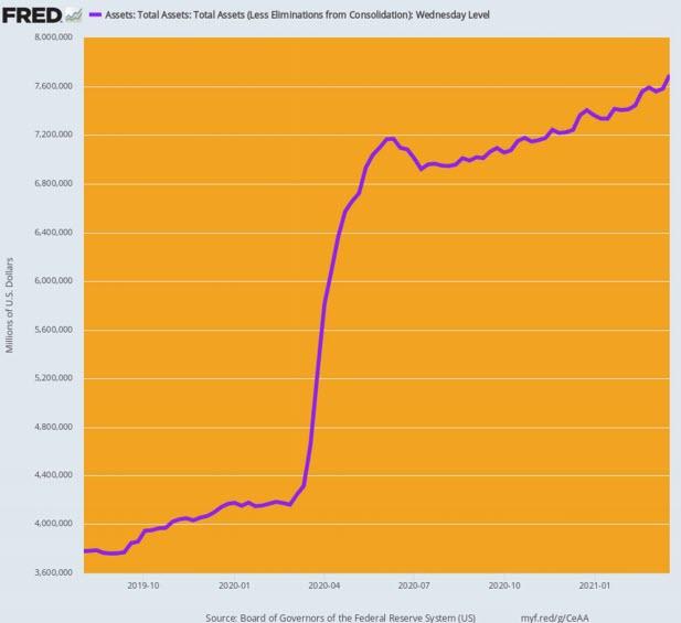
During the 19 months since August 2019, the Fed has injected a staggering $3.9 trillion of freshly minted cash into the canyons of Wall Street. Some of this massive balance sheet expansion temporarily ended-up as elevated business and household cash balances for one simple reason: The fiscal authorities and the red hot corporate/junk debt markets have been dispensing the Fed’s tsunami of cash faster than households and businesses can actually spend it!
And this is called evidence of financial health and stability?
No, it’s self-evidently a mindless, over-the-top experiment in money-printing that all of history and all of the laws of rational finance militate against.
After all, how can you call a 103% expansion of the Fed’s balance sheet rational during a 19 month period in which the indicators of main street activity have all fallen backwards?
Percent Change: Q4 2020 Versus Q3 2019
- Federal Reserve balance sheet: +103%;
- Nominal GDP: -0.2%;
- Business sector value added: -0.6%;
- Industrial production: -3.3%;
- Total labor hours worked: -5.1%%;
Federal Reserve Balance Sheet, August 2019 to February 2021
In the sections below, we demonstrate how Washington has turned the Fed’s massive outpouring of fiat credits into a simulacrum of excess “savings” in the business and household sector, when the truth of the matter is that both are drowning in record debt.
The fact that JayPo would focus on these utterly artificial and transient cash balances while ignoring the record $34 trillion of debt held by the household and nonfinancial business sectors combined is surely not an oversight; it’s mendacity of the first order, or, less politely, a pack of lies.
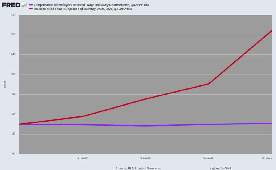
First, consider the explosion of checkable deposits and currency held by households. Between the pre-Covid benchmark in Q4 2019 and Q4 2020, these balances soared by nearly $2 trillion or 189%. That was off the charts of history as shown below.
In fact, the checkable deposit/currency level was virtually flat at $1.0 trillion between early 2014 and the end of 2019, and only erupted skyward when the stimmy checks, UI top-ups and other Washington free stuff began pouring into households in April 2020.
Household sector balances of checkable deposits and currency, 2000-2020

Moreover, balances in savings and money market accounts also rose substantially during the year of the Covid. These account balances stood at $12.4 trillion in Q4 2019 and had risen by $838 billion to $13.2 trillion by Q4 2020.
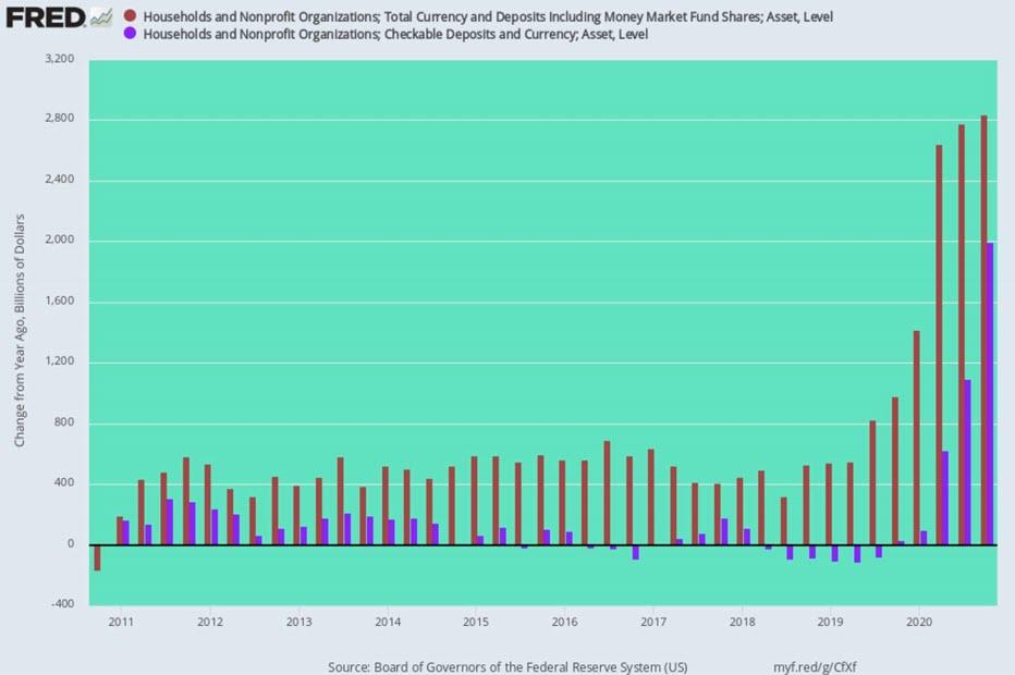
In all, combined household cash accounts–checking, savings and money markets—stood at an off-the-charts $16.49 trillion at the end of Q4 2020. That represents a $2.8 trillion gain during this 4-quarter period (brown bars in the chart below).
For perspective, the total deposit gain during 2019 compared to 2018 was just $980 billion or only 34% of the gain during 2020. And during 2018 and 2017, the gain was just $525 billion and $405 billion, respectively.
In any event, the chart below tells you all you need to know. Until the 2020 outbreak of Fed money printing and Washington Everything Bailouts, the year-over-year gain in total household cash account balances (brown bars) varied between $400 billion and $800 billion, while checking account balances alone (purple bars) barely changed at all.
Year-Over-Year Change In Total Household Cash Account Balances (brown) and Checking Accounts (purple), 2011-2020
Needless to say, the above eruption in America’s checking and other cash accounts did not happen because wages and salaries were booming, thereby providing the wherewithal for a $2.8 trillion gain in available cash. Actually, between Q4 2019 and Q4 2020, aggregate wage and salary disbursements rose by only an anemic $40 billion or just 1.4% of the gain in cash deposits!
No, America did not go on an ultra-austerity diet on the consumption spending front, either. Between Q4 2019 and Q4 2020, personal consumption expenditures declined by only $320 billion or 2.2%, notwithstanding the lockdowns and stay-at-home orders. These so-called Covid mitigation measures mainly caused consumption spending to shift from services that were closed by orders of the state to goods that could be ordered on-line and delivered to the doorstep.
Taken together, higher wages and lower spending add up to just $360 billion over the four quarter period, and this change accounts for just 13% of the surge in checking and other cash deposits.
So the question recurs: Is there something wrong with the NIPA (national income and products accounts) math or is JayPo’s assertion that households are financially solid because they’ve got a lot of cash just a load of self-justifying baloney?
The answer, of course, is yes and yes.
The NIPA accounts were designed by Keynesian economists 80 years ago and are inherently flawed; and the current head of the most powerful financial institution on the planet does not, apparently, even know the difference between Fake Fed Credit and real money savings obtained from income and profits earned in the production of goods and services.
Four-quarter Change in Household Checking Accounts Versus Wage and Salary Income, Q4 2019 to Q4 2020
Actually, it doesn’t take too much digging to identify where all the household cash came from. To wit, it’s the spawn of Washington’s frenzied descent into the distribution of free stuff to compensate for the mayhem caused by the Virus Patrol.
As it happens, much of the spending included in the Everything Bailouts is recorded as transfer payments in the NIPA accounts, and self-evidently that’s were most of America’s currently bulging cash account balances came from.
For want of doubt, the chart below shows that the pre-Covid government transfer payment level in February 2020 stood at $3.109 trillion on an annualized basis or about $777 billion on an actual monthly basis. Since this was already by far the highest level in history, we compute the monthly gains above that level as the “excess” transfer payments flowing from the Everything Bailouts.
That is to say, the preponderant share of the bulge in household cash balances was not “savings”; it was free stuff from Washington fresh off the Fed’s printing press one step removed.
- February 2020 Transfer Payments: $777 billion;
- March gain: +$7 billion;
- April gain: +$282 billion;
- May gain: +$189 billion;
- June gain: +$144 billion;
- July gain: +$139 billion;
- August gain: +$76 billion;
- September gain: +$74 billion;
- October gain: +$53 billion;
- November gain: +$43 billion;
- December gain: +$49 billion;
- January gain: +$214 billion;
- 11-month gain: +$1.270 trillion.
Government Transfer Payments: February 2020 to January 2021

On the nonfinancial business side, the gain in total cash account balances was also substantial, rising from $3.58 trillion in Q4 2019 to $4.66 trillion in Q4 2020. That’s a pick-up of $1.1 trillion or 30%, and it compared to the more ordinary $270 billion or 9% gain during the previous year (2019 over 2018).
Yet why Powell would choose to focus on this self-evident pass-through of the Fed’s own fiat credit is self-evident. He’s trying to hide the massive debt elephant in the room.
After all, what really happened in the nonfinancial business sector last year begins with the fact that the US Treasury’s massive debt issuance was almost completely monetized by the Fed. In turn, some of the resulting cash—all of which was plucked from thin air— was cycled into the Paycheck Protection Program and other targeted business bailouts such as the airline subsidies and tax cuts.
As it happened, the first $4 trillion of Everything Bailouts (excluding the $1.7 trillion Biden Boondoggle) included $950 billion for the PPP program and another $750 billion for business tax cuts, airlines, emergency business loans etc.
So surely some substantial portion of the $1.1 trillion pick-up in nonfinancial business cash balances represents the pass-thru of this massive $1.7 trillion cash infusions from the US Treasury and the Fed.
In short, the bloated cash balances of the business sector are a red herring. And if Powell nevertheless wishes to engage in such distractions, we are compelled to inquire as to just how long the Fed heads think this frog can boil?
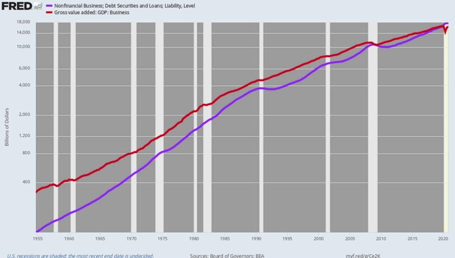
We are referring, of course, to the real financial condition of the business sector: Namely, the relentless rise of debt relative to the value-added generated by corporate and non-corporate businesses combined. As is evident in the chart below, the business leverage ratio has been climbing steadily since the 1950s, but when the Fed went full retard with money printing and extreme interest rate repression after the financial crisis, the business leverage ratio shot the moon.
Self-evidently, the Keynesian money-pumpers who now dominate the Fed are blithering know-nothings when it comes to history of more than a few years back. Otherwise, how do they explain that during the halcyon days of American business growth in the 1950s and 1960s, the business debt-to value added ratio was a mere fraction of today’s levels, yet American business prospered mightily?
In fact, in 1954 business debt (purple line) was only 38.6% of business value added. Thereafter at key inflection points when the monetary regime lurched to increasingly bad money, the leverage ratio kept rising to today’s 109%, while domestic business growth kept slowing.
Business Debt To Business Value Added Ratio:
- Halcyon Days of the 1950s (Q4 1954): 38.6%;
- Eve of Nixon’s Folly severing the dollar from gold (Q2 1971): 61.3%;
- Greenspan’s arrival at the Fed (Q2 1987): 80.5%;
- Peak of the Greenspan tech boom (Q4 2000): 82.0%;
- Pre-crisis financial bubble (Q4 2007): 90.6%;
- Current Peak after 13-years of relentless money-pumping (Q4 2020): 109.0%
Since the pre-crisis peak in Q4 2007, the purple line has decisively crossed-over the red line (business value added), and the resulting figures speak for themselves.
During the last 13 years, business value added has grown at an anemic 2.94% per annum rate—by far the lowest growth rate since 1950. In fact, $7.6 trillion of debt growth since Q4 2007 has generated only $5.1 trillion of additional business value added.
By our lights, that’s pretty dramatic evidence that the Fed is spinning its wheels into a dead-end.
Nonfinancial Business Debt Versus Business Value-Added,1955-2020
For want of doubt, here is the inflation-adjusted growth rate of business sector value added for broad intervals since 1954. It is gobsmackingly evident that as the leverage ratio has steadily risen (per above) the trend rate of real growth has steadily weakened.
Per Annum Growth Rate of Real Business Value-Added:
- Q4 1954 to Q4 2000:4: 3.68%;
- Q4 2000 to Q4 2007: 2.82%;
- Q4 2007 to Q4 2020: 1.54%
In short, money-pumping by the Fed has caused US businesses to drastically elevate their leverage ratios, but the added debt has not gone into productive investment in plant, equipment, technology, human resources and production. The proof is in the pudding: Business value-added growth since the 2007 pre-crisis peak has been only 42% of the 1954-2000 average.
To the contrary, the Fed’s interest rate falsification policies have turned business into part-time wagering venues wherein cheap debt has progressively lured business executives into the financial engineering business. And, by definition, the purpose of financial engineering is to goose asset values, not business production and value added.
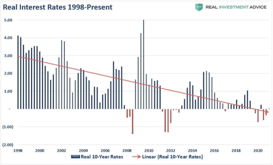
And when it comes to the matter of deliberate falsification of interest rates, the jury is in. Since the late 1990s, the real or inflation-adjusted rate on the 10-year UST benchmark has plunged from a historic 3.0% range to the actual negative real interest rate levels which currently prevail.
So while Powell insists on gassing about no financial stability problems in the household and business sectors, the Fed’s policies have actually unleashed a tsunami of dangerously debilitating debt in both the household and business sectors.
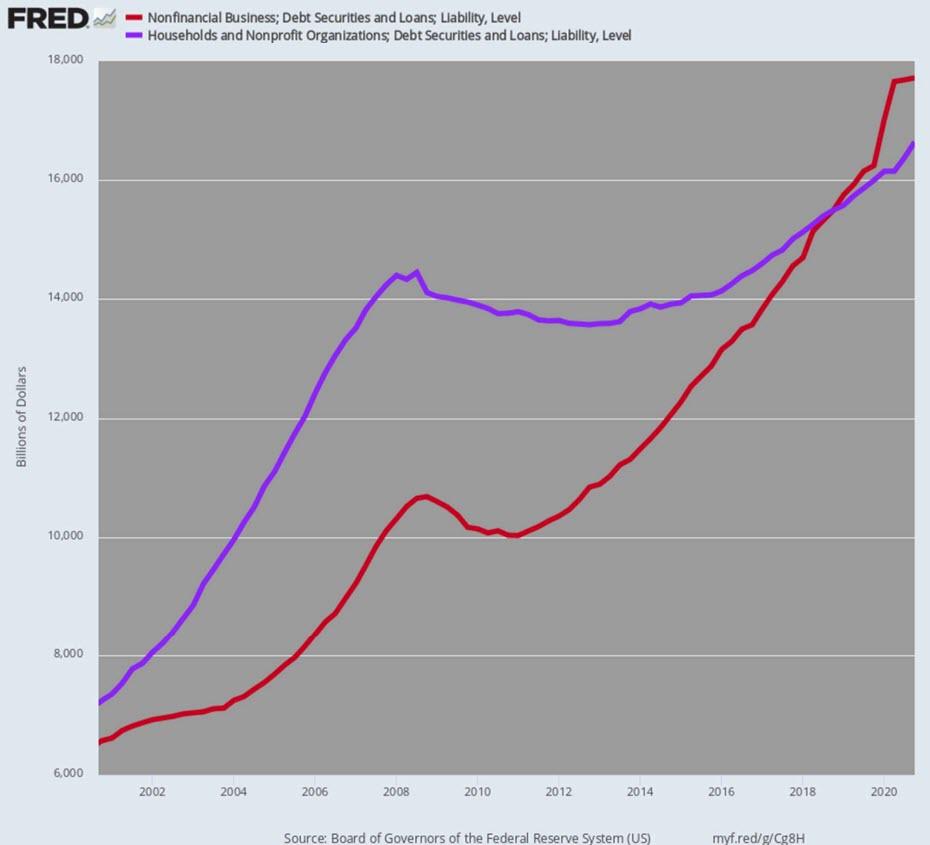
Since Q4 2000, combined debt has risen from $13.8 trillion to $34.4 trillion. In turn, that 150% gain in household and business debt outstanding far outpaced the 105% expansion of nominal GDP during the same 20-year period.
Total Business and Household Debt Outstanding, 2000-2020
Of course, while JayPo was completely ignoring the towering edifice of debt depicted above, he didn’t spare the rhetoric when it comes to the Fed’s sacred 2.00% inflation target:
“So, we’ve said we’d like to see inflation run moderately above 2% for some time. And we’ve resisted, basically, generally, the temptation to try to quantify that. Part of that just is talking about inflation is one thing. Actually having inflation run above 2% is the real thing. So, over the years, we’ve talked about 2% inflation as a goal, but we haven’t achieved it. So, I would say we’d like to perform. That’s what we’d really like to do is to get inflation moderately above 2%. I don’t want to be too specific about what that means, because I think it’s hard to do that. And we haven’t done it yet. When we’re actually above 2%, we can do that. I would say this: the fundamental change in our framework is that we were not going to act preemptively based on forecasts, for the most part. And we’re going to wait to see actual data. And I think it will take people time to adjust to that. And to adjust that new practice. And the only way we can really build the credibility of that is by doing it. So, that’s how I would think about that.”
The above miasma of words is simply a pack of lies. Any competent economist knows that the Fed’s sawed-off ruler called the PCE deflator is not a measure of the average price level change in a fixed basket of goods and services; it’s a cost-of-living index which drastically under-weight housing and medical costs, and continuously re-weights the component price items to nullify the actions of households and businesses on the free market.
That is to say, in response to the Fed’s insensible pursuit of MOAAR inflation, consumers tend to substitute lower cost items, such as chicken, for higher cost items, such as beef. Alas, the geniuses in the Eccles Building then interpret the cost minimizing behavior of consumers as evidence of lower inflation!
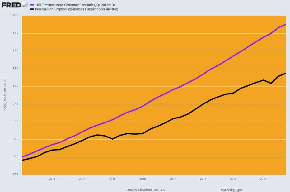
As the man says on later night TV, you can’t make this stuff up, but here it is: The best general price index from the government statistical mills is the 16% trimmed mean CPI, and since January 2012 when the Fed formally adopted its 2.00% inflation target, this index is up by 1.99% per annum. That’s more than close enough to 2.00% for government work.
By contrast, the PCE deflator is up by just 1.34% per annum, causing the Fed to keep pumping its balance sheet and repressing interest rates to the zero-bound on the grounds that its faulty index is not showing enough inflation.
Moreover, with every passing month, the gap between actual inflation and the Fed’s faulty PCE deflator widens. This gap has now given rise to the even more risible claim, contained in JayPo’s blathering above, that the Fed needs to let inflation run hot (i.e. above 2.00%) in order to catch-up on the phony inflation shortfall depicted below.
Cumulative Increase in 16% Trimmed Mean CPI Versus PCE deflator
Since January 2012 Meanwhile, the always cogent Lance Roberts reminded in a post this morning about the effect the Fed’s insane inflation targeting and interest rate repression is having on the old-fashioned households which actually attempt to save for retirement, rainy days and the other unforeseen contingencies of life.
To wit, the return on $1 million of 10-year USTs has dropped by 71% since the turn of the century. And, oh, Lance was given the Fed the benefit of the doubt – the chart below is in nominal dollars.
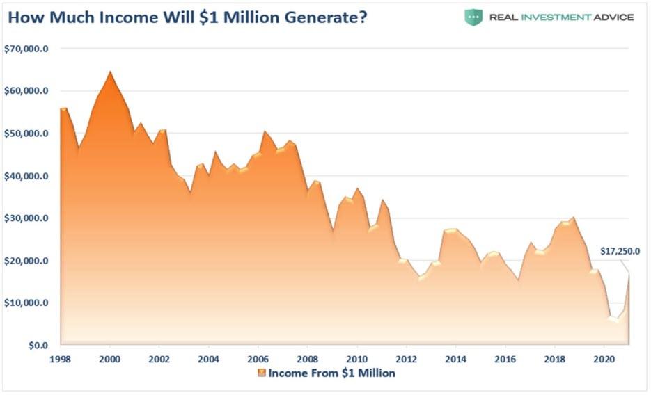
As it happens, the 16% trimmed mean CPI has risen by 2.12% per annum since the year 2000. So in real terms earnings from that $1 million of savings are downs by 81%, and the purchasing power of the principle now stands at only $650,000.
Meanwhile, the debt-entombed US economy is beginning to get a whiff of the inflation the Fed has so assiduously attempted to generate.
Specifically, the price of lumber per thousand board feet is at $1,044, according to Random Lengths. That’s an all-time high, and up 188% since the onset of the lockdowns, COVID-19 panic and massive Fed money printing. The National Association of Home Builders calculates that current lumber prices are adding at least $24,000 to the price tag of a typical new single-family home.
Yet sometimes a picture is worth a thousand words, and this one is surely the case.