chart
Cruisin’ With Yellen And The FOMC! The Banking “Crisis” In One Chart

by confoundedinterest17 Janet, are you kidding? As The Fed attempts to fight inflation, rates are rising. Consequently, deposits are all commercial banks are falling. The Fed just released its weekly commercial bank data dump showing deposit inflows/outflows. Two things to note: …
Michael Burry Scatter Chart of the Coming Bank Failures
pic.twitter.com/CExu8MbtbK — Michael Burry Archive (@BurryArchive) March 18, 2023 chatgpt: Quadrant 1 (top left): Banks in this quadrant have a relatively low percentage of deposits greater than 250k % of total (below the median of 30%) and a relatively low …
This chart reveals why Fed, US Treasury & FDIC now bailing out the whole US banking system….
This chart reveals why Fed, US Treasury & FDIC now bailing out the whole US banking system. US banks are sitting on bond losses of $600bn. These are still book losses in HTM accounts, but if customers had withdrawn their …
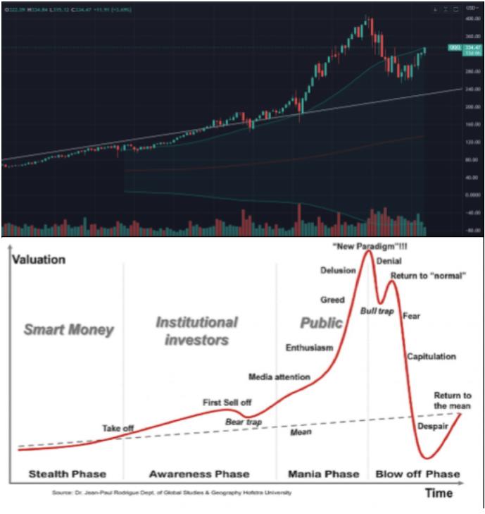
Tesla stock will sell off this month after ‘off the chart’ rally as retail investors lose excitement over Elon Musk, research firm says
Vanda Research sees a sell-off coming for Tesla stock later this month after a hot start to 2023. Retail investors have piled into the EV-maker’s stock, but Elon Musk’s recent announcements fell flat. “The current environment is more favorable for …
Look again at this chart and ask yourself why bond yields should be low?
Look again at this chart and ask yourself why bond yields should be low? Market keeps pricing more MMT (selling bonds) or the fact that debt is unproductive and require way way way way higher yields (pushing the same time …
Look at this chart! $50,000 per student and NO ONE can read…
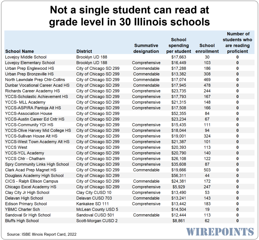
Spry Community Links High School, in the Heart of Little Village in Chicago, says its vision is to “provide a challenging and supportive environment…to enable our students to succeed in the 21st century.” Number one on the school’s focus list? …
Forget the Forecasts, This Chart PROVES Inflation Won’t Disappear Anytime Soon
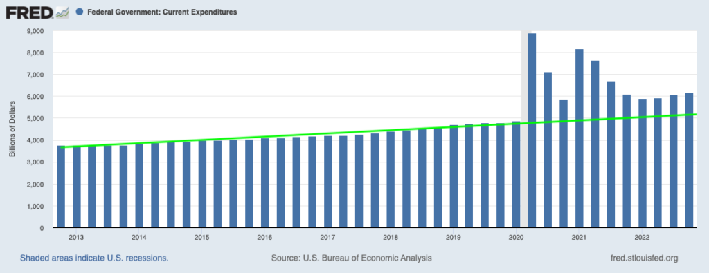
By Graham Summers, MBA If you want to find out what is causing inflation… and why it won’t be going away anytime soon no matter what the Fed does, look no further than the below chart. This is a chart …
This chart clearly shows why gold is undervalued
The dollar standard thrived because the world was relatively stable in terms of war, US financial markets were deep and liquid, inflation was low, and the US was the military superpower through which it could impose the world the use …
CHART: Stocks Are Still Very Expensive
Wilshire 5000 Market Cap to GDP is still well above the madness of the 2000 super bubble peak. Con artists want you focused on short-term catalysts and not on the bigger (more important) picture. pic.twitter.com/CuSf6tsGnb — Minsky Moment (@BP_Rising) January …
Chart: Tesla Still Dominates the U.S. EV Market
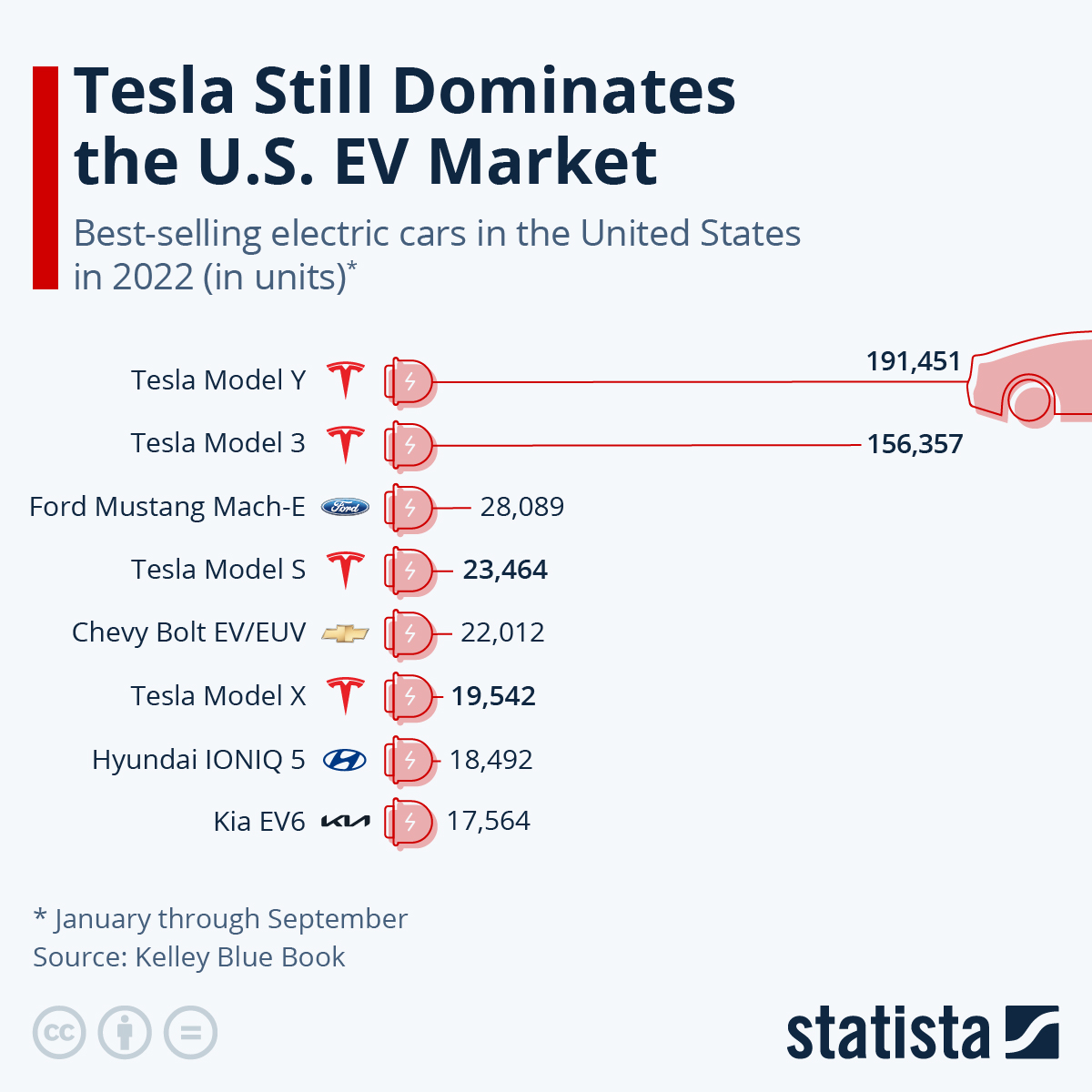
https://www.statista.com/chart/29037/best-selling-electric-cars-in-the-united-states/ h/t HumanJenoM
The 2008 chart setup is so obvious that people won’t believe it’s until it’s too late.
The 2008 chart setup is so obvious that people won't believe it's until it's too late. — Financelot (@FinanceLancelot) December 27, 2022 This year, we have had: 1. Most tech layoffs since 2001 2. Worst drop in tech stocks since …
Financials don’t like an inverted yield curve. This chart predicts full scale meltdown BEFORE the end of 2022.
Financials don't like an inverted yield curve. This chart predicts full scale meltdown BEFORE the end of 2022. pic.twitter.com/71aNAUkBXI — Mac10 (@SuburbanDrone) November 18, 2022 Housing speculators are seeing their “investments” shedding serious Yellen Bux valuations as the Fed’s Housing …
2008 vs 2022 S&P 500 chart continues to run in tandem…
2008 vs 2022 $SPY chart is still very interesting. Continues to run in tandem. pic.twitter.com/F1naNUIE1v — Minsky Moment (@BP_Rising) November 16, 2022
The US Midterm Election In One Chart (Hint: Republicans Favored As Inflation Soars, Biden Unpopular On Kitchen Table Issues)
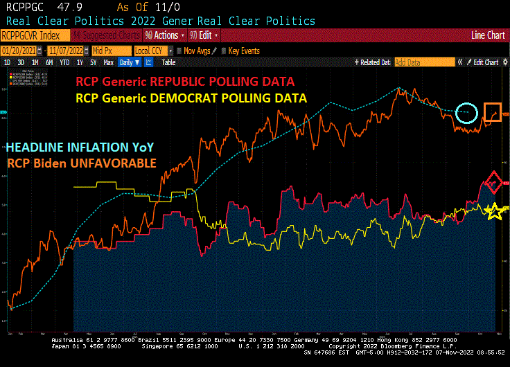
by confoundedinterest17 Here is the US midterm election in one chart. According to Real Clear Politics, the generic Republican polling data FAVORABLE (red line) is at 47.9% while Democrat polling data favorable polling data (yellow line) is at 45.4%, advantage Republicans. …
Blackhawks! Where Interest Rates Are Headed In One Chart (Fed Blackhawks Versus Doves)
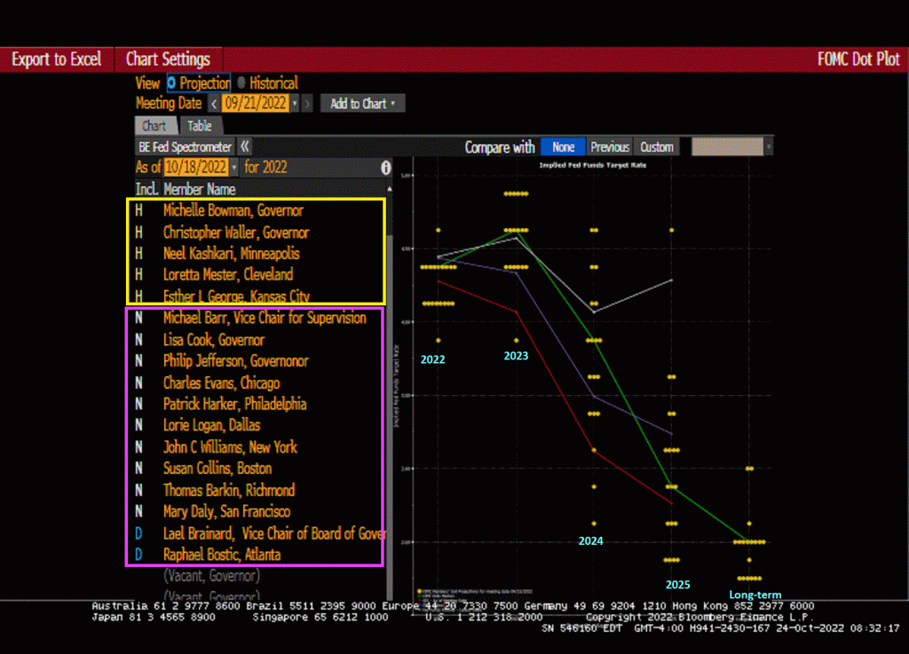
by confoundedinterest17 The Federal Reserve’s DOTS PLOT shows where each Fed official’s projection for the central bank’s key short-term interest rate is headed. As of the September 21, 2022 Fed Open Market Committee (FOMC) meeting, the prediction of future Fed target …
Hurricane #Ian Left One Quarter of Florida in the Dark: Chart – Bloomberg
🇺🇸 Hurricane #Ian Left One Quarter of Florida in the Dark: Chart – BloombergAt its peak, the storm had knocked out power to 2.7M homes and businesses across #Florida, leaving 24% of the state in the dark, according to an …
This chart shows how bad things are in Europe.
This chart shows how bad things are in Europe. Orange: Eurozone Trade Balance (collapsing)Blue: EUR-USD (inverted) When a currency weakens, the trade balance improves. Unfortunately, in the case of #Europe, we are witnessing the #Euro falling and a trade balance …
Chart shows that NZ residential property is currently declining faster than the recent US, Irish, Spanish and Japanese crashes did.
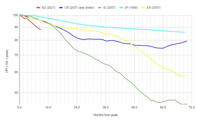
by mark000 Chart by commenter Miguel over at interest.co.nz
If this chart doesn’t scream “Caution!” I don’t know what does
Holy cats! If this chart doesn't scream "Caution!" I don't know what does (h/t @chsm1th ) https://t.co/Ri51z7JaxX — Adam Taggart (@adamtaggart) September 9, 2022 Yikes. pic.twitter.com/RRRdllE4Ns — Pedro da Costa (@pdacosta) September 12, 2022 More evidence of further slowdown in …
Chart shows the worst places to try to sell a house right now…

Big Geographic Component to this Crash. Entire Western Half of America is getting slammed with Inventory. Southeast starting to get hit, too. 🟡 But, amazingly, Midwest and Northeast is still tight. Inventory down YoY in states like NY, VT, and …
Based on this chart there will be no British tourists in Spain next year
https://twitter.com/Macro_Degen/status/1562900768604450817
Shocking chart: Gold and Silver mining stocks as a whole have created zero value in 40 years
Not what the narrative would tell you: Gold and Silver mining stocks as a whole have created zero value in 40 years….and in real terms is much, much lower so it hasn't offset inflation either. This chart quite shocked me. …
$ARKK vs dotcom bubble: This chart simply continues to be amazing. Human nature does not change, only the bubbles change.
$ARKK vs dotcom bubble 👇 This chart simply continues to be amazing. Human nature does not change, only the bubbles change. Ht @t1alpha pic.twitter.com/bbc7KBpRNp — Michael A. Arouet (@MichaelAArouet) July 19, 2022 Nasdaq earnings yield – 5yr tip. NASDAQ now …
What Is This Chart Telling Us About What’s Coming?
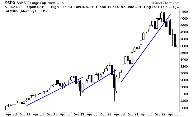
By Graham Summers, MBA Yesterday, I revealed some disturbing news. That news? That the economy is already in recession. It’s not a matter of a recession arriving soon… a recession is already here. By quick way of review… 1) Copper, …
This One Chart Explains Why Economic Collapse Is Inevitable
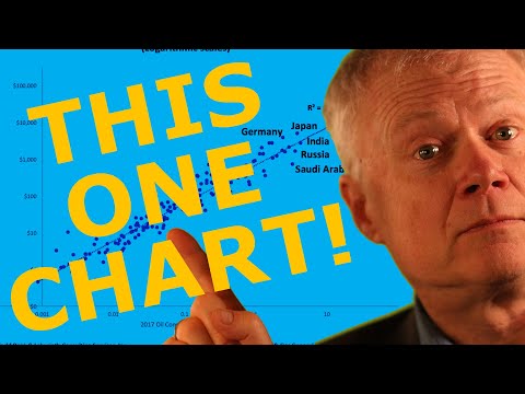
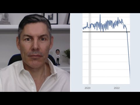
by Chris Martenson of Peak Prosperity PART 2 of this video (Episode 68) can be found at Peak Prosperity using the following link.
Chart compares price of nat gas in US with Europe
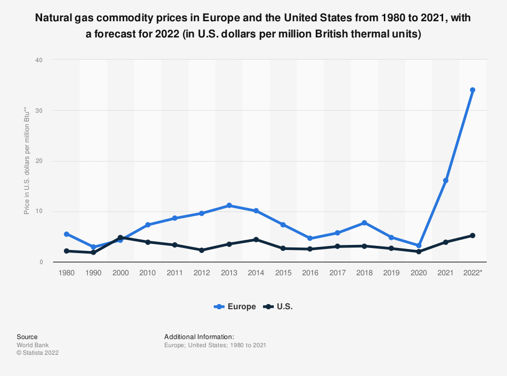
Find more statistics at Statista https://www.statista.com/statistics/252791/natural-gas-prices/
The ECB itself has just released its own version of the ”we got no clue about inflation” chart.
Step 1) Decide arbitrarily that the answer is 2%. Step 2) Draw a line from the current number to 2%. Step 3) It didn't work, let's draw another line. — Lyn Alden (@LynAldenContact) May 25, 2022