With the markets closed for Memorial Day yesterday, our analysis remains. In case you missed it, we updated our potential pathways following last week’s stagnation as follows:
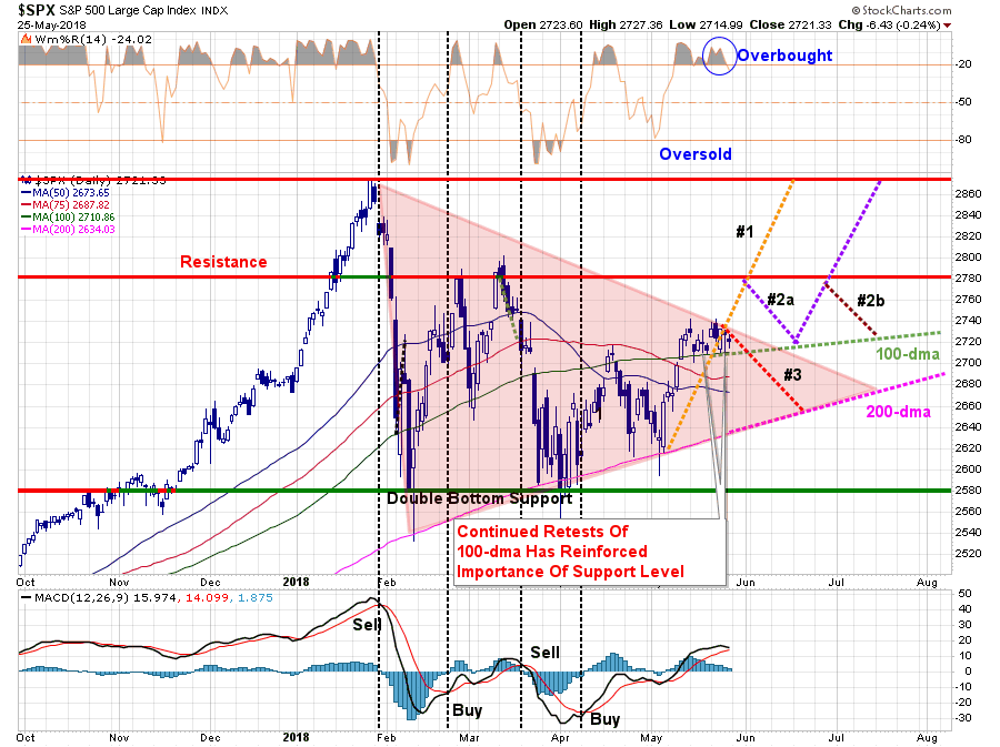
“As shown by the reddish triangle, the ongoing consolidation process continues. Eventually, this will end with either a bullish or bearish conclusion. There is no ‘middle ground’ to be had here.
- Pathway #1 – a breakout to the upside on heavy volume that pushes the market through resistance at 2780 and back to old highs. (Probability 20%)
- Pathway #2a and #2b – a breakout to the upside which fails resistance at 2780. The market then either a) retests the 100-dma and then is able to push to old highs, or, b) fails at 2780 a second time and continues the consolidation process through the summer. (Probability 50%)
- Pathway #3 – the market breaks down next week on continued geopolitical worries, economic data or some unexpected catalyst and retests the 200-dma. (Probability 30%)
I have increased the more ‘bearish’ probability from 20% last week to 30% this week given the potential triggering of a short-term ‘sell-signal.’ (Lower panel) If the market struggles next week, a triggering of that signal will increase the downward pressure on equity prices.
We will continue to hold our cash position until the market makes some determination as to its direction.”
Importantly, while we are still assigning a 70% possibility to more constructive market action, the 30% possibility of more “bearish” action should not be dismissed.
But what does that mean? How big of a correction are we talking about?
Just recently, Jesus Aldana took a shot at answering that very question.
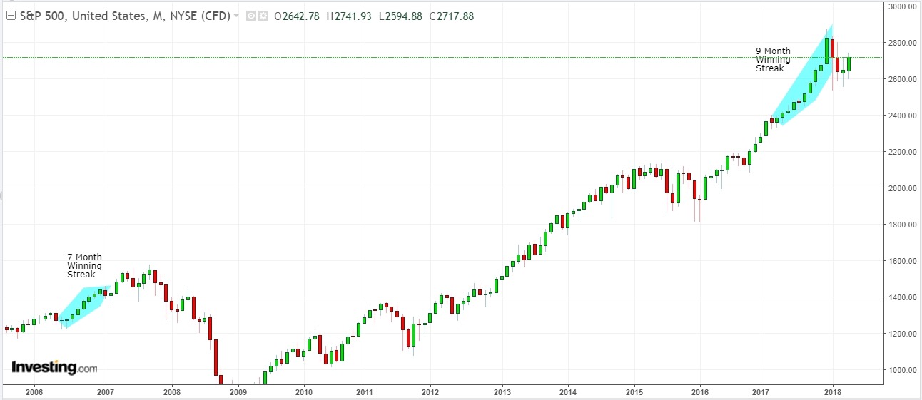
As he showed in his chart below, heading into 2018 the market pushed an unprecedented string of monthly gains not seen since heading into the peak of the market in 2008. Such market exuberance is not uncommon at the peaks of bull markets as remaining “holdouts” are finally sucked in.
The question which must be answered is what needs to happen to start a more significant correction process? Mr. Aldana suggests:
“First signs of a recession are the lack of new highs in the stock market. At this stage, it will be highlighted as a correction, investors aren’t willing to raise their open positions no matter how good the quarterly report is, it’s just not safe to keep pouring money in the market. This stage is already cleared as the S&P 500 hasn’t posted new highs since January.
Technical reversal patterns start to appear like double top, triangles, head and shoulders and others. A reversal pattern gives a good approach as to when a correction could start.”
As he shows in his chart below, the first reversal pattern was already broken and failed to reverse. As I showed this past week, which concurs with Mr. Aldana’s analysis, a second pattern has started to develop which potentially suggests a more important “double top” is in the process of forming. If this is indeed the case, it would likely complete over the next couple of months and could push the S&P 500 to toward new highs at 2950.
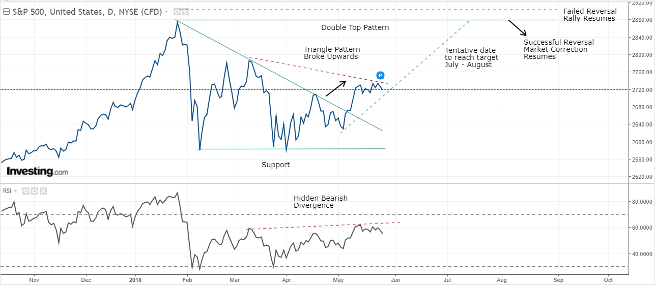
As shown in the chart above, a rally to “all-time highs” does not negate a more significant “topping process.” As I showed recently, such action is common at market peaks.
“While the markets have indeed gone through a correction over the last couple of months there is no evidence as of yet that central banks are on the verge of ramping up liquidity. Furthermore, the “synchronized global economic growth” cycle has begun to show “globally synchronized weakness.” This is particularly the case in the U.S. as the boost from the slate of natural disasters last year is fading.
More importantly, on a longer-term basis, the recent corrective process is the same as what has been witnessed during previous market topping processes.”
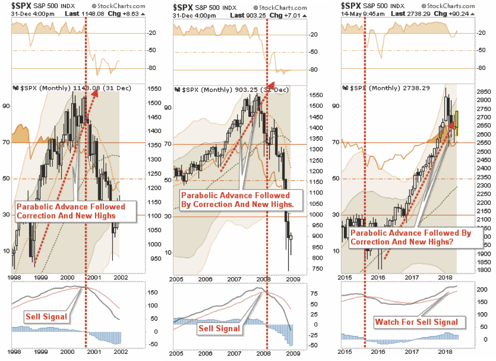
“In each previous case, the market experienced a parabolic advance to the initial peak. A correction ensued which was dismissed by the mainstream media, and investors alike, as just a ‘pause that refreshes.’ They were seemingly proved correct as the markets rebounded shortly thereafter and even set all-time highs.Investors, complacent in the belief that ‘this time was different’ (1999 – new paradigm, 2007 – Goldilocks economy), continued to hold out hopes the bull market was set to continue.
That was a mistake.”
There are a couple of important factors the Mr. Aldana discusses to support the idea of a deeper correction if the market does indeed begin a more important corrective process.
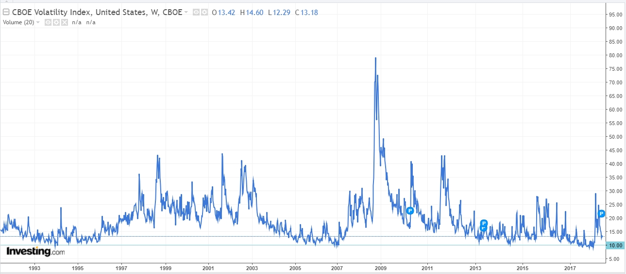
“First, let’s look at the VIX, it’s an Index most investors use when markets start to enter a correction phase. We can see that 10.00 is a multi-year support and normally when it reaches that price things don’t get better. In 1993, and 1995, it reached that level and started to rise until 2003 (Dot-Com Crisis). In 2006 and 2007, that level was reached again and then rallied until 2009 (Sub-Prime Crisis). Once again, in 2017 it touched 10.00 before reaching almost 30.00 in 2018.
Just looking at the VIX one can deduce there is plenty of room for another rally, which suggests another crisis is likely to happen and we are potentially not too far from it.”
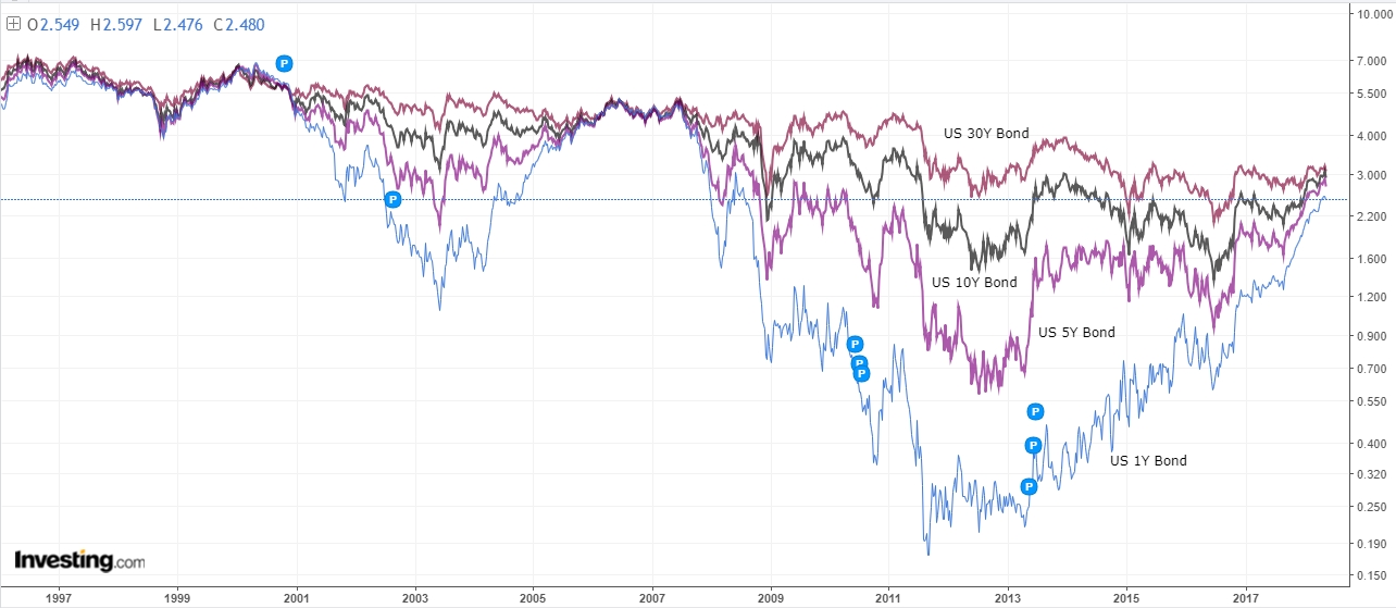
Mr. Aldana goes on to suggest the Treasury market is also sending some important warnings.
“The Treasury market normally predicts when a crisis is near. When short-term yields are far lower than a long-term yield, things are ‘okay.’ However, when the yield curve flattens, heading towards inversion, you should start worrying as investors aren’t comfortable with the current economy.
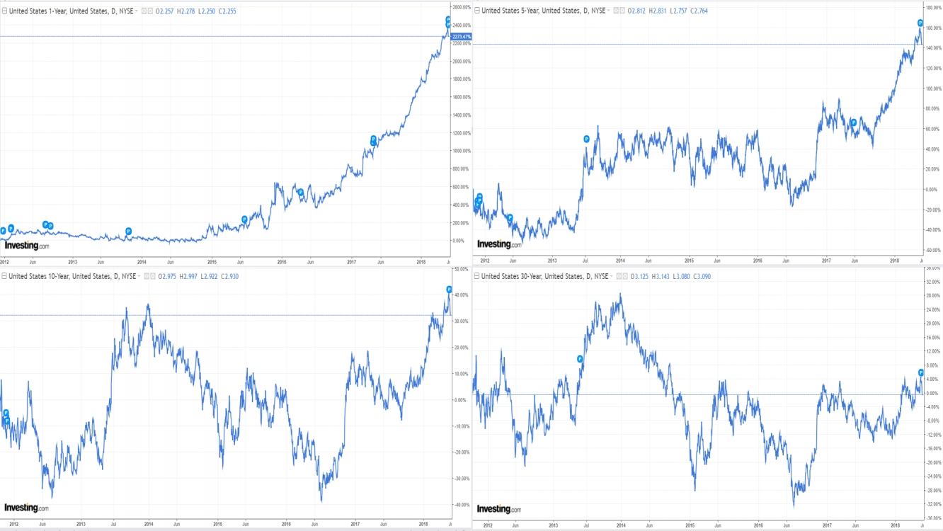
Looking at the charts below, one can see how brutally short-term yields have risen compared to longer-term rates in 2012. The 1-year rose +2400% while 5-year climbed +160%. A 2000% increase in only 6-years is not stable, and if we add the fact the 10-year has only risen +40% and 30-year just +4%, one can see the magnitude of the problem. It won’t be long for the 1-year yield to approach, or even cross, the 30-year.”
As he concludes:
“Under these circumstances, one can conclude that a market crash is more probable than just a market correction. Analyzing the S&P 500, VIX and Treasuries all point to a further downtrend. The question, of course, is just how deep will a correction be?
One of the best tools to determine a reversal is a Fibonacci Retracement. I have also added multi-year, month and week trend lines. The first support is located at 2600 where it has been consolidating since January. Second support is located at the multi-year support which nearly matches Fib 23.6% (healthy support.) The third support is located at the 2016 resistance level (major setback) with the fourth support located at Fib 50% (a complete meltdown.)”

Whether you agree with the analysis, or not, is largely irrelevant. The important point is to consider the possibility of a more sustained correction process. While we have no idea exactly “when” a correction of magnitude will occur, we do know it will.
Ignoring the “risk,” and failing to take some action to mitigate the potential destruction of capital in the near-term, has historically had irreparable long-term consequences.
This “time is not different,” and there will be few investors that truly have the fortitude to “ride out” the next decline.
Everyone eventually sells. The only difference is “selling when you want to,” versus “selling when you have to.”
But then again, if you do “ride it out,” the mathematical reality is that “getting back to even“ is not a successful investment strategy to begin with.
Lance Roberts

Lance Roberts is a Chief Portfolio Strategist/Economist for Clarity Financial. He is also the host of “The Lance Roberts Show” and Chief Editor of the “Real Investment Advice” website and author of “Real Investment Daily” blog and “Real Investment Report“. Follow Lance on Facebook, Twitter and Linked-In