By LV
Every four years Democrats and Republicans produce banners that succinctly proclaim the mission of each party’s standard bearers. The banners are ubiquitous and form the backdrop for each candidate’s rally or news conference. The signs will be planted on lawns across America and outside every polling place.
Let’s take a closer look at the campaign logos to see what, if anything, they tell us about the candidates and their campaigns.
Trump:

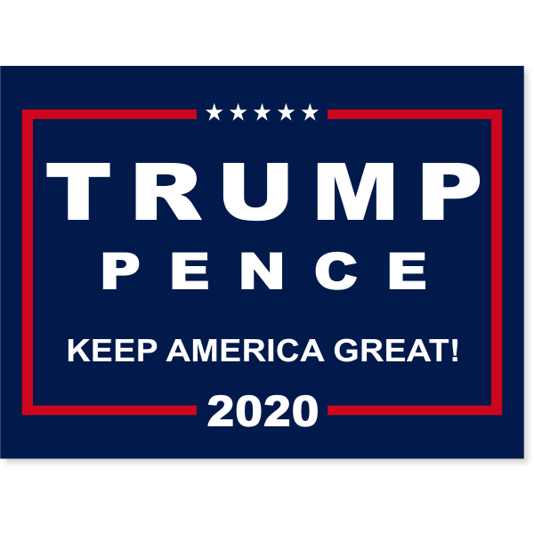
The Trump logo boldly proclaims the last names on the 2020 Republican ticket; i.e., President Donald Trump and Vice President Michael Pence. The logo has white lettering on a dark blue field within a red border, proudly reflecting the colors of the U.S. flag. Every letter of the name “TRUMP” is capitalized, as is the name of his running mate “PENCE” albeit in a somewhat smaller font. Below the names “TRUMP” and “PENCE” is their motto in an even smaller font, “Keep America Great!” At the top of the logo is five stars, reflecting the stars on the U.S. flag or a five-star rating. At the bottom of the logo is the year 2020. The logo is balanced and has a business-like appearance, not unlike a businessman dressed in a blue serge suit, white shirt, and a red tie.
Biden:

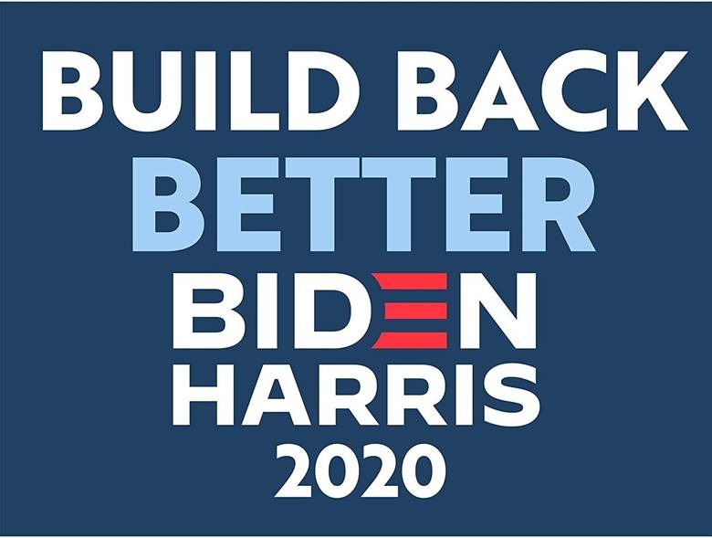
The Biden logo presents the last names on the 2020 Democratic ticket; i.e., former Vice President Joe Biden and Senator Kamala Harris. The logo is presented on a medium blue field with predominantly white lettering and no special border. At the top of the Biden logo is the motto, “BUILD BACK BETTER,” followed by the names BIDEN and HARRIS with the year 2020 indicated at the bottom. The word BETTER is printed with light blue lettering. Biden’s name has a slightly smaller font than the word BETTER directly above it. The letter “E” in Biden’s name is colored red instead of white, thus obliquely incorporating the colors of the U.S. flag in the logo. The name of Biden’s running mate, HARRIS, is in smaller font because her name has six letters instead of the five letters in Biden’s name. The logo has two words across the top line followed by single words on the following lines as the logo approaches the date at the bottom. The logo has no punctuation marks for emphasis, nor does it have a special border.
Analysis:
The Trump logo is very similar to one used in his successful 2016 presidential bid. The red, white and blue colors are the same as is Trump’s name at the top of banner, followed by Pence and the campaign motto. The motto this year is “Keep America Great!” which is a logical progression from the 2016 motto “Make America Great Again!” The intention is to continue and build on the achievements of Trump’s first term. The logo is balanced and direct in a businesslike manner.
The Biden logo appears top-heavy with a somewhat confusing motto at the top. Normally, one would expect the name of the party’s presidential candidate to appear at the top of the banner. The motto, BUILD BACK BETTER, followed by the name BIDEN scores points for alliteration, but it assumes that an observer knows what is intended to be built back. Apparently, whatever will be built back will be done so in better way, as noted by the slightly larger font and light blue color used for the word BETTER. Other than adding a splash of the patriotic color red in the logo, the stylized letter “E” in Biden’s name tends to unbalance the appearance of the sign by skewing it to the right.
Conclusion:
Campaign logos are visual sound bites that blanket the country during an election season. As such, a logo should be carefully designed and self-explanatory, if it is to achieve its objective successfully.
Based on this criterion, the Trump logo is more intelligently conceived than the Biden logo. Its message KEEP AMERICA GREAT! is simple to understand and follows up on the promise Trump made before his first term to MAKE AMERICA GREAT AGAIN! The sign uses simple red, white and blue colors punctuated by five stars at the top. It is balanced and pleasing to eye.
The Biden logo, on the other hand, is relatively unbalanced and confusing. The motto, BUILD BACK BETTER, appears muddled and lacks clarity. What is intended to be built back? Why isn’t Biden’s name at the top of the banner? Four colors are used on the banner: blue, light blue, white, and red. Three colors, as in the Trump logo, should have sufficed and would have made the Biden sign visually less busy. The logo’s message funnels down from the top line to the bottom line like an inverted pyramid. This inherent instability makes it less appealing to viewers than the Trump sign, which is more balanced horizontally from top to bottom. Putting Biden’s name in the middle of the logo instead of the top doesn’t help matters.
Frankly, for ardent supporters of a candidate, logos are simply campaign paraphernalia to be displayed the same way a baseball fan wears a cap or a shirt with the home team’s insignia. But for people who are not familiar with a certain candidate, a logo will make an impression on them whether they realize it or not.
In short (pun intended), a logo is a visual sound bite about a candidate. A logo is analogous to a tweet, which is perfect for people with short attention spans. But the message a logo sends subliminally might make a greater and longer impression than that which meets the eye.
A campaign logo is effective, if it quickly captures the attention of potential voters by transmitting a candidate’s message in a clear simple manner. On this basis, Trump’s logo is a winner whereas Biden’s logo falls short of the mark.