Wolf Richter wolfstreet.com, http://www.amazon.com/author/wolfrichter
I’m looking at what’s behind the numbers.
The monthly jobs report data is based on surveys of employers and households – looking at the labor market from two different perspectives. And everything depends on how it is defined. For example, “unemployed” doesn’t mean “not working.” There are a lot of people who are not working for a reason, such as infants, full-time students, retirees, and many others – and the reasons matter. So here we go.
Nonfarm payrolls rose by 103,000 jobs in March, seasonally adjusted, according to the Bureau of Labor Statistics, based on its survey of about 149,000 businesses and government agencies totaling about 651,000 work sites. As measly as the increase in payrolls was, March was the 90th month in a row of gains, the longest such period in the history of the data.
The job gains in January and February combined were revised down by 50,000 as more survey data became available. Even after those revisions, the gain in both months combined was 502,000. And for Q1, the payroll gains amounted to 605,000.
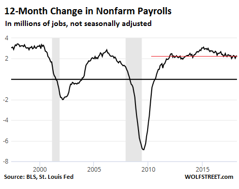
The monthly data is volatile, jumping up and down and getting revised after the fact. It’s the trends that matter. These trends become more apparent in the 12-month total.
For the 12-month period ended in March, employers added 2.24 million jobs (not seasonally adjusted). This is in the lower-middle of the range since 2012. The chart below shows the 12-month change in payrolls going back to 2000:
The civilian labor force, at 161.76 million people, was up by 1.64 million from March last year (not seasonally adjusted), according to the BLS survey of households.
The labor force consists of the employed and people who are considered “unemployed” of age 16 or over. Those people who don’t have jobs but are not considered “unemployed” are not in this measure of the labor force. For example, kids under 16 are not in it; a college student or a retiree who doesn’t have a job and is not looking for work is not considered unemployed and is therefore “not in the labor force.”
The people who are “not in the labor force.” This is very seasonal. July is always the low point, when students switch from “not in the labor force” to being in the labor force by accepting summer jobs and internships. Much like the labor force, the number of people “not in the labor force” has been steadily increasing. In March, the number of people “not in the labor force” rose by 1.05 million from a year ago, to 95.5 million (not seasonally adjusted).
But the size of the population also changes. So the labor force participation rate tracks the labor force as a percent of the population. This is one of the key measures of the health of the labor market. Note, this is not the total population of the US, but the “civilian noninstitutional population” 16 years or older.
This “civilian labor force participation rate” in March, at 62.9%, was down from February (63.0%) and down from March a year ago (63.0%). The chart below shows the labor force participation rate going back to the peak in 2000 when it was 67.3%. So the rate has moved off the bottom starting in 2016 but remains dismally low:
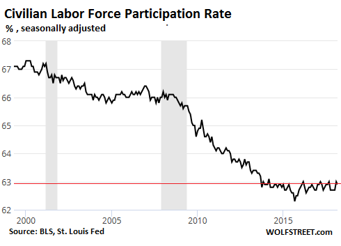
Discussions have been raging for years why exactly the participation rate is low, and why it deteriorated over the past nine years even as the number of jobs has surged. There is agreement, however, that the labor force participation rate is also impacted by factors other than the labor market, such as demographics: a large number of retiring boomers leaving the labor force, and an even larger number of millennials moving into the labor force. But they alone do not explain the dismal trend.
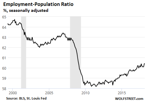
The broadest measure of the health of the labor market – but also impacted by demographic trends – is the Employment-Population Ratio (the employed as a percent of the “civilian noninstitutional population” 16 years or older. In March, at 60.4%, the rate was up a tad from March a year ago (60.2%), and up sharply from the 58%-range during the employment crisis after the Great Recession. While it has been recovering since 2013, it remains in troublesome territory. At the peak in 2000, it was at 64.7%. The chart shows the devastating impact the last two recessions had, and how each recovery has only been partial:
So how about the “unemployment rate?”
This is one of the thorniest issues – but it’s the most often cited number despite its limited usefulness.
The headline unemployment rate remained at 4.1%, a 17-year low, and the number of “unemployed” ticked down to 6.58 million (from 6.71 million in February). The number of people who’ve been unemployed for 27 weeks or longer fell by 338,008 from a year ago to 1.3 million.
Here are the limitations. This is the number of “unemployed” as a percent of the labor force. As we’ve seen above, “labor force” is strictly defined. And “unemployed” is also strictly defined. To be considered “unemployed,” people in the household survey have to meet these three criteria, according to the BLS:
- They had no employment during the reference week;
- They were available for work at that time;
- They made specific efforts to find employment sometime during the 4-week period ending with the reference week (but persons laid off from a job and expecting recall need not be looking for work to be counted as unemployed).
This is not the only unemployment rate the BLS offers. It offers six measures of “labor underutilization,” as it calls them, ranging from U-1 to U-6. The headline measure above – the 4.1% “unemployment rate” – is U-3.
The broadest measure is U-6, which is U-3 plus the people who are “marginally attached to the labor force,” plus those employed part time who want to have full-time employment. This U-6 unemployment rate was 8.0% in March, down from 8.8% a year ago. For some people, this is a more realistic measure.
The key part about these unemployment rates is that they’re not absolute measures of unemployment. They were never designed to be that, and shouldn’t be looked at as such. They’re indicators of trends in the labor market: Are the rates going up or down?
As indicators of trends, the unemployment rates work reasonably well. But they fail as absolute measures of unemployment – and yet, that’s the primary role they have now been shanghaied into by the media coverage of the labor market.
The Fed, when considering its monetary policies, takes a fairly broad view of the labor market and is not easily swayed by a single headline number. And it sees nothing in this report that differs significantly from the trend of the past year.
The sixth month of the Fed’s QE-Unwind has now ended. It appears to be on automatic pilot, clicking along at the pace that accelerated in January, despite the sporadic stock market sell-offs since early February. Read… Fed’s QE-Unwind Proceeds Despite Stock Market Sell-Offs