by UPFINA
The economy is already improving even though the 3rd stimulus hasn’t past nor has the pandemic been fully contained. We’re inching closer to containing it each weak. That explains why the chart below shows the recovery tracker in each region is improving with the Midwest doing the best and the Pacific doing the worst by a lot. This metric includes the pandemic as one of its inputs. In the week ending January 22nd, the national recovery tracker rose 2 points to 79.
On top of better than expected #jobless claims, our regional recovery trackers recorded their first synchronized upturn since early December. Recoveries in the large
states gained modestly, and #California strengthened as #Covid conditions improved. #USeconomy pic.twitter.com/0aJauz6LNw— Oren Klachkin (@OrenKlachkin) February 4, 2021
As of Thursday, there have been 36.7 million vaccine doses given out in America which is 11.2 per 100 people. This has caused the 7 day moving average of positive cases to fall from 244,707 to 130,569. The 7 day average of people in the hospital has fallen from a peak of 132,474 to 88,668. These sound like amazing numbers, but remember, the prior hospitalization peaks in the spring and the summer were just under 60,000. We’re a couple weeks away from getting back to the worst of the spring which is why we are surprised there has already been some improvement in the labor market. Imagine how great the data will be in March.
Another Better Jobless Claims Report
It’s not that investors are ruthless. It’s that investors jump the gun at the first sign of improvement. That needs to be understood because when the economy looks bad, but is getting less bad, the stock market usually does well. If you are a policy maker, the labor market is terrible and needs support via higher jobless benefits. If you are an investor you see the potential for millions of jobs to be created once the economy reopens.
🇺🇸Initial #unemployment claims posted an encouraging drop in week-ended Jan 30, but they remain alarmingly high.
Regular claims:
🛑779k (SA): -33k
🛑816k (NSA): -24kPUA claims (NSA):
🛑349k: -55k🚨Still very high 1.2 million **new** weekly jobless benefits claimants pic.twitter.com/l1TGIwuOSy
— Gregory Daco (@GregDaco) February 4, 2021
The latest jobless claims report was really good from an investor’s perspective. Every time we get a good report, economists love to show how many people are unemployed. Yes, it’s a bad situation, but financial markets care about the rate of change. In that mindset, this was a fantastic report because last week’s reading was revised down from 847,000 to 812,000. Initial claims in the week of January 30th fell to 779,000 which was below the consensus of 835,000 and the lowest estimate which was 820,000.
Non-seasonally adjusted claims fell 24,000 to 816,000. PUAs fell 55,000 to 349,000 which caused the total to fall another 6% as the chart above shows. That’s 3 straight weeks of improvement. Yes, we know adding more jobless claims is still bad, but it’s getting bad at a slower rate which is improvement on a rate of change basis.
Within NSA initial claims, California rose 46,000 and Illinois fell 55,000. The total number of people on all benefits programs in the week of January 16th fell from 18.32 million to 17.84 million. PEUCs fell 290,000 to 3.6 million. In the week of January 23rd, continued claims fell from 4.785 million to 4.592 million.
Unprecedented Bottleneck
The supply chain is under an unprecedented bottleneck as 8% of manufacturers are reporting delays related to ports, shipping, cargo, or containers. If you look at the data from 1997 to 2019, 2% was a high reading. This is costing firms a lot of money. As you can see from the chart below, the Shanghai Containerized Freight Index has gone parabolic in the past few months. This event could spur on the reshoring movement which is where manufacturing is brought back to North America. It’s actually cheaper to manufacture in Mexico because of lower wages and less shipping costs.
Shipping #inflation to the world? The pandemic has created many econ side effects and one of the less-reported news items in recent weeks has been the massive surge in shipping rates, DB says. Shanghai Containerized Freight Index has more than tripled from last May‘s levels. pic.twitter.com/nb7NNvKp5U
— Holger Zschaepitz (@Schuldensuehner) February 3, 2021
FAANMG Is Back
With the great earnings from Alphabet, its stock rose 7.4%, meaning it’s now up almost 40% in the past 6 months. There was a very brief window when we were saying the mega cap internet companies were unloved. That short period of a few months is officially over especially with the end of the short squeeze bubble which lasted a few weeks.
This is certainly a more sustainable rally in the sense that these companies have tons of profits and growth potential. The question is how big can they get? We ask that because every time in history when a company gets extremely large, it gets more regulated. You could argue that’s bad for the small business competition, not the large company itself. In the early 1900s, the trusts were broken up. Investors in 2021 don’t care at all about regulations. However, the bigger and more powerful these companies get, the more likely more severe action will be taken.
The size of the entire European economy was estimated to be $15 trillion in 2020. The top 5 internet companies are worth almost $8 trillion combined. Just 5 companies are worth more than half of the continent. With the growth some of the bulls project, they will usurp the continent in a few years. At first, investors started ignoring the so called “Buffett indicator” which is the market cap of the stock market versus GDP. Now it’s just 5 companies versus GDP which is absurd.
Pretty rare to see so few companies able to outperform an index itself.https://t.co/0tGIPrKPev pic.twitter.com/EtK2LQUj3e
— SentimenTrader (@sentimentrader) February 3, 2021
As you can see from the chart above, the percentage of stocks beating the S&P 500 over the past year is near the trough at the end of the Nifty 50 bubble and the dot com bubble. Because these companies are so large, if they do well, it’s very difficult for smaller companies to outperform.
https://t.co/R2czFCPfAg pic.twitter.com/cp6nfv5oXI
— Empathy Capital (@CapitalEmpathy) February 5, 2021
From 1897 to 1904, over 4,000 companies were combined into 257. By 1904, 318 trusts held 40% of US manufacturing assets and had a market cap of $7 billion. We inflation adjusted $7 billion in 1904 dollars into today’s dollars. It came to $204.9 billion. Alphabet is over 6.7 times those companies combined. Of course, that’s in part because stocks rise faster than inflation over time.
Therefore, we can look at those companies as a percent of the market. In 1904, the market cap of all New York listed stocks was $6.43 billion after accounting for currency valuations (the table above is in British pounds). That means those trusts were worth more than the whole New York listed market. Trusts weren’t listed on the NYSE. Of course, this review looks at 318 companies, so it’s not an ‘apples to apples’ comparison to the top 5 internet companies today.
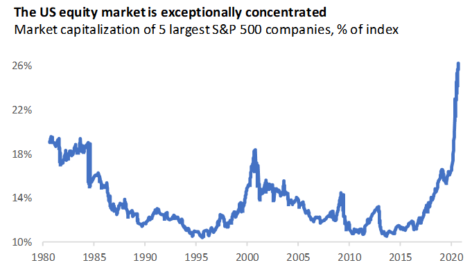
Using more recent data, the chart below shows the S&P 500 is more concentrated than at any point since 1980 by a wide margin.
Conclusion
Now that the virus is becoming more contained than a few weeks ago we are starting to see the recovery regain pace. The jobless claims report showed improvement again. This is a real re-acceleration. The U.S. stock market is way more concentrated than at any point in the past 41 years, but the economy probably isn’t as concentrated as it was during the early 1900s when trusts dominated it.