This article originally appeared in the Jan. 6, 2021 issue of The McClellan Market Report.
Watching the money supply numbers used to be a favorite activity of traders and investors back in the late 1960s and nearly 1970s, and below I will show you why. But stock investors are not as enamored of those data any more. Maybe they should be again.
I have worked for years to understand this relationship, and have learned a few things in the process. One point I have learned is that the raw numbers for M1 or M2 are not as meaningful as if we adjust them for the size of GDP. A bigger GDP naturally needs more “walking around money” in order to facilitate commerce.
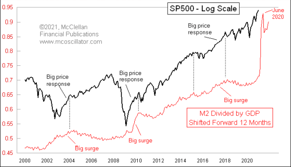
This is the adjustment I employ in all of the 3 charts this week. In the top chart, I compare that ratio of M2 to GDP to the SP500, with the M2 data plot shifted forward by 12 months. This helps us to see that when there is a big surge in M2, it shows up later in the stock market. By this logic, the stock market still has not fully felt the effects of the massive boost in M2 which the Fed has done in 2020 in response to the Covid Crash. But a top for stocks could arrive the summer of 2021, as the echo of the June 2020 peak in the M2/GDP ratio.
To understand this relationship better I went back further in time, and ran into some problems. This next chart shows the period from 1980 to 2000. I had to shorten the chart offset from 12 months down to 6 months to get the left side of this chart to line up. And in the 1990s the relationship did not seem to work much at all.
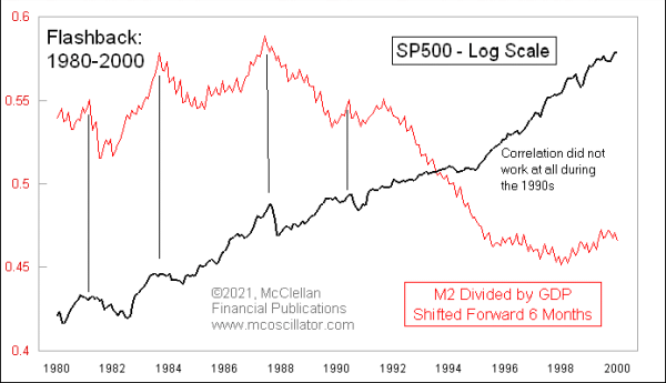
You may recall that the 1990s were when companies were more uniformly adopting direct deposit of salaries, and individuals were embracing debit cards. So the need for cash to make actual payments was undergoing a radical shift back then. Perhaps that explains the loss of correlation, perhaps not.
This next chart goes back another couple of decades, and it allows us to see why traders were so agog over M1 and M2 numbers back then. This chart employs zero time offset, showing that the stock market and the money supply reacted together in real time. So if anyone back then had an inkling of what the money supply data were going to do, that would have been useful information for knowing how to invest. But knowing that ahead of time was hard then. It is, however, why traders would gather around the quote screens as the money supply numbers would come in, thinking that they could get an edge by knowing what the numbers were.
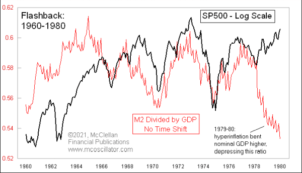
And in 1978, this relationship broke down for a couple of years as hyper inflation was underway. Perhaps that is what ushered in the change from a coincident relationship during the 1960s and 1970s to the 6-month lagging relationship in the 1980s.
Coming back to the current period in the top chart, it is clear enough that big surges in M2 are followed by big surges in the stock market. It is less clear whether or not big dropoffs in M2/GDP lead exactly to stock market declines, but they do seem to at least bring periods of increased volatility. So that is what we can look forward to if the Fed ever decides that it will try to put the M2 genie back into the bottle.
Tom McClellan
Editor, The McClellan Market Report