by AestheticFC

https://i.imgur.com/eElhmNU.jpg
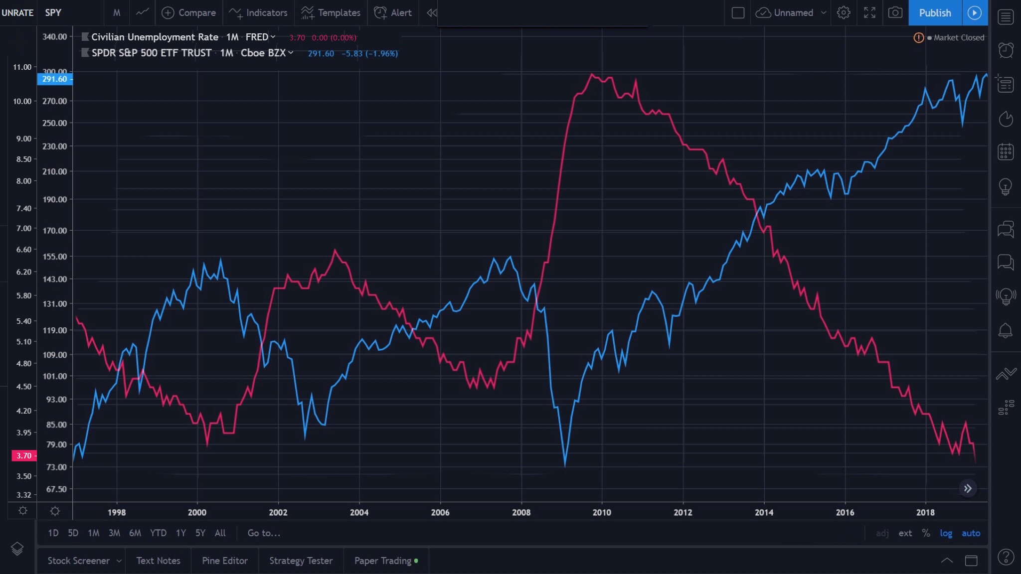
-Red line is Civilian Unemployment Rate (UNRATE)
-Blue line is SPDR S&P 500 ETF Trust (SPY)
This was generated by merging two charts together to see their interlaced behavior. X-axis is exactly the same for both (time) and Y-axis is labeled on the far left for each. UNRATE first column, SPY second column (both using log scale).
0 views