by C Hamilton
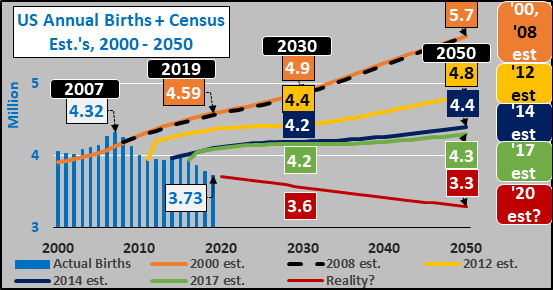
For a dozen plus years, the Census has incorrectly believed and projected that total US births were on the cusp of an upturn. The chart below shows actual total births and Census projections since ’00 through the most recent Census projection in 2017. Each projection was lower than the last but still far too high. Since 2007, there have been 5.5 million fewer births than the ’00 and ’08 Census projected. And this delta in projected growth versus rapidly diving births and fertility rates is only continuing to widen, as detailed through Q1 of 2019 at CDC Fertility Data.

Social Security essentially gets its projections from the Census and makes forward based assumptions on the median Census projection. In this case, the chart below shows actual US fertility rates since 1950 and Census projections (solid lines) versus UN projections (dashed lines). According to Social Security projections (solid lines), fertility rates at present 1.72 (and still falling) are not possible and only higher fertility rates are to come. Either fertility rates will rise to 2.2, 2, or 1.8…but the current reality and/or further decline is simply inconceivable. Meanwhile, the situation isn’t so inconceivable for the UN Population Projections (dashed lines) which offer a wide range of possibility from a low of 1.3, to high of 2.3, with a long term base case of 1.8.

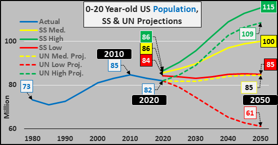
And here is the decade plus of discrepancy between actual 0 to 20 year-old US population. Census (Social Security, solid lines) versus United Nations (UN) projections (dashed lines). Again, the Census nor SS can conceive of what has been happening for the last decade nor can the Census and therefor Social Security project anything but growth. In fact, the Social Security low growth projection is even slightly higher than the UN medium (baseline) projection?!? And the UN baseline is too high…which means the reality for Social Security is significantly worse than their most “bearish” scenario.
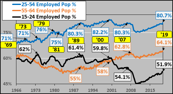
But it isn’t just the absence of population growth, it is how this translates to the lack of fuel for further employment growth. Rather than use the BLS unemployment data, I simply divide the populations that make up the work force by the quantity of those employed among each age group (chart below)…and this reveals we are at historical levels of full employment. In fact, only once (briefly in 2000) has the largest and most important group (25-54 year-olds) ever had a higher portion employed. The 55-64 year-olds have never had such a high portion employed…and even the 15-24 year-olds have recovered much of the losses they suffered in the ’09 great financial crisis (but even beyond X-Box, there are structural reasons this group is unlikely to see significantly higher employment %’s…detailed HERE).
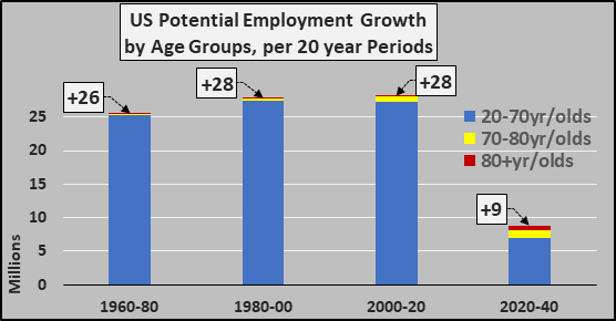
Given we have full employment, the problem is we have precious little growth among the working age population over the next decades. As the chart below details, the population growth over the next two decades shifts to the oldest among us with hardly any labor force participation among them. The growth among 70-80 year-olds and 80+ year-olds will dominate.
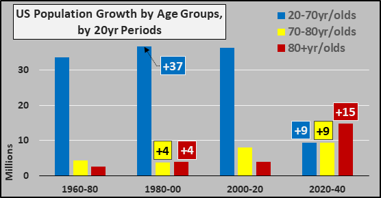
And dividing the age groups by their participation rates gives us a clear idea of the potential fuel available for employment growth (aka, new home buyers, new car buyers, those likely to undertake loans, etc.). For the coming two decades, I even likely over-estimate the 70-80 year-olds at 12% LFP and 5% LFP among 80+ year-olds versus a consistent 75% for 20-70 year-olds. This means over the coming twenty years, the US is only capable of about 1/3rd the employment growth it was consistently capable of from 1960 through 2020.
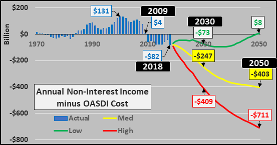
Thanks to the 2019 OASDI Trustees Report, the Social Security situation is fairly plain. The chart below shows the OASDI annual deficit plus low, medium, and high cost projections. What I have detailed from this point forward is that given the unrealistic population growth projections and resultant unrealistic employment growth expectations, the worse case “high cost” estimate may be too optimistic. This will mean the Social Security so-called “trust fund” of $2.9 trillion will be burned through prior to 2035 and the politically charged issue of automatic “pay-as-you-go” 20% to 40% declines in benefits will be thrust upon the nation sooner rather than later. For instance, of the 60+ million SS beneficiaries, the average beneficiary in 2019 pulls in $1461 monthly, and would be looking at an automatic $400 to $600 reduction in monthly benefits once the “trust fund” is depleted. The worst-case OASDI cumulative scenario adds an additional $5 trillion in deficit spending through 2050 over the medium projection.
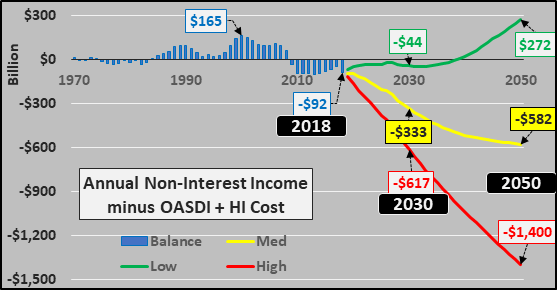
And just to round out the picture, the chart below details the combined OASDI and HI (Hospital Insurance) deficits. Again, the redline worst case “high cost” projection is likely too optimistic. Annual deficits absent population growth among the young and working and resultant minimal further employment growth…and the inevitable explosion of elderly…means a worse than “worse case” should be the base case. And the combined worst case OASDI + HI cumulative projection adds another $12+ trillion to the projected debt pile above and beyond the medium projection.
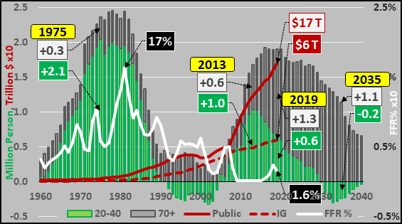
Two final charts, below, detailing the annual change in the 20-40 year-old US childbearing population versus 70+ elderly and the movement of the Federal Funds Rate, plus the impact of the federal funds rate on incentivizing debt.
Below, annual population change (million persons) of the 20 to 40 year old US population versus annual change in 70+ year old US population, Federal Funds Rate (%), and public versus Intragovernmental debt outstanding (trillion $’s).
 Below, annual population change (% of total population) of the childbearing versus elderly, Federal Funds Rate (%), and public versus Intragovernmental debt outstanding (trillion $’s).
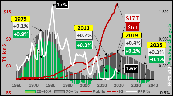 Of course this doesn’t show unfunded liabilities, corporate debt, student debt, auto loans, credit card debt…but the Federal debt gives a nice example of the impact of ZIRP on the undertaking of new debt when the money is essentially “free” (particularly for the Federal Government and Corporations…and when served to our young adults as “student loans”).
Why is it important to break out the public vs. IG (Intragovernmental) debt? IG trust fund surplus’ are mandated by law to buy US Treasury debt while Primary Dealers (a select # of the largest banks) are likewise mandated to bid on government debt which they then typically resell to the public and foreigners. As you can see, IG purchasing is slowing while nearly all the debt is now being resold to the public / foreigners / and Federal Reserve. This trend will accelerate rapidly over the coming decades. The surge in 70+ year-olds collecting their Social Security benefits and the minimal growth among new taxpayers will result in public debt soaring while the theoretical IG trust fund is depleted.
Perhaps a “come to Jesus” moment is likely sooner than later.