via @pattidomm
- A scary chart pattern, called the ‘death cross,’ formed in the chart of the S&P 500 on Friday, signaling traders that there could be more selling ahead.
- The death cross formation appeared in the chart of the small cap Russell 2000 index just over three weeks ago, and the Russell has lost 4.4 percent since then.
- The death cross means the market could stay “lower for longer,” said one technical strategist.
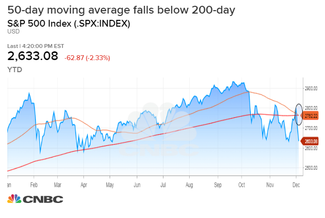
The chart of the S&P 500 Index is flashing a warning of more selling ahead.
A pattern, called the ‘death cross,’ appeared on the chart on Friday as stocks plunged. The S&P 500’s average price of the last 50 days, dropped below the 200-day moving average, a sign of negative momentum and possible change in trend, according to technical analysts.
“It just means you’re lower for longer, meaning there’s no real bounce, which is a sign of real selling.” said Scott Redler, partner with T3Live.com. “Sometimes you break moving averages and you get some kind of quick fast recovery…but when you stay down longer, all of a sudden it’s showing real selling. That’s why people don’t like the death cross. It’s almost confirming what could be a change in trend to the downside.”
The S&P 500 is already down more than 10 percent from its record high earlier this year, officially a correction. Because of Friday’s rout, the benchmark is now negative for 2018.
The death cross pattern formed on the Russell 2000 on Nov. 13, and it is down 4.4 percent since then. The Nasdaq Composite Index saw a death cross form on Nov. 27, and it has lost 1.6 percent since then.
***
2 Warnings: <320sma (daily), <2666 $SPX pic.twitter.com/UiuUHAfzaI
— Alastair (@StockBoardAsset) December 7, 2018