Skip to content

Investment Watch Blog

  • Home
  • About
  • Newsletters/RSS
  • Disclaimer

graph

Can’t stop staring at the m1 money supply graph…

October 7, 2022 10:08 pm
Categories Latest Story

An Alarming Graph

November 11, 2018 9:54 am
Categories Sticky

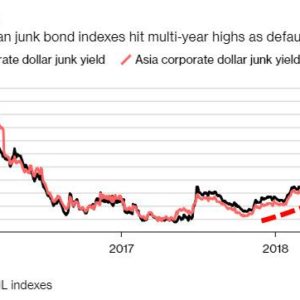
This graph shows the surge in Chinese junk yield on liquidity squeeze from higher interest rates, higher DXY, and, next, decreasing USD liquidity when tariffs start to bite.

July 15, 2018 9:26 am
Categories Featured Post

Julian Assange Posts an Eerie Graph—As the CFR Delivers a Disturbing Message To Americans

June 7, 2018 3:29 pm
Categories Sticky post

This Graph Shows That No Other Country Competes with the U.S. Military

May 17, 2018 11:23 am
Categories Latest Story

The Wild West of Crypto Hacks in One Graph

May 10, 2018 9:34 am
Categories Latest Story

This Graph Shows Where the Filthy Rich Live in the World

March 27, 2018 1:19 pm
Categories Latest Story

This Graph Shows Which Political Party Corporate America Loves the Most

March 20, 2018 9:46 am
Categories Sticky

Graph depicting reasons for decline of living standards in America. Price changes of Selected U.S Consumer Goods & Services & Wages from 1997 – 2017.

February 21, 2018 3:59 pm
Categories Sticky
  • RSS Feed
  • Twitter
  • Facebook
  • Mail

To afford free speech, IWB needs to be fully reader-funded. Please donate here

Submit Correction/News Tips/Suggestions

Privacy & Cookies: This site uses cookies. By continuing to use this website, you agree to their use. To find out more, see here: Cookie Policy Do Not Sell My Personal Information Please consider turning off your ad blocker to support our website and ensure we can continue to provide quality content for free. Disclaimer

InvestmentWatchBlog.com © 2013-2023. All Rights Reserved.

© 2025 Investment Watch Blog • Built with GeneratePress