Wolf Richter wolfstreet.com, http://www.amazon.com/author/wolfrichter
Historic spike in Seattle. Sharp increases in other metros. New York condos fall.
Homes prices in the US surged 6.4% in May compared to May a year ago (not seasonally-adjusted), and 1.1% from April, according to the S&P CoreLogic Case-Shiller National Home Price Index, released this morning. The index is now 10% above the crazy peak in July 2006 of “Housing Bubble 1” in this millennium — a phenomenon that after its collapse everyone had called “bubble” and “unsustainable,” but which by now has become the new-normal rock-solid base upon which to build a solid housing market, apparently. The index is now 51% above the bottom of “Housing Bust 1”:
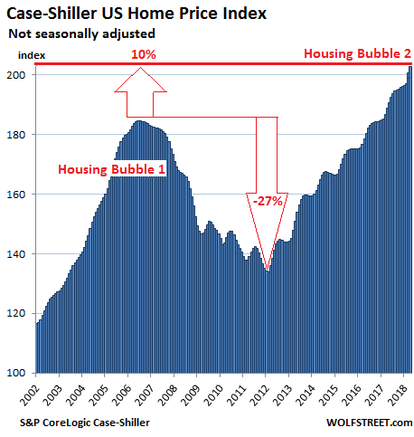
Real estate may be local but prices are impacted by national and global factors, such as monetary policies and offshore investors for whom “housing” in the US is a global asset class and in many cases also a way to get their family and assets out of reach of their own governments. These local and global factors inflate local housing bubbles. When enough local housing bubbles come together at the same time, even as some other housing markets don’t see a lot of price movements, they turn into a national housing bubble, as seen in the chart above.
The index is not inflation adjusted — in fact, it’s itself a measure of inflation: of asset price inflation, specifically of housing price inflation. What you see in the above chart is that the dollar has lost purchasing power with regards to housing in the US since the bottom of “Housing Bust 1” in February 2012 — as the amount of dollars needed to buy the same homes has jumped by 51% since then.
The Case-Shiller Index is based on a rolling three-month average; today’s release is for March, April, and May. The index is based on “home price sales pairs,” comparing the sales price of a home in the current month to the last transaction of the same home years earlier. The index incorporates other factors and uses algorithms to arrive at each data point. It was set at 100 for January 2000; hence an index value of 200 means prices as figured by the index have doubled.
So here are the most splendid housing bubbles in major metro areas in the US:
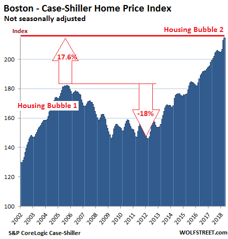
Boston:
Home prices in the Boston metro, according to the Case-Shiller home price index, jumped 7.0% from a year ago. During Housing Bubble 1, from January 2000 to October 2005, the index soared 82% before dropping. It now tops that crazy peak by 17.6%:
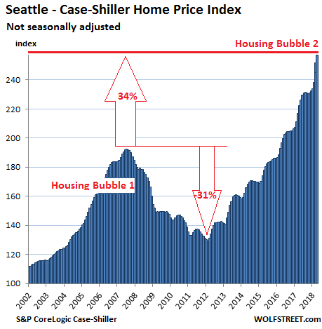
Seattle:
The Case-Shiller index for the Seattle metro index spiked 2.2% from the prior month. This comes on top of the spike in April which in terms of points — up 6.6 points — had been the biggest monthly jump in the data series. Over the past two months, the index has soared 5%! Over the past 12 months, the index has jumped 13.6%. It is 34% above the peak of Seattle’s insane Housing Bubble 1 (July 2007). Note the historic spike over the past two months:
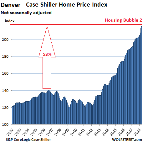
Denver:
The index for the Denver metro, which in May booked its 31st monthly increase in a row after a historic spike in April, is up 8.5% from a year ago and 53% from the crazy peak in July 2006, with a historic spike in April:
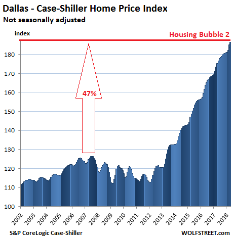
Dallas-Fort Worth:
Home prices in the Dallas-Fort Worth metro, according to the Case-Shiller index, rose for the 52nd month in a row, and is up 5.7% from a year ago. Since its peak during Housing Bubble 1 in June 2007, the index has surged 47%:
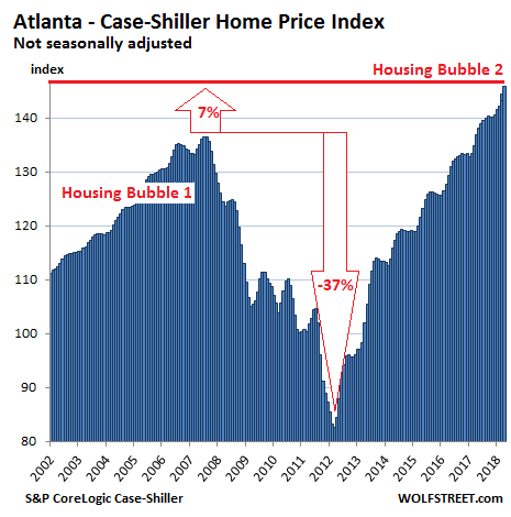
Atlanta:
The Case-Shiller home price index for the Atlanta metro rose 0.9% in May from a month earlier and 5.7% over the 12-month period. It now exceeds the peak of Housing Bubble 1 in July 2007 by 7%:
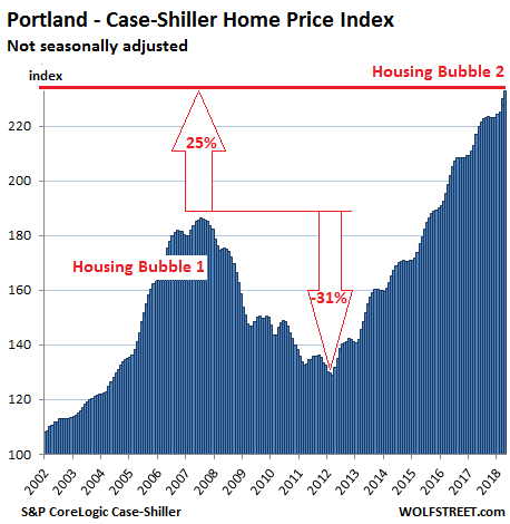
Portland:
Home prices in the Portland metro in May jumped 1.2% from a month ago, 5.9% from a year earlier, and 25% from the crazy peak of Housing Bubble 1 in July 2007. It has ballooned 132% since 2000:
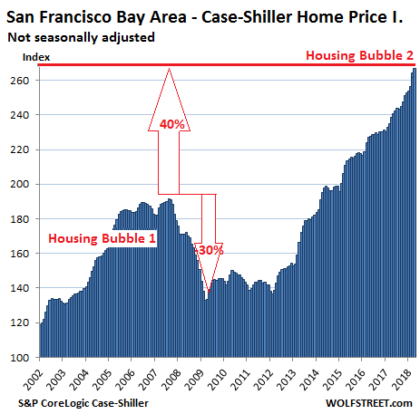
San Francisco Bay Area:
The index for “San Francisco” includes the counties of San Francisco, Alameda, Contra Costa, Marin, and San Mateo, a large and diverse area consisting of the city of San Francisco, the northern part of Silicon Valley (San Mateo county), part of the East Bay and part of the North Bay. In May, the index jumped 1.1% from the prior month and 11% from a year ago. It’s up 40% from the insane peak of Housing Bubble 1 and up 167% since 2000. Note the spike over the past two months:
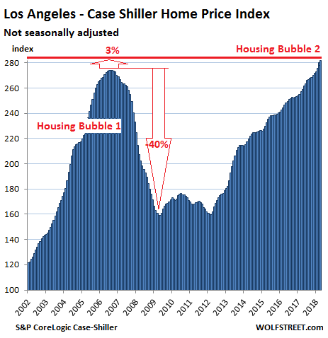
Los Angeles:
The Case-Shiller index for the Los Angeles metro in May rose 7.6% year-over-year. Between January 2000 and July 2006, the index had skyrocketed 174% before totally cratering. The index now exceeds the peak of Housing Bubble 1 by 3%:
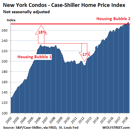
New York City Condos:
Prices for condos in the New York City metro did the unthinkable in May: they fell. The Case-Shiller index for condos fell 0.5% for the month, the second month in a row of declines, after having fallen 0.5% in April. But this index has produced many monthly dips over the years that turned out to be blips. The index remains up 2.4% from a year earlier. It’s 18% above the peak of Housing Bubble 1, having surged 173% since 2000:
So New York City’s condos are dipping, compared to Seattle’s gorgeous spike. For most of the metros in this list, the sharp acceleration over the past few months either continued unabated or is only backing off a tad.
No, the biggest apartment construction boom in the US is not taking place in Seattle, despite the countless cranes. Denver is by far #1. New York isn’t even in the top 25. And it explains why rents in Chicago are collapsing. Read… Biggest Apartment-Construction Boom-Towns Are Not What You May Think