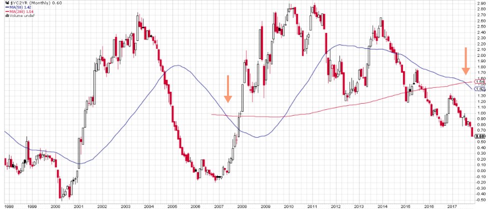
Scariest Chart of the Overnight Session – @StockBoardAsset?
Something is wrong— 2s10s curve (monthly) death cross- last time this happened it was 2007 – @StockBoardAsset?
What Happened To Cash Flow Growth: The Red Flag In Q3 Earnings
So if one wants to avoid the “fluid”, easily adjustable concept of earnings altogether, and focus on something far more tangible, such as cash flow, what is the conclusion? Well, as SocGen’s Andrew Lapthorne points out this morning, this emerges as yet another problem to the strong earnings growth narrative, as not only has cash flow growth stalled, but excluding energy and financials (i.e., eliminating the base effect), it is now the lowest in 4 years, since late 2013. From SocGen:
The US yield curve (10s-2s) continues to head lower, yet headline trailing EPS growth for the S&P 500 is around 10%. However, much of this strength relates to the rebound in the Energy sector. The chart below strips out Financials and looks at the annual change in Gross Cash flow post the Q3 reporting season. What is noteworthy is how ex Energy growth has slowed markedly since October last year. For all the fanfare of the Q3 reporting season gross cash flow growth is back down at anaemic levels and contrasts with much of what we read.
https://stockboardasset.com/insights-and-research/happened-cash-flow-growth-red-flag-q3-earnings/
SPX Put /Call 1.06 pic.twitter.com/emXR3G45kO
— Sunchartist (@sunchartist) November 21, 2017
Payback looms after central banks’ $11tn splurge
Central banks have spent around $11tn in emergency support measures since the global financial crisis in 2007, providing a powerful tailwind that has helped raise asset prices worldwide.
But investors have in reality been “borrowing returns from the future”, according to JPMorgan Asset Management’s latest projections for asset markets over the next 10 to 15 years. The study, designed as a framework to help asset allocation decisions, indicates that investors should expect significantly weaker returns in dollar terms over the next decade than those achieved historically.
https://www.ft.com/content/c991f222-c937-11e7-ab18-7a9fb7d6163e?conceptId=45391af4-d00f-3cf5-813f-aff2e85a7991&desktop=true&segmentId=7c8f09b9-9b61-4fbb-9430-9208a9e233c8
https://twitter.com/NorthmanTrader/status/933010201350991873
11 Charts Exposing The Madness Of The Stock Market Crowd
The necessity of a decent return in this historic low interest rate environment has resulted in a desperate chase for yield, often motivated by the current spread between earnings and bond yields.
 The chase for yield also demonstrates a lack of investment opportunities since newly printed money has acted more to drive up prices in the secondary market rather than fueling additions to capital goods. This has doubtlessly helped prolong the bull market in stocks as it has had a dampening effect on the business cycle.
But there is more to stock market valuations than the current level of interest rates. Further declines in nominal interest rates are limited, while the upside potential is tremendous in percentage terms. The best one can hope for is perhaps that rates remain near historical lows for a long period of time. Placing your bets solely on interest rates remaining low however requires a portion of delusion.
The nominator in any prudent appraisal of stock prices also matters, though it appears to play a minimal role these days as exposed in the charts below. Most of these charts have one thing in common – they compare stocks to a range of economic aggregates related to corporate sales and with it earnings. After all, earnings per share, no matter how “earnings” are calculated, cannot forever increase or even be maintained due to cost cutting and share repurchases alone.
Some of the charts published below were included in an unexpectedly popular article I published here on SA back in February this year – Ten Charts Demonstrating The 2017 Stock Market Euphoria, And One That Doesn’t. Bulls should therefore be pleased as the only thing those charts have demonstrated is that the market has valued low interest rates and positive sentiment more than other fundamentals combined ever since. In other words, those charts look even worse today.
But for those of you concerned with probabilities and minimizing losses, and for those not posing in the glorious light of hindsight, the charts below should send shivers down your spine even more so today than nine months ago, especially given the savings disaster this year which have helped drive U.S. economic activity and stock prices.
My message however is unchanged from last time: “view and decide for yourself.”
Chart 1. Wilshire 4500 & Disposable Personal Income
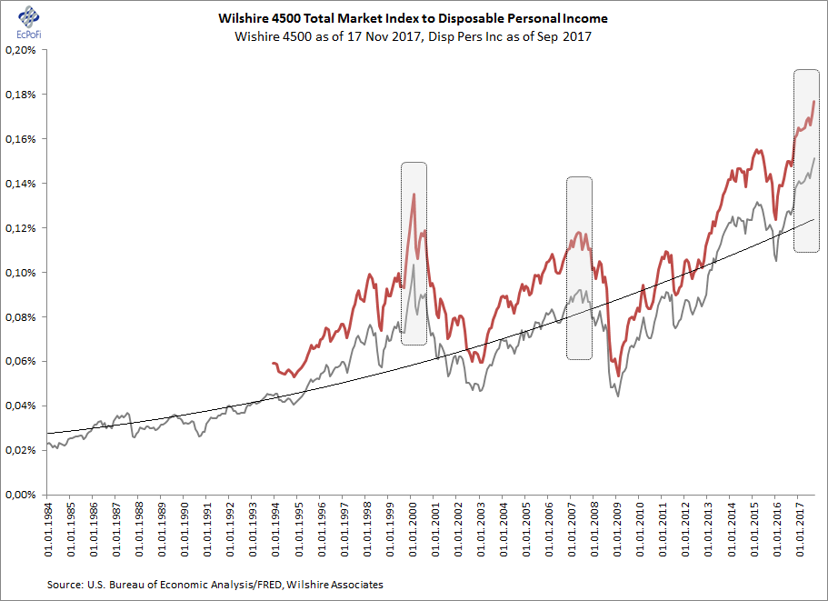
Chart 2. Wilshire 4500 & Commercial Banks’ Equity
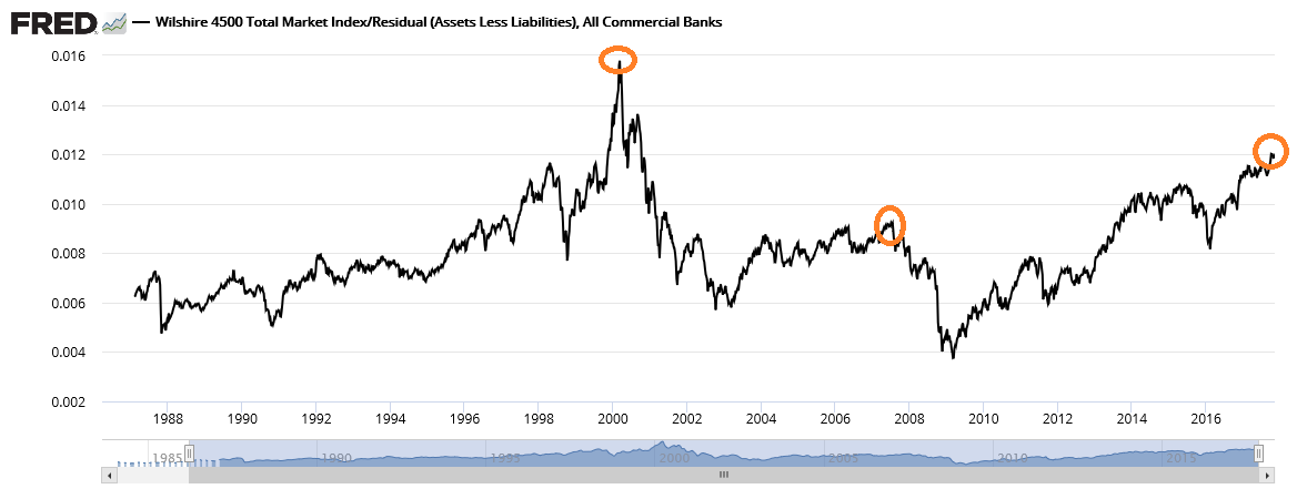
Chart 3. Russell 3000 & Productivity (Real Output per Hour)
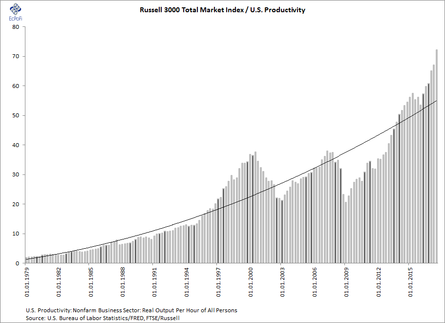
Chart 4. Wilshire & Retailers Sales
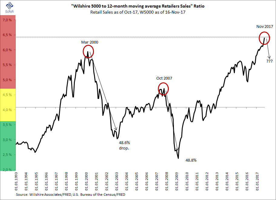
Chart 5. Wilshire 4500 & Manufacturers’ New Orders
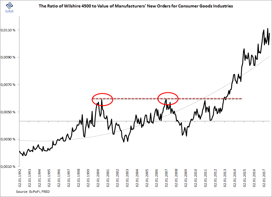
Chart 6. Households Net Worth & Disposable Personal Income
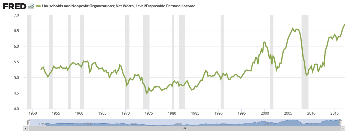
Chart 7. Wilshire US Mid-Caps & M2 Money Supply
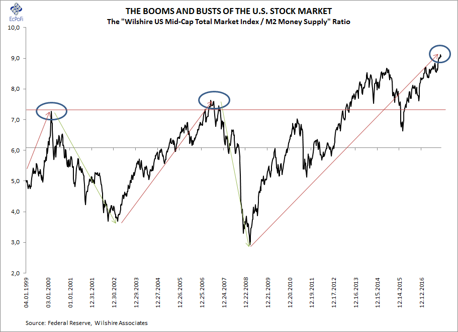
Chart 8. Wilshire 5000 & GDP
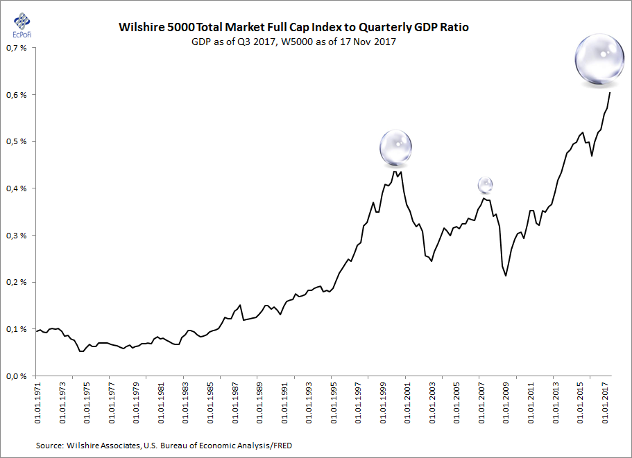
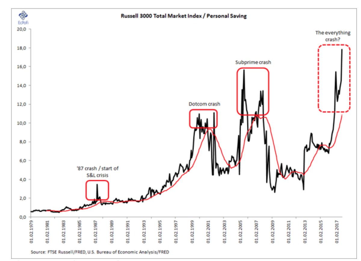
Chart 9. Russell 3000 & Personal Saving

Chart 10. Market Cap of U.S. Companies & Gross Private Saving
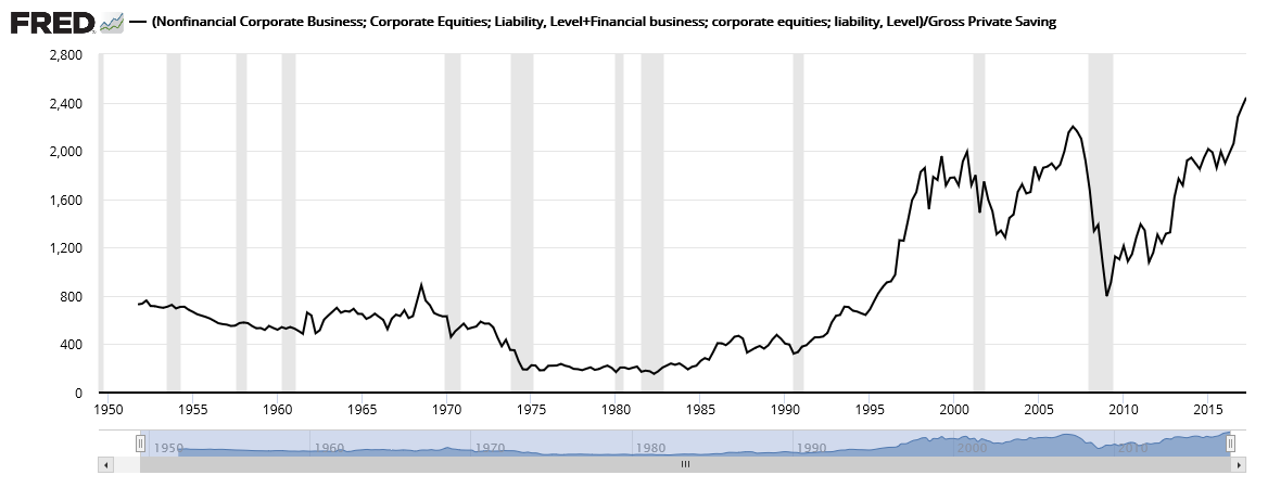
Chart 11. Wilshire 4500 compared to a combination of the Money Supply and a Leading Economic Indicator

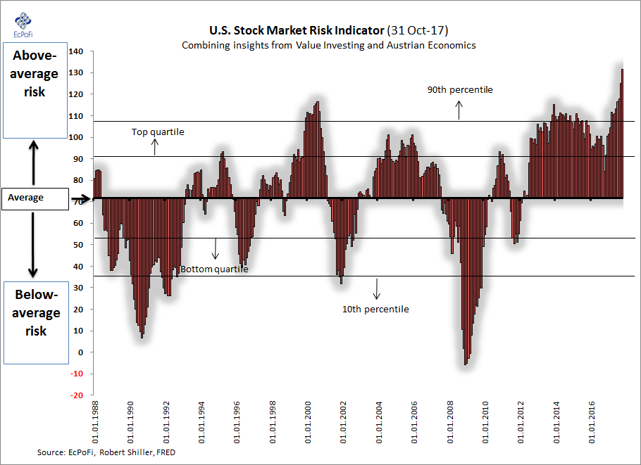
Bonus Chart: The U.S. Stock Market Risk Indicator
https://stockboardasset.com/insights-and-research/11-charts-exposing-madness-stock-market-crowd/
Why Wall Street’s record run may soon come to an end
Wall Street won’t like it if tax reform fails, or is delayed. And it will be disappointed if it is watered down.
https://nypost.com/2017/11/20/why-wall-streets-record-run-may-soon-come-to-an-end/
IS THERE A STOCK FLASH CRASH & A BOND BUBBLE IMPLOSION COMING IN 2018?
Millions of American have negative wealth, these people never recovered from the financial crisis of 2008, meanwhile the 1% have stolen the wealth from the rest of the people. Existing home sales decline. The yield curve is flattening and this is a sign that the entire system is going to come crashing down, this is the same pattern we have seen in other recession. Inflation is starting to tick up and once it is let loose it will be uncontrollable. BoA is predicting a stock flash crash in 2008 with a bond crash at the same time. The Economist magazine has predicted a new currency in 2018.
Four reasons why another global financial crisis is imminent – SCMP
Now consider the reasons to be nervous. First, the monetary policy party is closing. The Fed and the Bank of England are raising rates. The combined assets of the big four central banks – the Fed, European Central Bank, Bank of Japan and Bank of England – peak in December 2018, but the expansion rate has already started to slow. Global credit growth in aggregate is slowing.
Second, we are at a demographic inflection point. Between now and 2100, China’s working-age population is projected to shrink from 1 billion to below 600 million. Many labour markets look tight, with unemployment rates and other measures of slack leading economists to expect a surge in wages and inflation. Countries that think immigration will help matters will be disappointed as many newcomers lack the skills to easily absorb into a modern workforce. The rising dependency ratio as populations age doesn’t translate into higher saving but higher consumption, especially on health care.
The end of the 35-year bond bull market is nigh. Bonds will sell off; long-term rates will rise. The question is whether inflation will increase as much or more. If not, then real interest rates will rise, with serious implications for highly indebted entities. The Bank for International Settlements has published “early-warning indicators for stress in domestic banking systems”. Two big economies with flashing red lights are China and Canada.
Point three: a networked world – whose biggest companies are dedicated to reducing the cost of everything from shopping to searching to social networking – is a structurally deflationary world.
According to the World Bank, a range of occupations – from food processors to finance professionals – have a 50 per cent or higher probability of being “computerised”, with technology entirely or largely replacing human workers. Already, Waymo’s driverless cars are on the streets of Phoenix, Arizona.