Wolf Richter wolfstreet.com, http://www.amazon.com/author/wolfrichter
Some flat spots disappear, new ones form.
Prices of houses and condos across the US rose on average 6.2% from a year earlier (not seasonally-adjusted), according to the S&P CoreLogic Case-Shiller National Home Price Index for January, released this morning. The index exceeds the crazy peak of “Housing Bubble 1” in July 2006, just before it collapsed, by 6.3%. Prices have now been inflated by 46% since the bottom of Housing Bust 1:
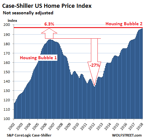
Local real estate prices are impacted by national and global factors — monetary policies, offshore investors looking at US housing as an asset class and escape hatch, etc. — as well as by local factors. Together they form local housing bubbles. When enough of them coincide, they turn into a national housing bubble, as depicted in the chart above.
The Case-Shiller Index is based on a rolling three-month average; today’s release is based on data from November, December, and January. The index uses “home price sales pairs,” i.e. comparing the January transaction to the prior transaction of the same house years earlier. Other factors and algorithms are used to obtain a price movement. The index was set at 100 for January 2000. An index value of 200 means prices as figured by the index have doubled.
The most splendid housing bubbles in major metro areas:
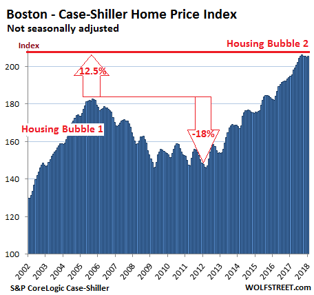
Boston:
The Case-Shiller home price index for the Boston metro rose on a monthly basis, after three declines in a row, that had followed 22 months in a row of increases, during which the index defied even the normal seasonal variations. It is now flat with August 2017, but after the price surge in early 2017, the index is still up 5.3% year-over-year. During Housing Bubble 1, from January 2000 to October 2005, the index soared 82% before dropping. It now topped that peak by 12.5%:
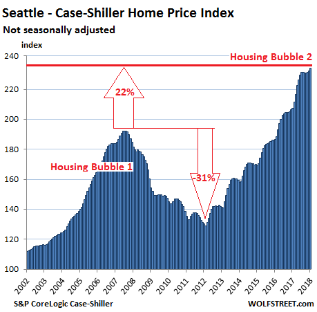
Seattle:
The index for the Seattle metro jumped 1% on a month-to-month basis to a new record. Late last year, it had experienced the first since the end of 2014! But that phase appears to be over at the moment. The index soared 12.9% year-over-year, 22% from the peak of Housing Bubble 1 (July 2007), and 81% from the bottom of Housing Bust 1 in February 2011:
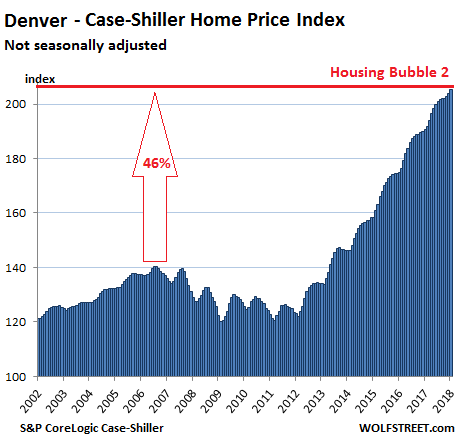
Denver:
The Denver metro index rose 0.7% on a monthly basis, the 27th increase in a row. The index is up 7.6% year-over-year and 46% from the peak in July 2006:
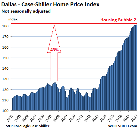
Dallas-Fort Worth:
The index for the Dallas-Fort Worth metro ticked up on a monthly basis for the 48th month in a row and rose 6.9% year-over-year. Since its peak during Housing Bubble 1 in June 2007, it has skyrocketed spectacularly 43%:
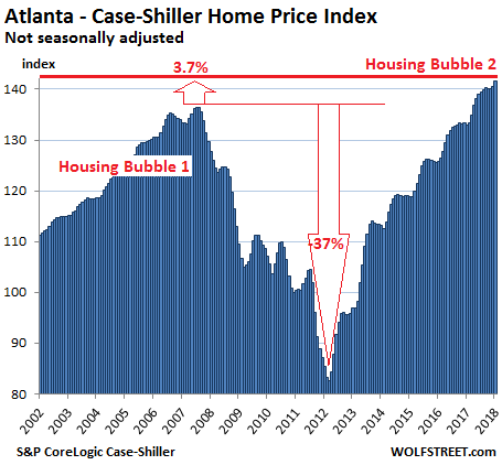
Atlanta:
The index for the Atlanta metro, which had been flat-ish for four months in a row, in line with prior seasonal patterns, ticked up 0.7% on a monthly basis and is up 6.5% year-over-year. It now exceeds the peak of Housing Bubble 1 in July 2007 by 3.7%, after having surged 70% since February 2012:
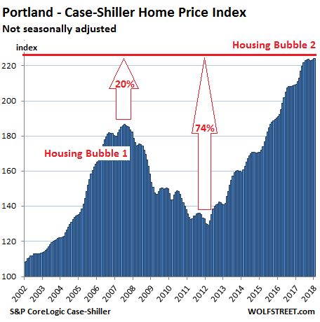
Portland:
The index for the Portland metro, after remaining about flat for five months, ticked up 0.43% on a monthly basis and hit a new record. The index is up 7.1% year-over-year, has soared 74% since 2012, is 20% above the peak of Housing Bubble 1 in July 2007, and has ballooned 124% since 2000:
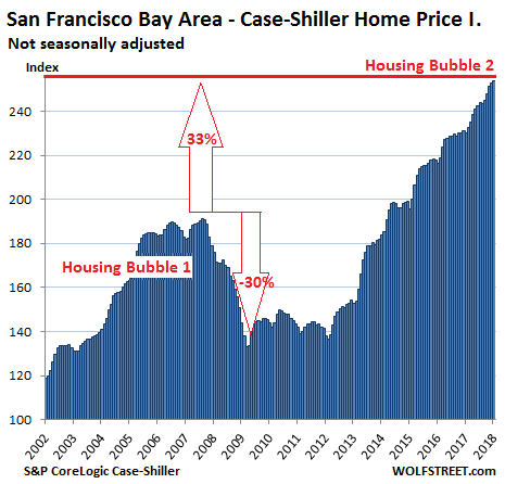
San Francisco Bay Area:
The Case-Shiller home price index for “San Francisco” actually covers the counties of San Francisco, Alameda, Contra Costa, Marin, and San Mateo, the latter being the northern part of Silicon Valley. This is a large and very diverse area that includes the city of San Francisco, the northern part of Silicon Valley (San Mateo county), part of the East Bay (the counties of Alameda and Contra Costa) and part of the North Bay (Marin county). The index rose 0.4% on a monthly basis and shot up 10.2% year-over-year. It’s up 33% from the insane peak of Housing Bubble 1, 87% from the end of Housing Bust 1, and 154% since 2000:
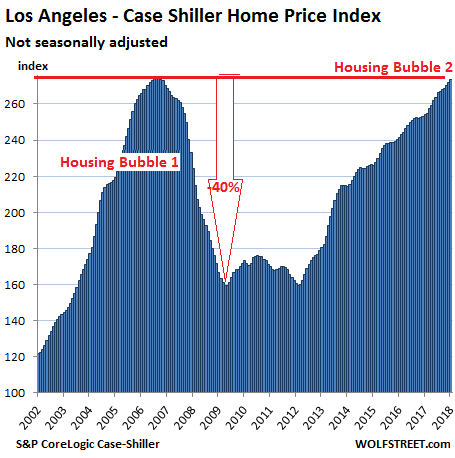
Los Angeles:
The index for the Los Angeles metro rose 0.6% for the month and 7.6% year-over-year. During Housing Bubble 1 in Los Angeles, home prices surged 174% from January 2000 to July 2006. The the crash that followed was nearly as steep. The index is now about a quarter point from where it had been during the peak of the housing insanity in 2006 and is likely to set a new record next month. The index for the neighboring San Diego metro looks nearly identical, with similar percentage changes, though the absolute numbers are just a tad lower.
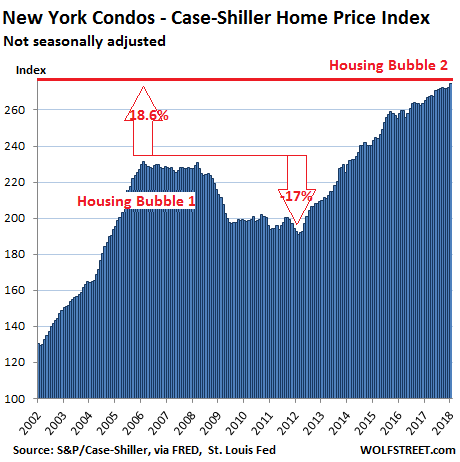
New York City Condos:
Case-Shiller’s special index for the condo market in New York City inched rose 0.8% on a monthly basis and is up 3.5% year-over-year. From 2000 to February 2006, the index soared 131%, and then declined. But QE unleashed money for Wall Street and global investors, and this stabilized the condo market until it began rising again in 2012. The index is 18.6% above the prior peak and has surged 175% in 17 years:
These charts show the handiwork of asset-price inflation, a monetary phenomenon where the dollar loses its purchasing power with regards to assets, such as homes. The Fed has set out to accomplish this starting in late 2008. Over the same period there has been little wage inflation. As a result, income from labor has been devalued with regards to assets, and this process continues as long as home prices rise faster than wages. The result of this type of asset price inflation that exceeds wage inflation can bee seen in the current “affordability crisis” or “housing crisis,” as it’s called in many cities.
At a certain level of wealth, these things aren’t the end of the world. But they do add up, as the co-founder of YouTube is finding out. Read… How Much Does it Really Cost to Buy a Luxury Condo in San Francisco, Not Live in it for 10 Years, Then Sell at a Loss?