via trueeconomics:
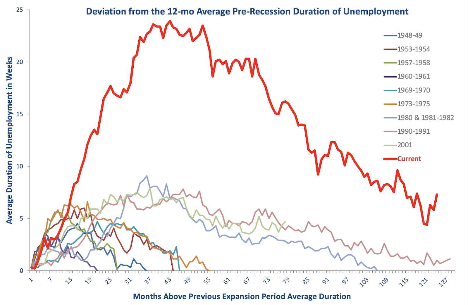
Remember my ‘scary chart’ from the day back? The one plotting the persistently high – relative to the business cycle – duration of unemployment in the U.S.?
I have not updated this chart for some years now. So here is a new version based on the latest data:
Two things worth noting:
- Declines in unemployment and rises in employment in recent years have been accompanied by a rather dramatic decline in the average duration of unemployment claims in the U.S. This is reflect in the drop in the cyclically-adjusted average duration of claims evidenced in the chart.
- However, by all historical comparatives, the current business expansion cycle continues to be associated with significantly higher average duration of unemployment, compared to the pre-recession average.
In other words, not all is rosy in the labor markets.
Got a news tip or correction? Let us know
If you got something out of this, please chip in to keep this site running, or subscribe to go ad-free.
5 views