- A Run For The Highs
- Ignore The Yield Curve…They Said
- Sector & Market Analysis
- 401k Plan Manager
A Run For The Highs
Friday wrapped up the first quarter of 2019, and it was the best quarterly performance since 2009. As shown in the chart below, if you bought the bottom, you are “killing it.”

However, you didn’t.
Despite all of the media “hoopla” about the rally, the reality is that for most, they are simply getting back to even over the last year.
That is, assuming you didn’t “sell the bottom” in December, which by looking at allocation changes, certainly appears to be the case for many.
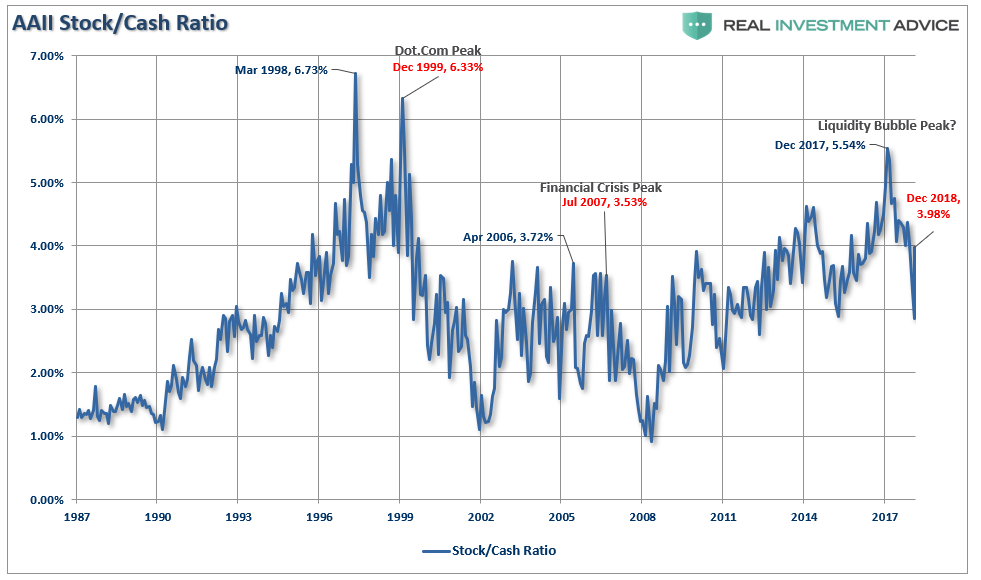
If we deconstruct the ratio we can see the rotation a bit better
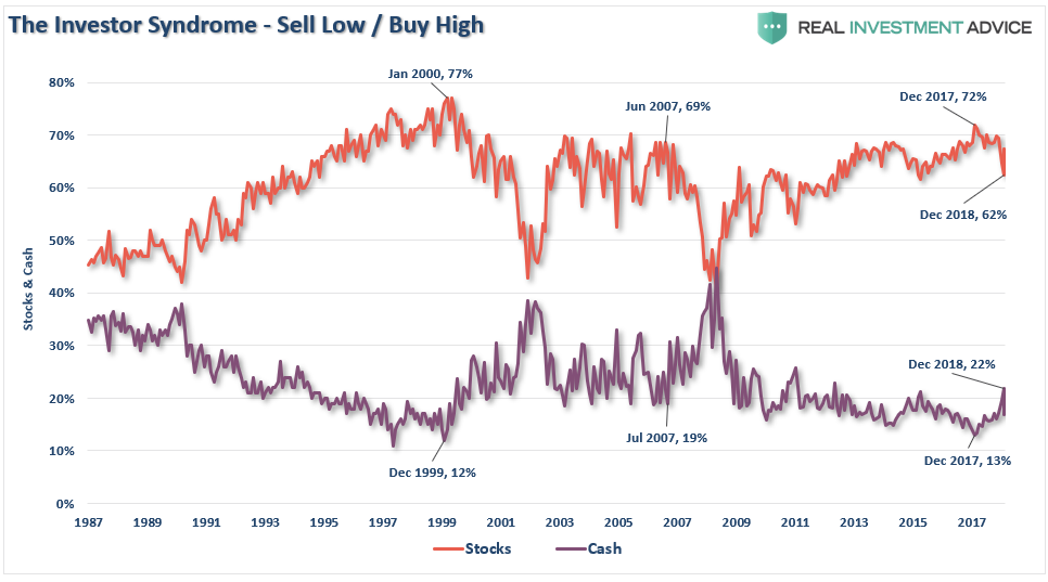
Not surprisingly, historically speaking, investors had their peak stock exposure before the market cycle peak. As the market had its first stumble, investors sold. When the market bounces, investors are initially reluctant to chase it. However, as the rally continues, the “fear of missing out or F.O.M.O” eventually forces them back into the market. This is how bear market rallies work; they inflict the most pain possible on investors both on the bounce and then on the way back down.
However, for the moment, we are still in the midst of a bear market rally. This will be the case until the market breaks out to new highs. Only then can we confirm the previous consolidation is complete and the bull market has been re-established.
The good news is on a very short-term basis, the market IS INDEED bullishly biased and coming off an extremely strong first quarter rally. The current momentum of the market is strong as bullish optimism has regained a foothold.
But, as we noted for our RIA PRO Subscribers last week, (Free 30-Day Trial with Code: PRO30) complacency has moved back to extremes which suggests that a further rally isn’t “risk free.”
“The graph below is constructed by normalizing VIX (equity volatility), MOVE (bond volatility) and CVIX (US dollar volatility) and then aggregating the results into an equal-weighted index. The y-axis denotes the percentage of time that the same or lower levels of aggregated volatility occurred since 2010. For instance, the current level is 1.91%, meaning that only 1.91% of readings registered at a lower level.
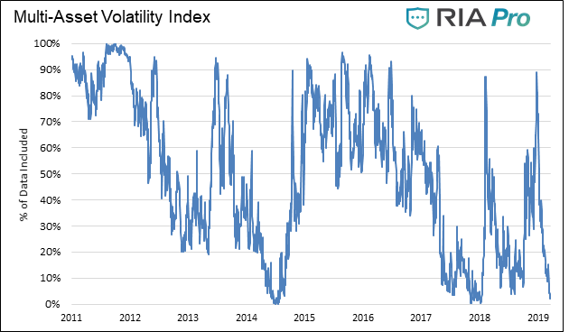
“Beyond the very low level of volatility across the three major asset classes, there are two other takeaways worth pondering.
The peak -to- trough -to- peak cycle over the last year was measured in months not years as was the case before 2018.
Secondly, when the index reached current low levels in the past, a surge in volatility occurred soon after that. This does not mean the index will bounce higher immediately, but it does mean we should expect a much higher level of volatility over the next few months.”
Nonetheless, the markets are close to registering a “golden cross.” This is some of that technical “voodoo” where the 50-day moving average (dma) crosses above the longer-term 200-dma. This “cross” provides substantial support for stocks at that level and limits downside risk to some degree in the short-term.
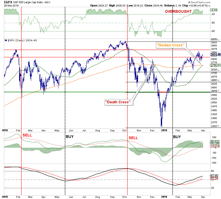
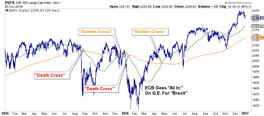
Over the next couple of weeks, you are going to see a LOT of commentary about “the Golden Cross” buy signal and why this means the “bull market” is officially back in action. While “golden crosses” are indeed bullish for the markets, they are not an infallible signal. The chart below shows the 2015-2016 market where investors were whipsawed over a 6-month period before massive Central Bank interventions got the markets back on track.
The next chart shows the longer-term version of the chart above using WEEKLY data. The parameters are set for a slightly longer time frame to reduce the number of “false” indications. I have accentuated the moving averages to have them more clearly show the crosses.
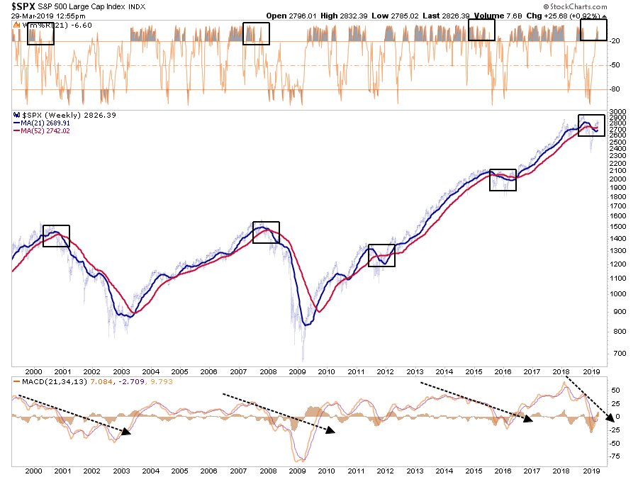
The one thing that you should notice is the negative “cross over” is still intact AND it is doing so in conjunction with an extreme overbought weekly condition and a “negatively diverging” moving average divergence/convergence (MACD) indicator. This combined set of “signals” has only been seen in conjunction with the previous market peaks.(As noted, the corrections of 2012 and 2015-16 were offset by massive amounts of Central Bank interventions which are not present currently.)
From a portfolio management standpoint, what should you do?
In the short-term the market remains bullishly biased and suggests, with a couple of months to go in the “seasonally strong” period of the year, that downside risk is somewhat limited.
Therefore, our portfolio allocations:
- Remain long-biased towards equity risk
- Have a balance between offensive and defensive sector positioning
- Are tactically positioned for a trade resolution (which we will sell into the occurrence of.)
However, the analysis also keeps us cautious with respect to the longer-term outlook. With the recent inversion of the yield curve, deteriorating economic data, and weaker earnings prospects going forward, we are focused on risk management and capital controls. As such we are:
- Continuing to carry slightly higher levels of cash
- Overweight bonds
- Have some historically defensive positioning in portfolios.
- Continue to tighten-up stop-loss levels to protect gains, and;
- Have outright hedges ready to implement when needed.
Ignore The Yield Curve…They Said
In the World War II real-time strategy (RTS) game Company of Heroes, released on September 12th, 2006, the engineer squad would sometimes say:
“Join the army they said. It’ll be fun they said.”
Since then, the statement has become a common meme on the internet to espouse the disappointment derived from various actions from doing the laundry to getting a job.
Well, the latest suggested action, which will ultimately lead to investor disappointment, is:
“Ignore the yield curve they said. It’ll be fun they said.”
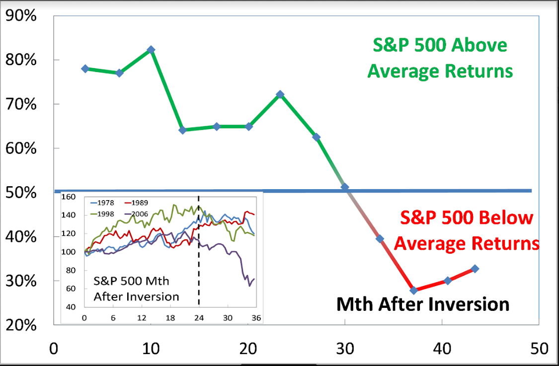
Last week, Mark Kolanovic of J.P. Morgan stated:
“Historically, equity markets tended to produce some of the strongest returns in the months and quarters following an inversion. Only after [around] 30 months does the S&P 500 return drop below average,”
While the statement is not incorrect, it is advice that will ultimately lead to disappointment.
In 1998, for example, as the bull market was running hot. There was “no recession in sight,” and investors were repeatedly advised to ignore the yield curve because “this time was different.”
After all, at that moment in history, it was perceived to be a “new paradigm.” The internet was changing the world and making old metrics, like earnings, relics of the past. It was even suggested at the time that “investing like Warren Buffett was like driving Dad’s old Pontiac.”
Over the next two years, that advice held true as bullish optimism seemed well founded. It was in early 2000 that Jim Cramer issued his Top 10-Stock Picks for the next decade.
The problem is that no one ever said “sell.”
While it was great that gains were made during the period between the initial yield curve inversion and the peak of the market, all of those gains, plus much more, were wiped out in the ensuing decline. Values in portfolios were returned to where they were roughly a decade earlier by the time the decline was officially over.
Since the majority of mainstream financial advice never suggest selling, investors had no clue that if they had gone to cash in 1998, they saved themselves both a lot of grief and years of losses needing to be recovered.
It was just an anomaly.
That was the belief at the time. Following the “Dot.com” crash, the entire tragic event was considered an anomaly; a once-in-a-100-year event which would not be replicated anytime again soon.
But just 4-years later, in 2006, investors were once again told to ignore the yield curve inversion as it was a “Goldilocks economy” and “sub-prime mortgages were contained.” While many of the individuals who had told you to stay invested leading up to 2000 peak were mostly gone from the industry, a whole new crop of media gurus and advisors once again told investors to “ignore the yield curve.”
For a second time, had investors just sold when the yield curve inverted, the amount of damage that would have avoided more than paid off for the small amount of gains missed as the market cycle peaked.
Grab a cup of coffee and start your trading/investing day with me.
Streaming Live On The Web
This quad-panel chart below shows the 4-previous periods where 50% of 10-different yield curves were inverted. I have drawn a horizontal red dashed line from the first point where 50% of the 10-yield curves we track inverted. I have also denoted the point where you should have sold and the subsequent low.
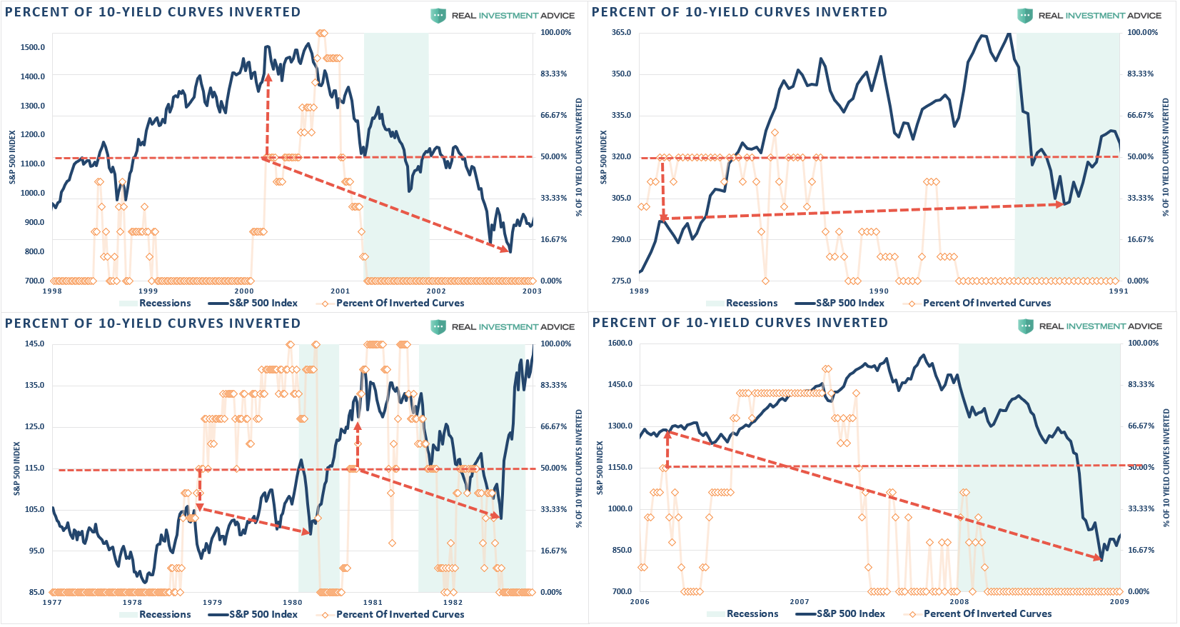 As you can see, in every case, the market did rally a bit after the initial reversion. However, had you reduced your equity-related risk, not only did you bypass a lot of market volatility (which would have led to investor mistakes anyway) but ended up better off than those trying to just ride it out.
That’s just history
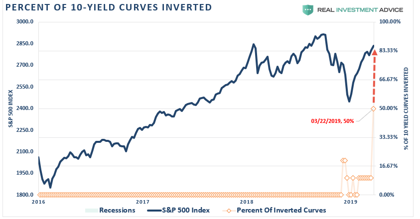
Oh, as we noted last week, we just hit the 50% mark of inversions on the 10-spreads we track.
This time is unlikely to be different.
More importantly, with economic growth running at less than 1/2 the rate of the previous two periods, it will take less than half the amount of time for the economy to slip into recession.
While I am not suggesting you sell everything and go to cash today, history is pretty clear that you will likely not miss much if you did.
What Can You Do?
I don’t disagree that the markets could certainly rise from here, in the short-term. I answered this question last week:
“Are we going to hit new highs you think, or is this a setup for the real correction?”
The answer is “yes” to both parts.
The mainstream media’s advice is simply:
“Since you don’t know when a bear market will start, you just have to ride it out.”
This is the problem with the mainstream media and the majority of the financial advice in the world today.
It is not required that you know precisely when one market cycle ends and another begins.
Investing isn’t a competition. It is simply a game of survival over the long-term. While it is critically important we grow wealth while markets are rising, it is NOT a requirement to obtain every last incremental bit of gain there is. Staying too long at the poker table is how you leave broke.
We wrote in early 2018 the bull market had come to its conclusion for a while. That correction process is still intact as shown in the chart below.
There are three important things worth pointing out:
- The top panel is GAAP earnings (what companies REALLY earn) and nominal GDP.
- The black vertical line is when the markets begin to “sniff out” something is not quite right.
- The red bars are when “expectations” are disappointed.
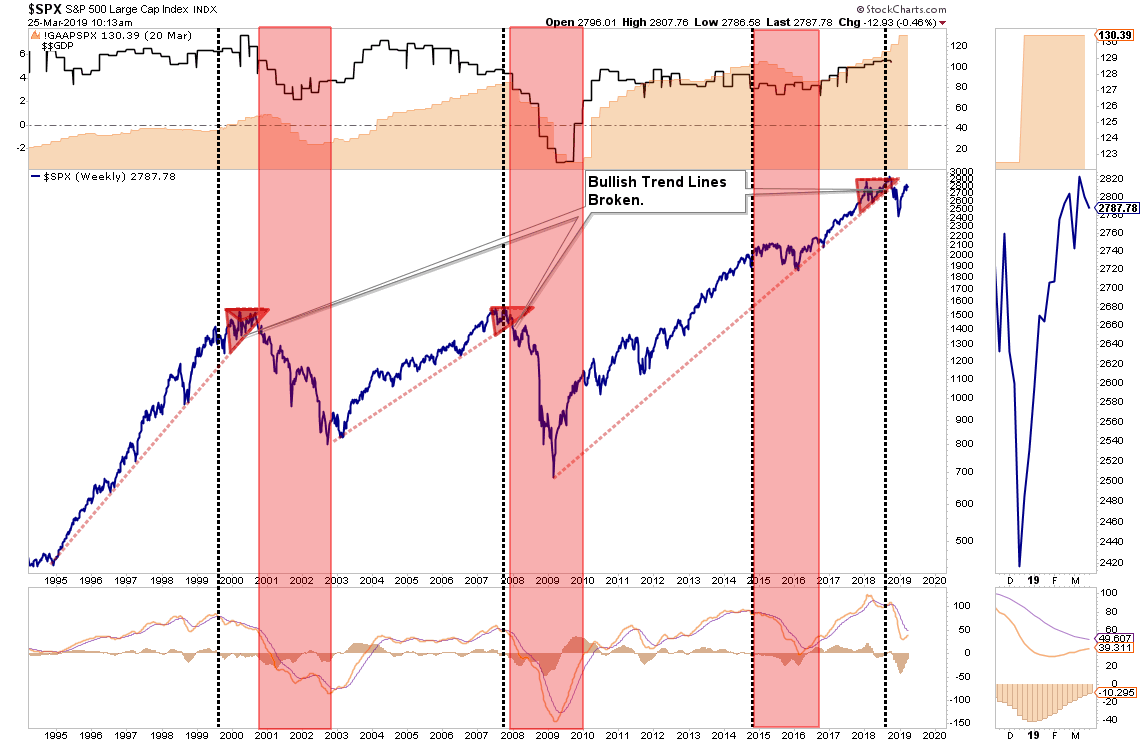
Pay attention to these longer-term trend changes as historically they signify bigger issues with the market.
It is unlikely this time is different. There are too many indicators already suggesting higher rates are impacting interest rate sensitive, and economically important, areas of the economy. The only issue is when investors recognize the obvious and sell in the anticipation of a market decline.
The yield curve is clearly sending a message which shouldn’t be ignored and it is a good bet that “risk-based”investors will likely act sooner rather than later. Of course, it is simply the contraction in liquidity that causes the decline which will eventually exacerbates the economic contraction. Importantly, since recessions are only identified in hindsight when current data is negatively revised in the future, it won’t become “obvious” the yield curve was sending the correct message until far too late to be useful.
While it is unwise to use the “yield curve” as a “market timing” tool, it is just as unwise to completely dismiss the message it is currently sending.
See you next week.
Market & Sector Analysis
Data Analysis Of The Market & Sectors For Traders
UNLOCKED – This week were are unlocking our market and sector analysis for you. This section is normally reversed solely for our RIA PRO Subscribers.
S&P 500 Tear Sheet
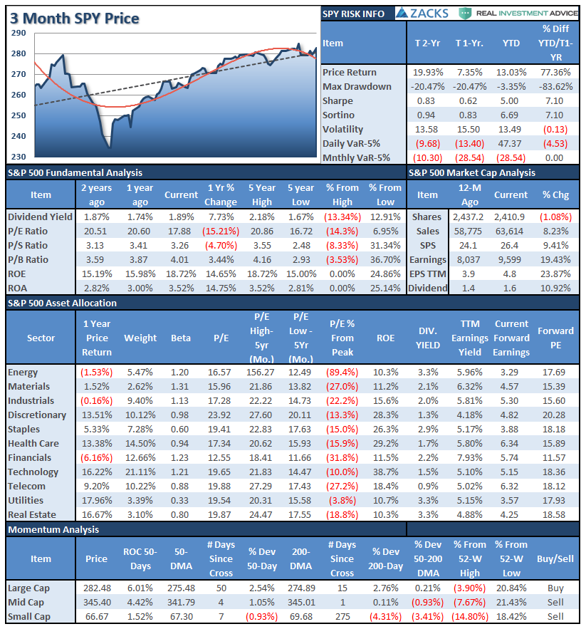
Performance Analysis
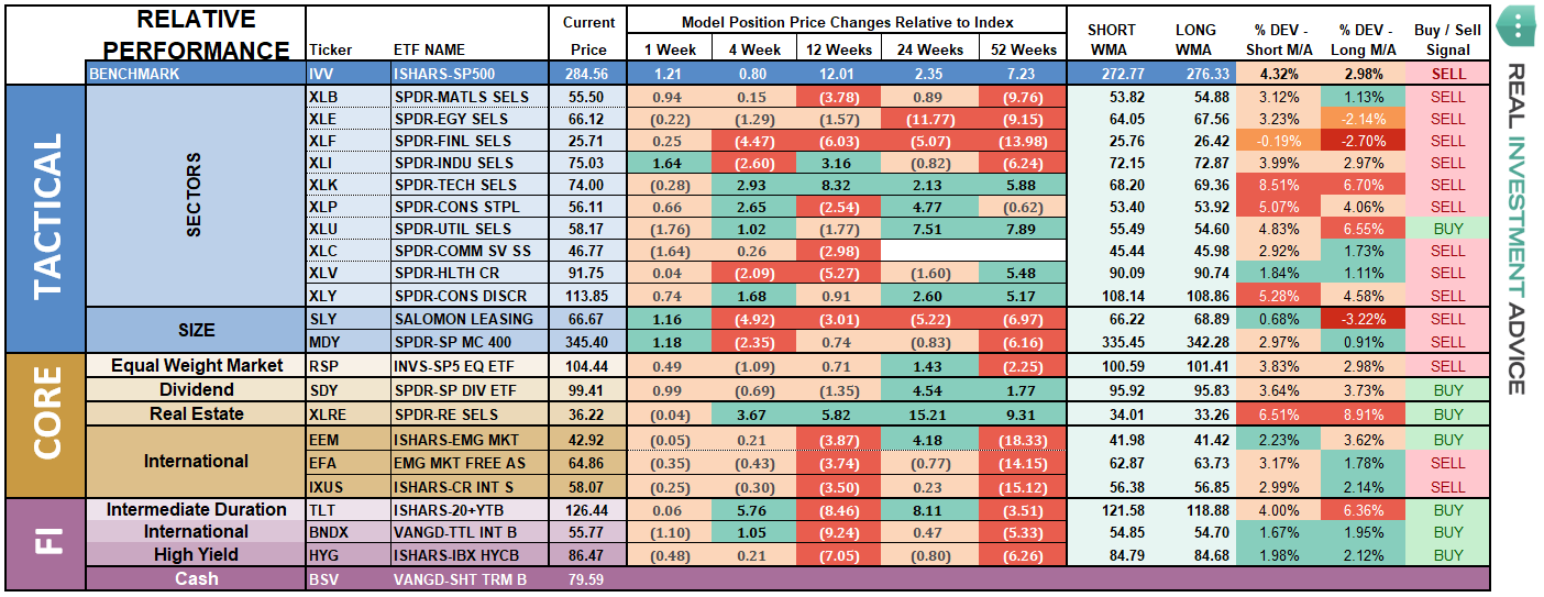
ETF Model Relative Performance Analysis
Sector & Market Analysis:
Be sure and catch our updates on Major Markets (Monday) and Major Sectors (Tuesday) with updated buy/stop/sell levels
Sector-by-Sector
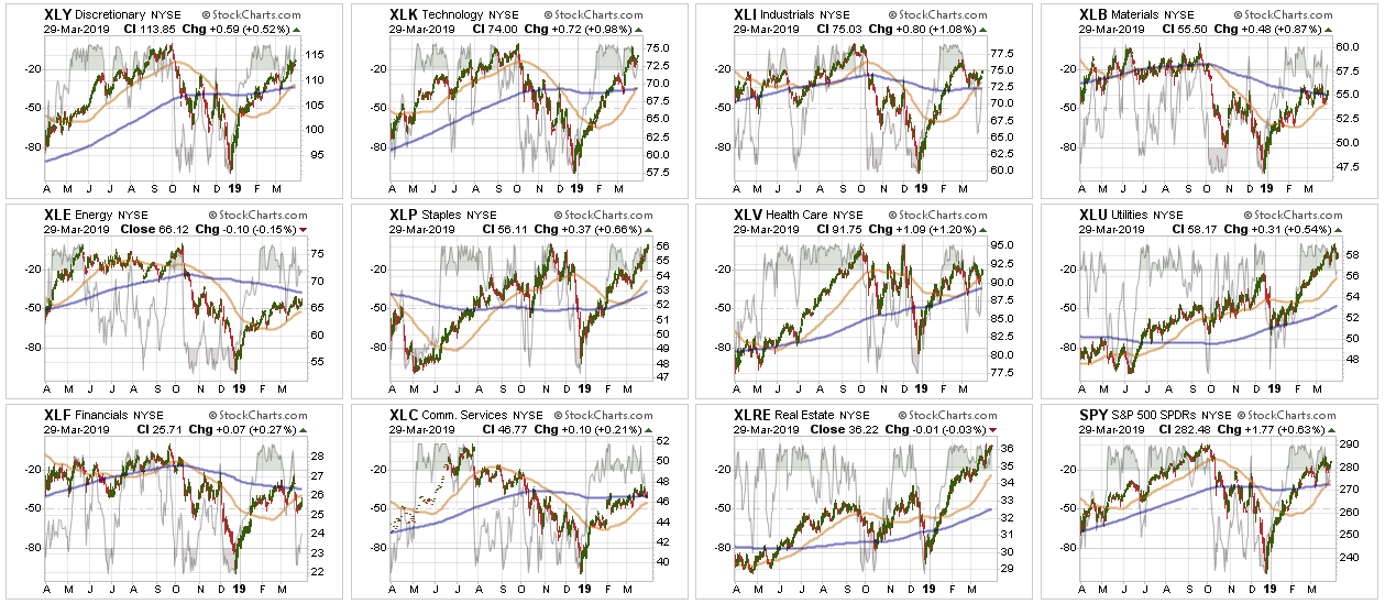
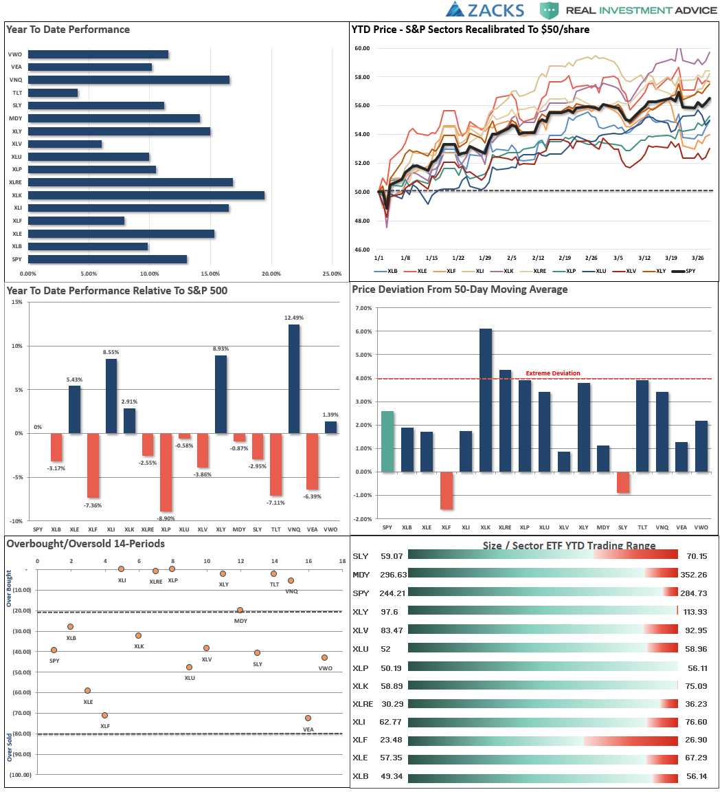
Looking at sectors on a “relative performance” basis to the S&P 500 we have seen some rotations in leadership over the last week.
Improving – Energy
Energy began to improve its performance as oil prices perked back up last week. With oil back to the higher end of its trend range, this is likely a good time to harvest some profits from the sector.
Current Positions: 1/2 Position in XLE
Outperforming – Technology, Industrials, Discretionary & Communications
Discretionary particularly picked up performance last week and joined the small group of sectors where the 50-dma has crossed bullishly. Industrials also gained ground on continued hopes for a trade resolution with China. These sectors are all overbought, so take some profits, but remain long for now.
Current Positions: XLI, XLY, XLC, XLK – Stops moved from 50- to 200-dma’s.
Weakening – Real Estate & Utilities
Lately, Utilities and Real Estate have been on a parabolic advance. Not surprisingly, they are taking a breather as money rotated to more offensive sectors last week. We have previously recommended taking profits in these sectors for now, which remains the advice again this week.
Current Position: XLU
Lagging – Healthcare, Staples, Financials & Basic Materials
Financials have been struggling as of late due to the inversion of the yield curve which impacts their profitability. Healthcare and Staples also weakened a bit this past week as money rotated from defense to offense in the market. Take profits and reduce back to portfolio weight as needed.
Current Positions: XLB, XLF, XLV, XLP – Stops remain at 50-dmas.
Market By Market
Current Position: None
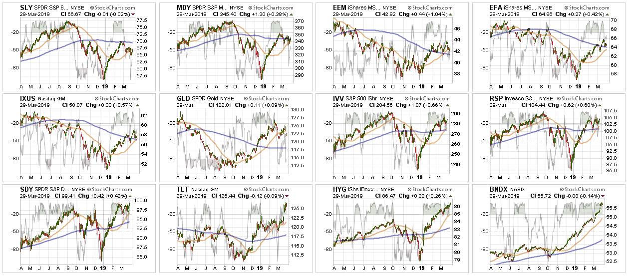
Emerging, International & Total International Markets
As noted last week, Emerging Markets pulled back to its 200-dma after breaking above that resistance. We did add 1/2 position in EEM to portfolios three weeks ago understanding that in the short-term emerging markets were extremely overbought and likely to correct a bit. That corrective action is continuing and we need a breakout above the current consolidation to become more aggressive on the holding.
Major International & Total International shares DID finally break above their respective 200-dma’s on hope the worst of the global economic slowdown is now behind them. The pullback last week has brought the market back to test its 200-dma. It is critical support holds next week. Keep stops tight on existing positions, but no rush here to add new exposure.
Stops should remain tight at the running 50-dma which is also previous support.
Current Position: 1/2 position in EEM
Dividends, Market, and Equal Weight – These positions are our long-term “core” positions for the portfolio given that over the long-term markets do rise with respect to economic growth and inflation. Currently, the short-term bullish trend is positive and our core positions are providing the “base” around which we overweight/underweight our allocations based on our outlook.
Core holdings are currently at target portfolio weights.
Current Position: RSP, VYM, IVV
Gold – Despite the reversal of the Fed, the collapse of the yield curve, and concerns about global economic growth, Gold sold off last week and broke the rising trend of the 50-dma. Gold is oversold currently, but has really struggled to advance. There isn’t a compelling reason to add more to our holdings at this juncture. A move above $125 will make things more interesting.
Current Position: GDX (Gold Miners), IAU (Gold)
Bonds –
The big move two weeks ago was in Bonds. If you have been following our recommendations of adding bonds to portfolios over the last 13-months, this portion of the portfolio has performed well in offsetting market volatility. As noted previously, intermediate duration bonds remain on a buy signal after increasing exposure last month. However, they are now extremely overbought, so look for a pullback that holds 2.50% on the 10-year Treasury to increase exposure.
Current Positions: DBLTX, SHY, TFLO, GSY
High Yield Bonds, representative of the “risk on” chase for the markets, popped higher last week with the move higher in equities. International bonds, which are also high credit risk, are running akin to the markets. If you are long high yield or international bonds take profits now and rebalance risk back to normal portfolio weights. The current levels are not sustainable and there will be a price decline which will offer a better entry opportunity soon.
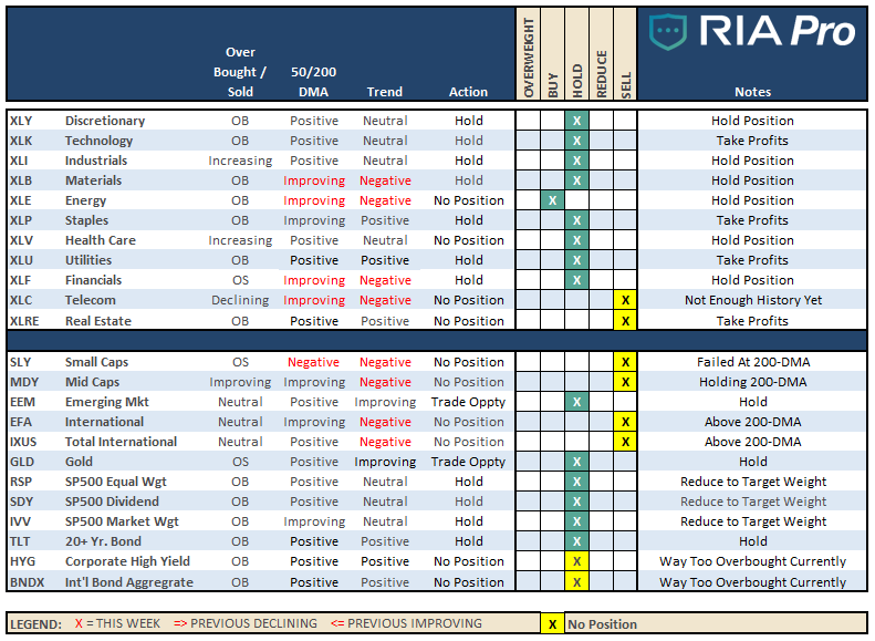
The table below shows thoughts on specific actions related to the current market environment.
(These are not recommendations or solicitations to take any action. This is for informational purposes only related to market extremes and contrarian positioning within portfolios. Use at your own risk and peril.)
Portfolio/Client Update:
There were no changes to portfolios last week:
With rising concerns over economic weakness the markets have consolidated over the last couple of weeks. With earnings season fast approaching, we are reviewing holdings to take profits, tighten up stops, and reduce risk.
A bad announcement or forecast can have an immediate and sharp impact on company stocks prices. However, in most cases we are carrying underweight exposure so we may get opportunities is some of our holdings to buy at cheaper prices as long as trends are holding.
- New clients: Will begin the onboarding process this coming week if the market continues to hold support at 2800.
- Equity Model: No changes – Reviewing for rebalancing as needed.
- ETF Model: No changes. – Reviewing for rebalancing as needed.
Note for new clients:
It is important to understand that when we add to our equity allocations, ALL purchases are initially “trades” that can, and will, be closed out quickly if they fail to work as anticipated. This is why we “step” into positions initially. Once a “trade” begins to work as anticipated, it is then brought to the appropriate portfolio weight and becomes a long-term investment. We will unwind these actions either by reducing, selling, or hedging, if the market environment changes for the worse.
THE REAL 401k PLAN MANAGER
A Conservative Strategy For Long-Term Investors
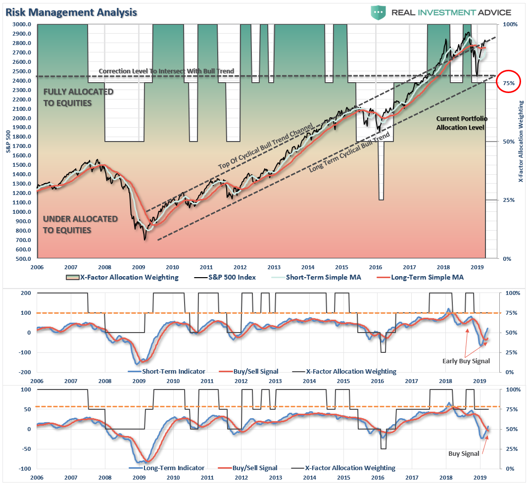
There are 4-steps to allocation changes based on 25% reduction increments. As noted in the chart above a 100% allocation level is equal to 60% stocks. I never advocate being 100% out of the market as it is far too difficult to reverse course when the market changes from a negative to a positive trend. Emotions keep us from taking the correct action.

Rebalance To Targets
As noted above, the bullish backdrop of the market remains currently, and the recent consolidation process has alleviated some of the short-term overbought condition.
With earnings season getting ready to kick off, there is support for the markets over the next month. However, with that said, the economic risk is also rising as well so we still want to remain cautious for the time being.
Over the last couple of months, we have repeatedly suggested to rebalance risk, align portfolios with the target, and be patient until the market gives us an all-clear sign. That advice has worked well in reducing portfolio volatility while allowing for participation to the markets.
That same advice remains this week.
- If you are overweight equities – take some profits and reduce portfolio risk on the equity side of the allocation. However, hold the bulk of your positions for now and let them run with the market.
- If you are underweight equities or at target – just sit tight for now and let’s see what happens next.
If you need help after reading the alert; don’t hesitate to contact me.
Exciting News – the 401k Plan Manager is “Going Live”
We are making a “LIVE” version of the 401-k allocation model which will soon be available to RIA PRO subscribers.You will be able to compare your portfolio to our live model, see changes live, receive live alerts to model changes, and much more.
This service will also be made available to companies for their employees.
Stay tuned for more details over the next couple of weeks.
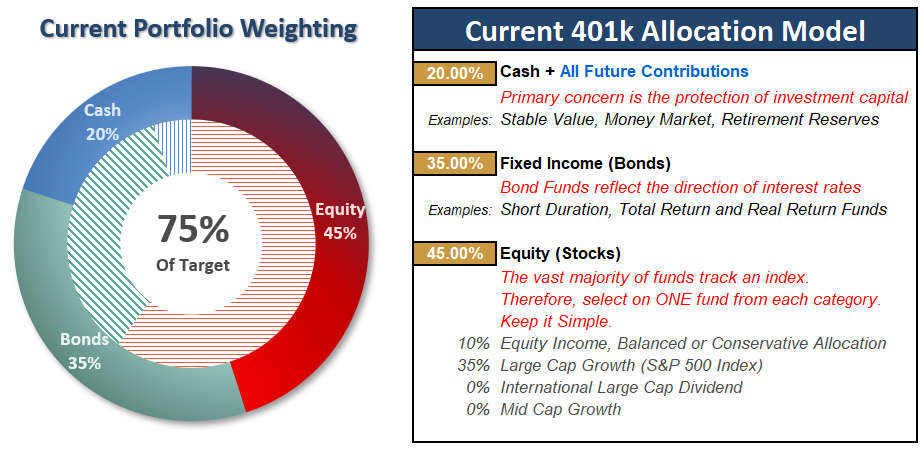
Current 401-k Allocation Model
The 401k plan allocation plan below follows the K.I.S.S. principle. By keeping the allocation extremely simplified it allows for better control of the allocation and a closer tracking to the benchmark objective over time. (If you want to make it more complicated you can, however, statistics show that simply adding more funds does not increase performance to any great degree.)
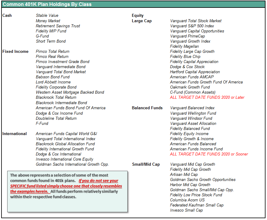
401k Choice Matching List
The list below shows sample 401k plan funds for each major category. In reality, the majority of funds all track their indices fairly closely. Therefore, if you don’t see your exact fund listed, look for a fund that is similar in nature.