World Population Growth Visualized (1950-2100)
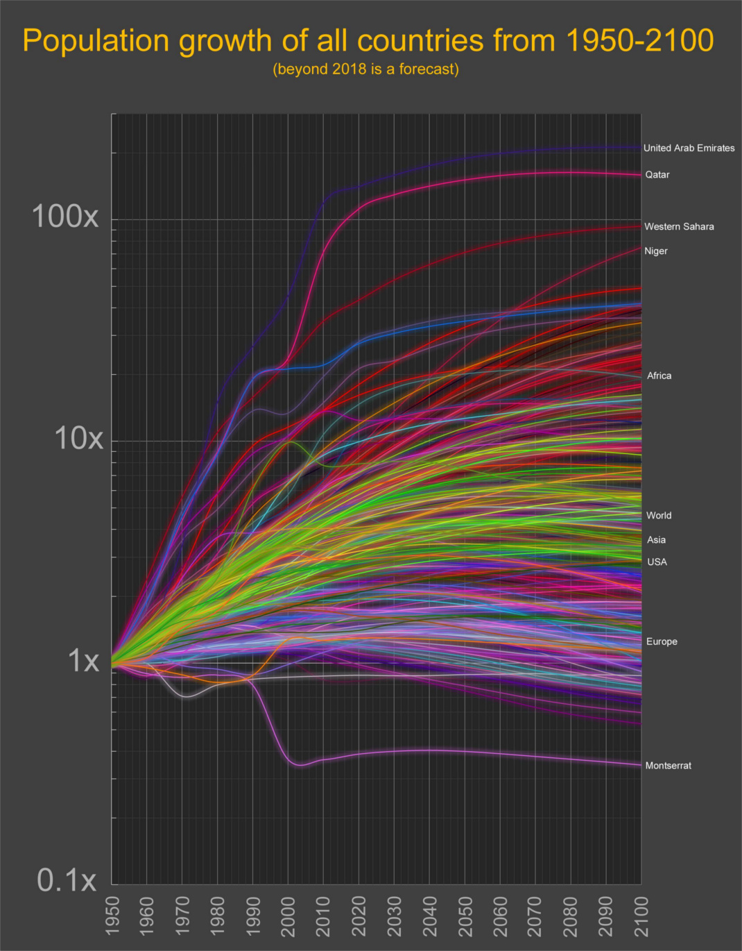
by visualcapitalist In any large set of data, there are bound to be some interesting outliers. Today’s data visualization comes to us from Reddit user /r/mythicquale and it shows the population growth of every country using data and projections from the United Nations population division. The graph is on a logarithmic scale, which ultimately groups together most growth … Read more