Skip to content

Investment Watch Blog

  • Home
  • About
  • Newsletters/RSS
  • Disclaimer

chart

Is the Yield curve correlated with financial crises? See the chart. Gray vertical bands indicate the last seven financial crises.

February 15, 2019 12:35 pm
Categories Sticky

Smart Money Was FLEEING the Stock Market! THIS Chart Proves Fed Saved Crashing Stocks!

February 13, 2019 8:58 am
Categories Sticky post

Here are the levels chart for $SPX – very very pretty (if you are bearish)

February 7, 2019 10:14 am
Categories Latest Story

Is there a more deflationary chart than the Baltic Dry Index of global freight rates?

February 5, 2019 6:10 pm
Categories Latest Story

Chart: The World’s Largest 10 Economies in 2030

January 11, 2019 8:13 pm
Categories Sticky

Junk bonds lose 43% of their value from here as this chart suggests we will be in a depression…..Gundlach: “By historic standards 62% of Triple B rated bonds should be considered junk status right now BUT are not”

January 9, 2019 8:09 am
Categories Featured Post

This chart could be the most important for markets in Q1-2019

January 1, 2019 7:57 pm
Categories Featured Post

2018 Chart Of The Y(B)ear – Stock bulls started out of the gates quickly in 2018 — but it’s the bears in position now to win in the long run.

December 31, 2018 5:44 pm
Categories Featured Post

Think You’re Middle Class? Check This Chart to Find Out

December 26, 2018 12:25 pm
Categories Featured Post

Chart: Mean-reversion can be painful

December 19, 2018 9:47 am
Categories Latest Story

Will 2019 Be the Year the Stock Market Crashes? THIS is the Most Important Chart Right Now!

December 17, 2018 9:11 am
Categories Sticky

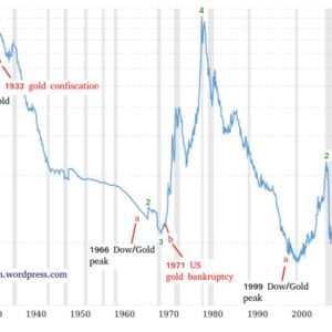
This Gold Chart Analysis Shows We’re Closer To A SIGNIFICANT Monetary Event

December 13, 2018 9:37 pm
Categories Latest Story

This S&P 500 Chart Just Went From Interesting To Dangerous

December 8, 2018 9:44 am
Categories Latest Story

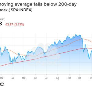
S&P 500 closes in an official ‘death cross,’ a chart pattern that could signal more pain ahead

December 8, 2018 9:37 am
Categories Latest Story

You’ll be shocked to learn in this chart that the breaking point in credit markets is right here

November 29, 2018 8:43 am
Categories Sticky

Reliable Chart Suggests Gold’s Time May be Near

November 26, 2018 4:18 pm
Categories Sticky

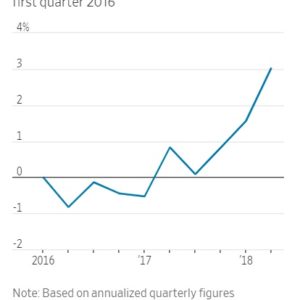
BOOMING ECONOMY: Here’s One Simple Chart That Shows How Trump Boosted The GDP

November 1, 2018 10:29 am
Categories Latest Story

‘Godfather’ Of Chart Analysis Says The ‘Damage Done To The Stock Market IS MUCH WORSE’

October 31, 2018 10:14 pm
Categories Latest Story

GDP, Pending home sales, new home sales, leveraged loans, 3M chart

October 26, 2018 3:27 pm
Categories Sticky

The Chart About Tesla’s Financials Makes Me Scratch My Head

October 25, 2018 7:53 am
Categories Featured Post
Older posts
Newer posts
← Previous Page1 … Page4 Page5 Page6 … Page10 Next →
  • RSS Feed
  • Twitter
  • Facebook
  • Mail

To afford free speech, IWB needs to be fully reader-funded. Please donate here

Submit Correction/News Tips/Suggestions

Privacy & Cookies: This site uses cookies. By continuing to use this website, you agree to their use. To find out more, see here: Cookie Policy Do Not Sell My Personal Information Please consider turning off your ad blocker to support our website and ensure we can continue to provide quality content for free. Disclaimer

InvestmentWatchBlog.com © 2013-2023. All Rights Reserved.

© 2025 Investment Watch Blog • Built with GeneratePress