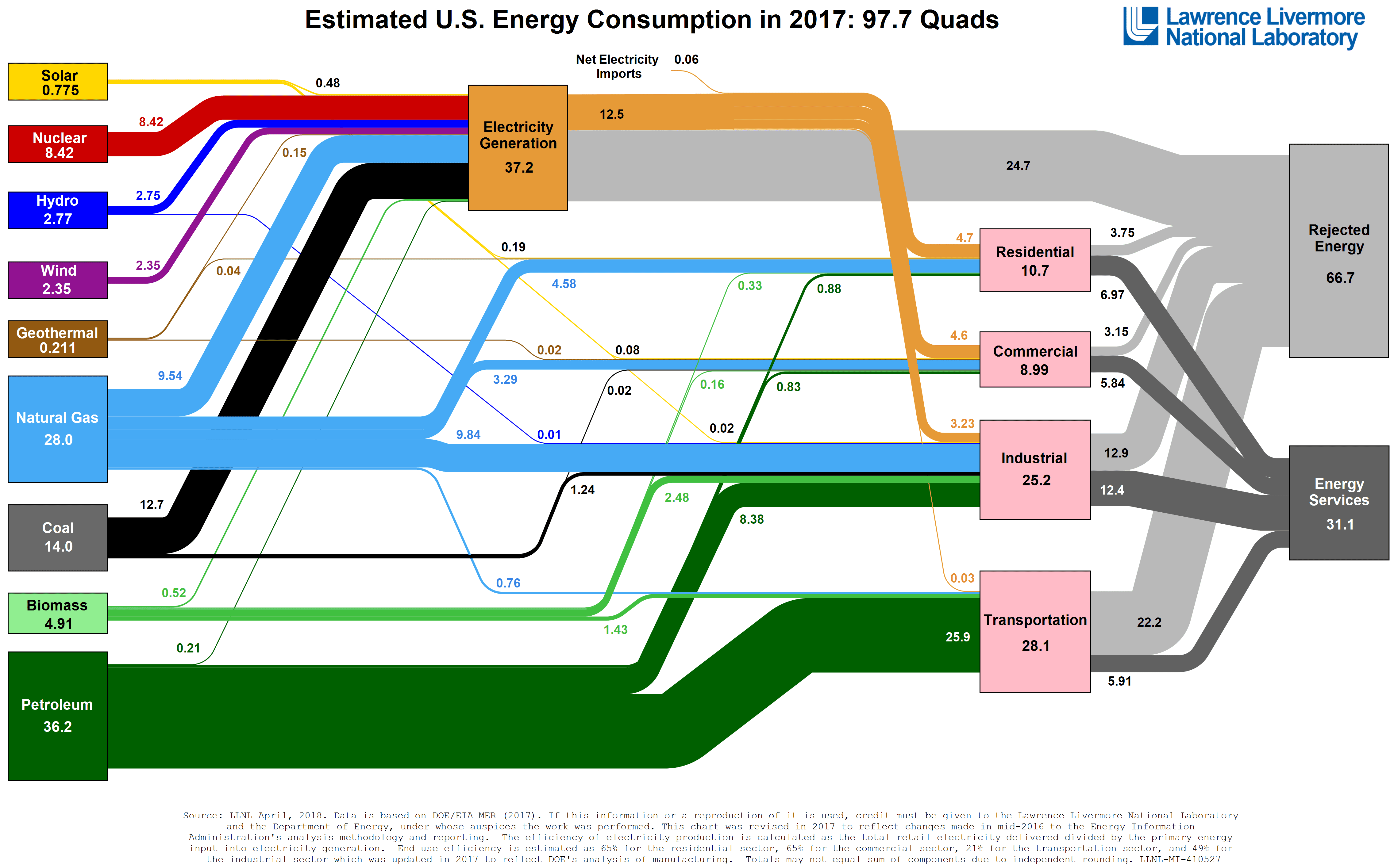
Chart: Small Caps Vs Large Caps PE10 Valuations
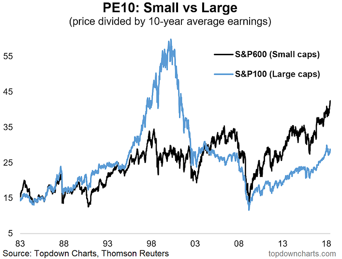
via Callum Thomas Starting the week off with a long term look at the small end of the market, this chart shows the PE10 Valuation metric (price vs trailing 10 year average earnings) for the S&P600 (small cap stocks) vs …