Authored by Chris Hamilton via Econimica blog,
In 2019, US population growth fell to +1.55m or +0.5%…this was due to a trifecta of declining births, lower immigration, and higher deaths than anticipated. However, as with everything “2020”, all three trends are only intensifying to blow away 2019. Births are falling faster and further, deaths moving higher with Corona-virus and drug related overdoses, and immigration nearly non-existent. Thus, US population growth will likely dip to “just” 1 million or +0.3% this year. And while I anticipate (or think it feasible) that immigration could return to 2019 levels eventually, births will almost surely continue falling and deaths rising more than anticipated. The simple outcome of this is an ongoing collapse in US population growth which is far larger than in scope than the current Corona-virus pandemic.
Census Population Estimates…Wildly Overstating Growth
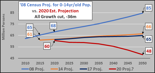
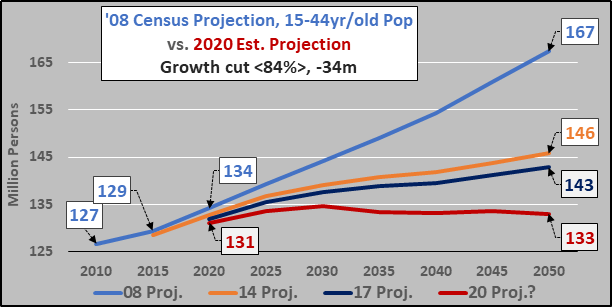
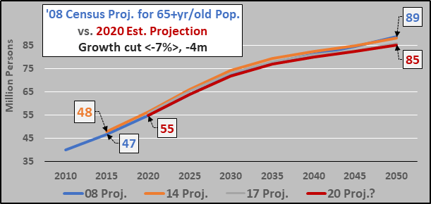
The chart below shows the 2008, 2014, and 2017 Census US total population projections through 2050. Some quick math shows that in 9 years time from ’08 to ’17, the Census downgraded US population growth through 2050 by 50 million persons. But due to the factors mentioned above, the 2020 Census projection through 2050 will need another massive downgrade…I’d suggest something on the order of another 29 million person downgrade.

The most significant contributor to decelerating population growth is declining births. This is true among the native population and true among immigrants. On average, they are all having significantly fewer children than anticipated. As the Census estimates from ’00, ’08, ’12, ’14, and ’17 show…the Census models just can’t fathom the fast declining births taking place in the US. But each Census estimate is still far too high, and perhaps in ’20 the Census will “fix” their models and portray reality (ok, not likely)…but I offer a more realistic picture below.

However, the downgrades in population are specifically among the younger populations. Obviously, declining births and immigration means declining young. The about face from ’08 to ’20 is stunning in the suggestion that the US truly is far more Japanese than immune to depopulation.
Supporting the decline of young is the flattening and eventual decline of the childbearing population. Again, the ongoing declines in projections means that a flat childbearing population with declining fertility rate will continue having fewer children unless something intercedes.
One place that will not see significant downgrades in population growth are the elderly. Despite Corona-virus, the elderly population is likely to continue swelling.
Below, the rising fertility and births amid “better” economic times and declining among “worse” economic times. The clear insinuation is that the “recovery” since ’07 has been no recovery for those young adults of childbearing age as their willingness / capability to undertake childbearing has continued to wane.

Below, annual births again but including the cost of money (FFR%), marketable federal debt, and the Federal Reserve Balance sheet (QE). Again, the US only eclipsed the ’57 peak in ’07 before births again began declining as interest rates went to zero and QE began in earnest.
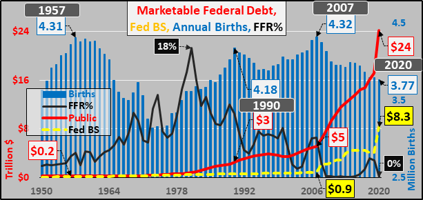
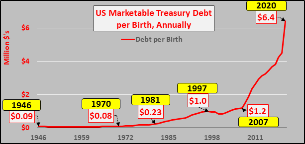
Simply dividing declining annual births against rocketing marketable Treasury debt…and a very ugly reality emerges. Take a gander at the marketable debt against those responsible (over their lifetimes) to repay (lol), service (not so much), but primarily endure the stagflationary QE/monetization. These contradictory trends of declining births and surging debt mean ever fewer are responsible for bearing ever more. Not a very nice shower gift.
US Employment Breakdown
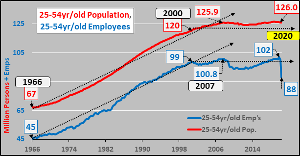
Moving on to gauge population growth versus employment growth among the differing age age groups that make up nearly all the working age population. First, the 25 to 54 year-old population ceased growing in 2007 with predictable results for employment among the 25 to 54 year-olds. The core of US economic activity and growth has been in neutral for well over a decade.
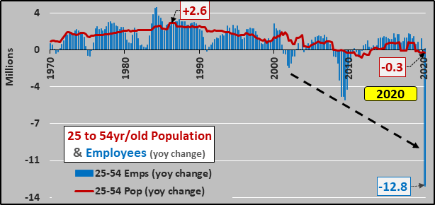
Year over year change in 25 to 54 population growth and employment…the population growth is always an eventual restrictor for potential employment growth. Periods of employment growth above and beyond population growth eventually result in peak employment and the absence of further potential growth…and then resultant recession. No matter the interest rate cuts, stimulus, QE…demographics eventually overrule.
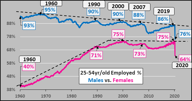
And taking a peek at the two charts below, breaking down employment between 25 to 54 males and females, the chart suggests male and female peak employment is a signal of impending slowing economic activity…and we had seen that clear signal in 2019…well before Corona-virus.

Declining participation among males and peak employment among females…pretty clear trends. Also clear is that it was females entering the workforce that drove the economy through 2000, and the lack of further potential growth since should not be surprising (hello Federal Reserve interest rate led bubbles, QE, etc. since in lieu of further potential growth).
Looking at the youngest segment of adults, engaged in the culmination of high school, college, and/or initiating careers. As for the population, it is emblematic of the lack of growth taking place among young presently at about 1980 quantities. But due to increasingly higher quantities going on to community college and/or college and the declining quality/quantity of jobs available for this population…the total number of those among them employed has been in decline for 40 years.
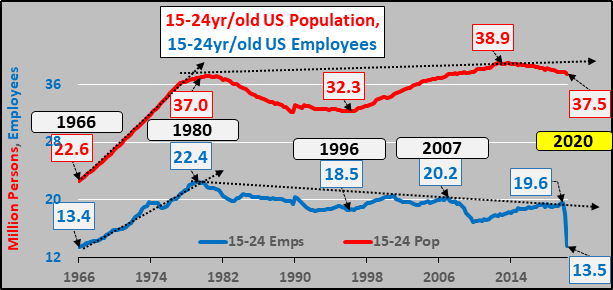
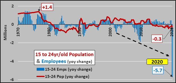
Year over year change in population and employment, minimal population growth with ongoing net employment declines.
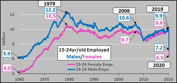
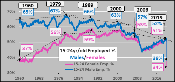
Importantly, 15 to 24 males and females are now essentially equal in the workforce though apparently significantly more females were laid off than males in the Corona-virus shut down?!?
25 to 54 year-old males realized peak participation back in 1979 and females in 1989, and since then both males and female participation continue to decline. This segment of the population appears continually less apt to take part in the economy.
As for the OTA 55 to 64 year-olds in the work force, this has been the segment driving working age population growth and employment for over a decade.
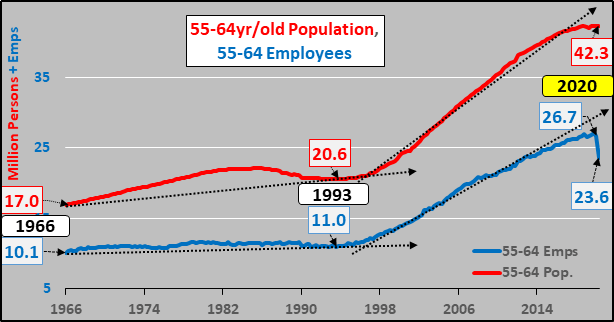
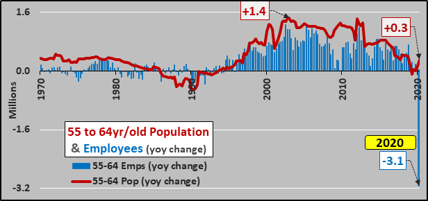
But looking at the year over year, the decelerating 55 to 64 population growth and employment with it is really hard not to see.
55 to 64 male and female participation doing all the heavy economic lifting for decades.
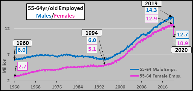
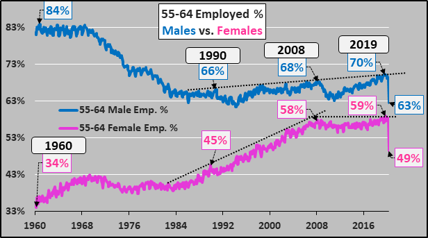
The rising female participation and declining male participation seems to end around 2008…and since then, a relative cap of participation among 55 to 64 year-olds has been established.
Stacking all three employment segments together versus total population growth of the age group details simple governor to potential employment growth.

And so simply, once the employed portion of the 25 to 64 year old population hits the ceiling somewhere around 76% to 77%, little to no further employment or economic growth is possible. Earlier periods had lower ceilings due to the lower participation of females.
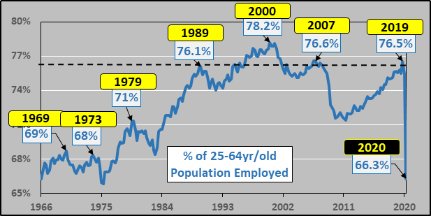
The shifting importance of the 55 to 64 year-old segment and demotion of the 15 to 24 year-old segment. The ceiling in employment for the 25 to 54 year old segment (and signal of imminent deceleration/decline) is very clearly defined at anything above 80%.

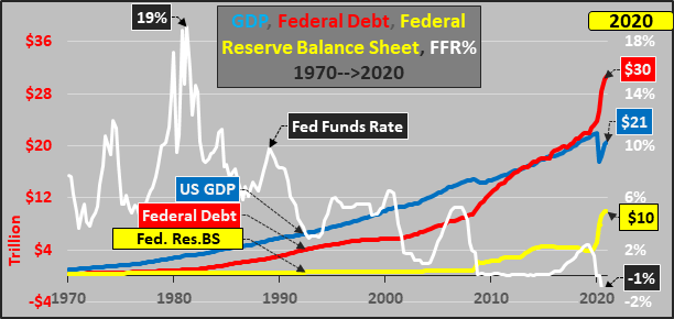
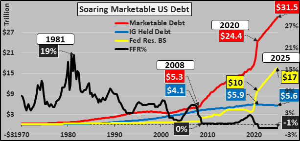
Federal Funds Rate, GDP, Federal Debt, Federal Reserve Balance Sheet
Four decades of declining interest rate policy (FFR%), to incent higher debt utilization at lower cost, to artificially boost consumption (and asset prices), and once this was inadequate the introduction of wholesale QE via the Fed’s balance sheet.
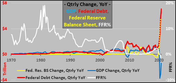
Same as above but viewing the impact of the Federal Reserve set FFR in driving the quarterly (YoY) utilization of federal deficit spending, relatively low impact on GDP, but the increasingly higher QE substitution (to avoid market set interest rates on all that debt).
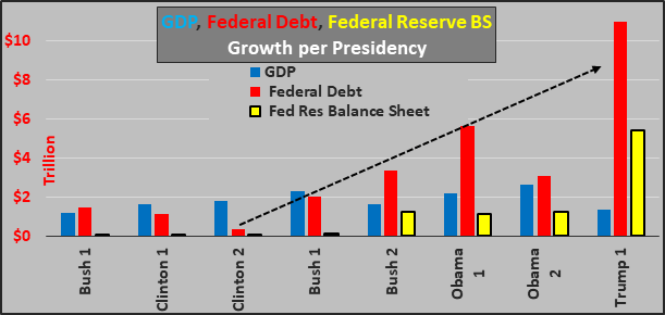
No red team/blue team debate here nor debating what Obama 1 or Trump 1 faced in GFC/Corona-virus, respectively…just the change in GDP, federal debt, and Federal Reserve balance sheet per presidency. There appears to be a trend here.
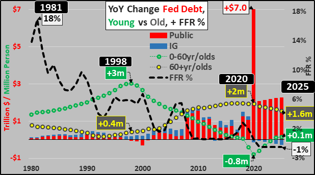
Below, looking out through 2025…again the impact of declining (soon to be NIRP) federal funds rate on incenting Congress to spend beyond what they are willing to tax, and the rising role of using the Federal Reserve balance sheet to monetize all the new debt. And yes, I’m quite confident negative interest rates are imminent.
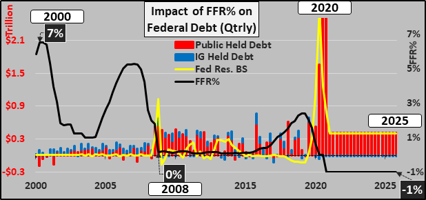
Below, a guestimate of where things are heading through 2025…unless the system breaks earlier (probably 50-50 odds).
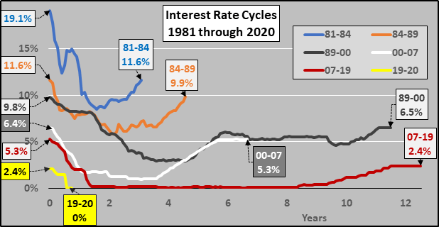
Federal Funds Rate – 1981 to Present
The Federal Reserve set FFR, so critical in benchmarking the cost of money. For 40 years, interest rates moving lower for longer…and this time they will almost surely move negative.
How the Fed will achieve NIRP?
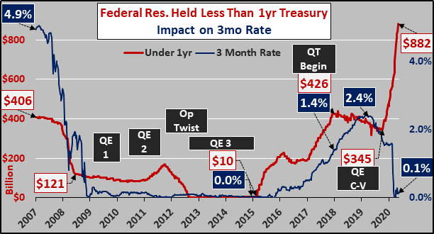
Consider that the Fed is now the buyer of last resort at anything near these interest rates. Gander at the Fed’s Treasury holdings and impacts on relevant interest rates.
Fed held Treasuries less than one year in duration and the impact on the three month rate.
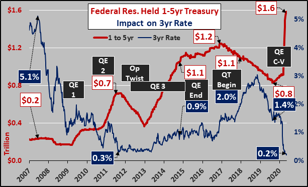
Fed held Treasuries one to five years in duration and the impact on the 3 year rate.
Fed held Treasuries five to ten years in duration and the impact on the 10 year rate.

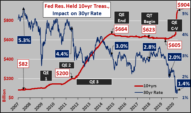
Fed held Treasuries more than ten years in duration and the impact on the 30 year rate.
Market Implications of Federal Reserve Balance Sheet Expansion
As the Federal Reserve balance sheet explodes, and given the current and future 0.1% interest paid on excess reserves…banks, hedge funds, etc. will take the monetization and put it to work. The Fed knows banks will follow the money, and the absence of IOER’s communicates that the Fed wants those freshly created dollars to move into the financial system (why else would the Fed only offer banks 0.1% annually to not lend money?).
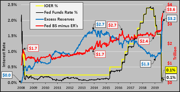
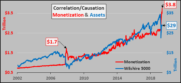
So, the Federal Reserve creates money and subsequently buys assets, removing those assets from the market. Those assets are thrown into a black hole as the Fed will maintain them on its balance sheet indefinitely. On the flip side, the newly created dollars can either be held as excess reserves (for 0.1% interest on excess reserves annually) or become liquid. Of the Fed’s nearly $7 trillion balance sheet, $3.2 trillion are currently held as excess reserves while $3.8 trillion have moved directly into the financial system.
Although I’ve nothing to do with investing, the simple act of “monetizing the debt” alongside 0.1% IOER’s is hugely inflationary for assets…and if the Federal Reserve continues removing assets from the market and replacing them with freshly created dollars…and the dollars primarily move into assets (with anywhere from 2x to 10x leverage)…a “bull market” can theoretically be sustained regardless the underlying economic conditions. This is an inorganic, monetary short squeeze to infinity rewarding a shrinking class of asset holders and harming a growing class of young/poor with little to no assets.
Wrapping this up, an overview of declining federal funds rate, incenting rising annual federal debt (split between public marketable debt vs. intragovernmental buying (SS trust fund, etc.)), while the demographic reality of a surging elderly population suffocates the now declining under 60 year-old population. This is only going to get significantly worse until something (everything?) breaks.
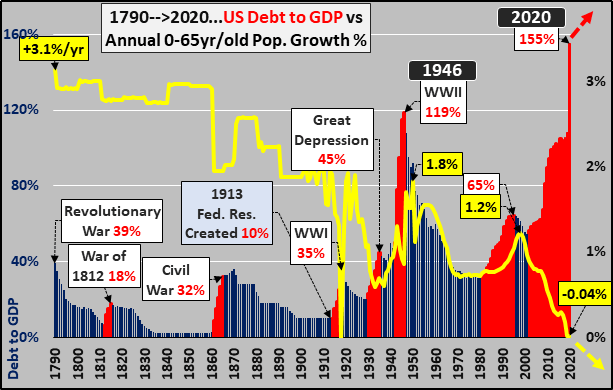
Sort of a grotesque finish…assuming the US runs a $7T 2020 deficit to finance the CARES and HEROES acts plus any and every other bailout they can think of, US debt to GDP will blast to an inconceivable record while annual population growth among the under 65 year-old population hugs the zero line.
Ever more debt to be repaid/serviced/monetized by ever fewer…what could go wrong?