U.s. Banks And 2 & 10-Year Yields

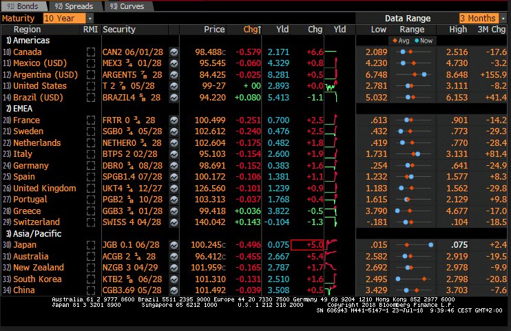
via Slope of Hope During the past year, or so, U.S. 2-Year Treasury Yields have shot up sharply, in comparison with 10-Year Yields, as shown on the following weekly price comparison chart and percentage comparison chart. The next (longer-term) percentage comparison chart shows the weakness that ensued in the SPX when …

READ MORE

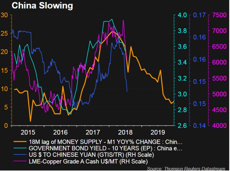
China – A Dangerous Combination

#ChinaSlowing Updated with data for June 2018. – China Money Supply M1 YoY 18M lag (orange) – China 10 Year Govt Bond Yield (light blue/green) – $CNYUSD #CNYUSD (blue) – LME Copper Grade A USD per Metric Tonne (pink) Hello …

READ MORE

Uh-oh! It looks like you're using an ad blocker.

Our website relies on ads to provide free content and sustain our operations. By turning off your ad blocker, you help support us and ensure we can continue offering valuable content without any cost to you.

We truly appreciate your understanding and support. Thank you for considering disabling your ad blocker for this website